Georgia: 7.8

Caroline
- Design: 2/3
- Fabric/Sparkle: 1.6/2
- School Spirit: 1.7/2
- Overall Appearance: 2.2/3
- Total: 7.5/10
Okay, if UGA ever wears a throwback leo, I vote for this one! The cutout design is actually kind of nice here and really complements the lines of each gymnast. The sparkle and velvet combination feels like nostalgia for days, and the big Super G gives it some school spirit bonus points. Definitely a strong outing for the Gymdogs.
Christina
- Design: 2.2/3
- Fabric/Sparkle: 1.6/2
- School Spirit: 1.8/2
- Overall Appearance: 2.3/3
- Total: 7.9/10
Yaaaas red crushed velvet! I am usually not a fan of a change of fabric and color on the sides like this, but here it works really well and created a nice hourglass-y shape on the front. The sparkles all along the black are a nice touch, and it makes the leo as a whole quite sparkly for its time. Great spirit with the G smack in the center as well. Nice one Georgia. Bonus point for having the warmups literally match this leo, sparkles and all.
Elizabeth
- Design: 2.4/3
- Fabric/Sparkle: 1.5/2
- School Spirit: 1.8/2
- Overall Appearance: 2.3/3
- Total: 8.0/10
I’m kind of loving this. The crushed velvet, the diamond/geometric design on the bottom and the sparkly Super G—it’s great. I also love the sparkles along the arms and how the black extends under the arms. It looks nice when the arms are lifted into the air.
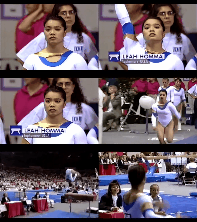
UCLA: 6.933
Caroline
- Design: 1.7/3
- Fabric/Sparkle: 1.4/2
- School Spirit: 1.4/2
- Overall Appearance: 1.5/3
- Total: 6.0/10
While I’m not immediately against this design, it strikes me as quite odd. The nude strap along the collar serves no obvious purpose and makes no sense as far as the design, though I suppose with the thought in mind that Miss Val models her leos after evening gowns, it starts to sort of take shape that way. The cutout on the arm is very unique, so some definite creativity bonus there. That’s actually a trend I wouldn’t mind seeing today. I agree with Christina, though, I do think the design would have made more sense overall to have the same V from the back reflected on the front.
Christina
- Design: 2/3
- Fabric/Sparkle: 1.6/2
- School Spirit: 1.7/2
- Overall Appearance: 2.2/3
- Total: 7.5/10
While I didn’t really like the keyhole on the front of Alabama’s leo, but I really do like this one here, especially with the golden strap. It’s quite unique. I also like that these gold and blue bands come back on the sleeves, and I LOVE the smooth V neckline on the back. I kind of wish the front would have been the same shape although not as low instead of the rounded neckline. And I do wish this leo had something else going on… It’s just a lot of white and nothing much on the rest of the bodice. But overall, I find it elegant, and it’s a great way to incorporate school spirit in a simple way.
Elizabeth
- Design: 1.9/3
- Fabric/Sparkle: 1.6/2
- School Spirit: 1.6/2
- Overall Appearance: 2.2/3
- Total: 7.3/10
I’ve decided present-day UCLA needs to wear more gold. Why didn’t this trend continue? I love it. I don’t mind this leo’s hole but the placement of the gold on the front is a bit weird. I do like the all white with the subtle touches of blue and gold, though and think it looks good on all the girls.
Alabama: 5.7

Caroline
- Design: 1.2/3
- Fabric/Sparkle: 1.3/2
- School Spirit: 1.2/2
- Overall Appearance: 1.3/3
- Total: 5.0/10
So let me get this straight: one random asymmetrical squiggle on the front, with another draping over the shoulder and probably down to the back? An actual, not-mesh-covered keyhole at the bust? No identifying school spirit marker or noticeable sparkle? Are we sure this is the same Alabama we know and love? This is what my old dance teacher used to call a Hot Mess Express. As a gymnast, I would feel self-conscious in this—between the keyhole in the chest and the ribbon squiggle that wraps around the hip almost like a butt pad, like the pink leo from a couple weeks back. It’s just a big no all around.
Christina
- Design: 1.6/3
- Fabric/Sparkle: 1.4/2
- School Spirit: 1.2/2
- Overall Appearance: 1.8/3
- Total: 6.0/10
This is… interesting. I don’t hate it, but I am a bit unsure how to feel. It’s definitely unique. I like the lines created by the crimson but I really dislike that keyhole in the front. I am, however, obsessed with the white crushed velvet (duh). But yeah, overall I’m rather meh on this one. A little sparkle and more school spirit would have been nice as well.
Elizabeth
- Design: 1.7/3
- Fabric/Sparkle: 1.3/2
- School Spirit: 1.3/2
- Overall Appearance: 1.8/3
- Total: 6.1/10
This leo… The keyhole in the front is not cute and all white with the ribbon of crimson reminds me of a snowman with a red scarf. But the crushed velvet material makes up for it some. It’s just so not what I’m used to seeing from Alabama.
Oregon State: 5.167

Caroline
- Design: 2/3
- Fabric/Sparkle: 1.3/2
- School Spirit: 1/2
- Overall Appearance: 1.8/3
- Total: 6.1/10
While an interesting design, almost a little reminiscent of a yin-yang symbol with the white twisting into the black and vice versa, it needed something more to really work. Featuring the school name or initials somewhere would have been nice. Or perhaps a bright pop of orange or even just some visible sparkle would have been a better touch.
Christina
- Design: 1.2/3
- Fabric/Sparkle: 0.8/2
- School Spirit: 0.7/2
- Overall Appearance: 1/3
- Total: 3.7/10
Blah. There is nothing very exciting or unique about this look. No sparkles, basic design and no school spirit. When the camera zooms in, it looks like there are some polka dots or some light sparkles on the white part, but it’s basically invisible from far away and while moving. Eh, just a (too) simple black and white leo.
Elizabeth
- Design: 1.6/3
- Fabric/Sparkle: 1.2/2
- School Spirit: 1.2/2
- Overall Appearance: 1.7/3
- Total: 5.7/10
I like the hole in the back but the rest is kind of boring. It’s reminds me of a leo I’d see on a compulsory team from the early 2000s. And apparently ribbons were trendy at this point in time. I also wish this leo had orange somewhere to bring out the school spirit. Anyone can do black and white.
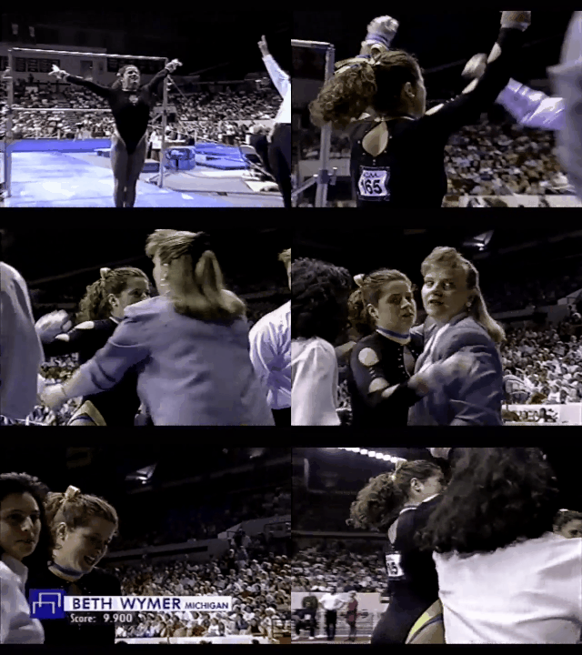
Michigan: 4.967
Caroline
- Design: 1.3/3
- Fabric/Sparkle: 1.5/2
- School Spirit: 0.8/2
- Overall Appearance: 1.1/3
- Total: 4.7/10
WOW. So much going on. First, let’s address the fact that without a clear shot, this looks like the girls have a bright blue choker and leg bands on separately from their leotard? Of course, at second glance, you see that that’s the end of the leotard itself, which almost makes it even odder. Why put yellow fabric (that looks tan) at the end of the leg holes of a leo? The faux high cut is just bizarre to me. The arm holes I actually don’t hate. That was a trend in long-sleeve shirts in the ‘90s (I would know, I definitely had one) and without a contrasting fabric color, I think this was a great way to spice up the onenote design. I also love the use of sparkle to accentuate that pattern on the arms—nice touch. That being said, the front keyhole trend has got to go or at least needs to be covered with mesh. I understand it’s a trend but gymnasts shouldn’t have to worry about whether or not they’re going to have a wardrobe malfunction while they’re doing dangerous stunts—they have enough on their minds!
Christina
- Design: 0.7/3
- Fabric/Sparkle: 0.5/2
- School Spirit: 1/2
- Overall Appearance: 1/3
- Total: 3.2/10
This leo is a mess. First of all, what is this trend of weird keyholes in the front? This one especially is boobalicious. I don’t believe the gymnasts didn’t flash anybody while tumbling while wearing this. Second of all, what are your sleeves? WHY why WHY have open holes? It’s like a kid cut through the sleeves, reminding me of the way you create your own Christmas garland as a child and cut the same holes through layers of papers and—bam—there’s your garland. That’s essentially what happened here, right? Finally, I can’t with the dog collar. You get it; it’s awful for me.
Elizabeth
- Design: 2.1/3
- Fabric/Sparkle: 1.3/2
- School Spirit: 1.6/2
- Overall Appearance: 2.0/3
- Total: 7.0/10
This leotard is something else. I am especially loving/hating the weird arm holes and bright yellow and blue accents on the neckline and faux hi-cut leg holes. I wish there were a few more sparkles but also don’t think this leo is terrible? Or maybe it’s one of those so terrible it’s amazing leos?
Have a throwback meet you want us to judge? Stick it in the comments or hit us up on Twitter, and we’ll try to get to it in the coming weeks!
Article by Elizabeth Grimsley, Christina Marmet and Caroline Medley

