Continuing with the throwback leotard theme, this week we’re taking a look back at the fashion at the 1996 national championships. And let us tell you, all of these leotards are outrageously amazing. Prepare yourself.
The criteria is the same as during the season. But to refresh your memory: up to three points for design; two points for fabric, sparkle, etc.; and two points for school spirit; three points for overall appearance. But we want to know your thoughts too! Make sure to vote in our poll at the bottom of the page.
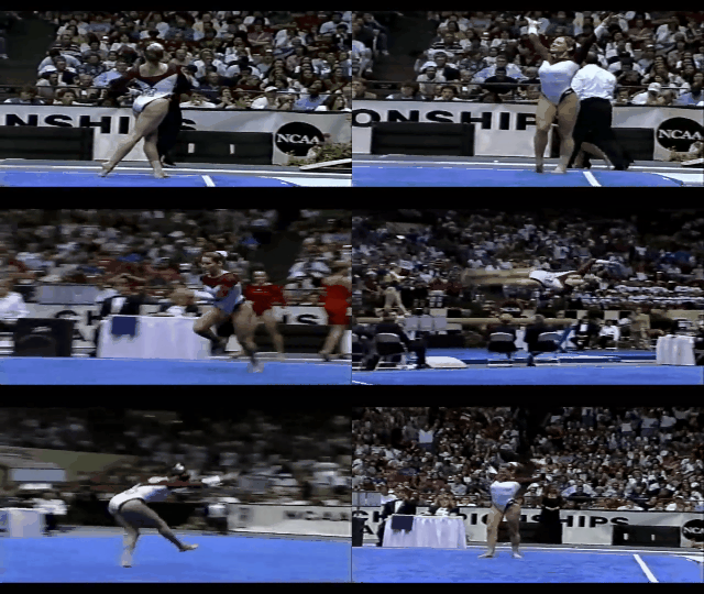
Alabama: 8.167
Caroline
- Design: 2.6/3
- Fabric/Sparkle: 1.4/2
- School Spirit: 1.6/2
- Overall Appearance: 2.6/3
- Total: 8.2/10
Uhh can Alabama wear this in 2018 please?? The all white is lovely on the broadcast, the red mesh is a gorgeous color and the logo on the back is the perfect placement and size. I’m not a huge fan of the faux cuffs on the sleeves, and I could use a little more sparkle on the rest of the bodice besides the neckline, but other than that, I’m in love!
Christina
- Design: 2.5/3
- Fabric/Sparkle: 1.6/2
- School Spirit: 1.6/2
- Overall Appearance: 2.5/3
- Total: 8.2/10
At first, I wasn’t really sure how to feel about the all white bodice, but I am kind of digging it in motion the more I look at it. Love the sweetheart neckline and the low V in the back. This is a fairly modern design to be honest, and I really like it. I could have done without the red along the hips to make that faux high cut look, but honestly, overall, it’s a great look. Seriously obsessed with the back. A pleasant surprise from Alabama for this era in gymnastics!
Elizabeth
- Design: 2.4/3
- Fabric/Sparkle: 1.6/2
- School Spirit: 1.5/2
- Overall Appearance: 2.6/3
- Total: 8.1/10
Ok, so I must be going crazy, but I’m kind of really digging this. I love the white and crimson combo and the neckline is really nice. The faux high cut is a bit weird but it works and looks good on the gymnasts. And it almost accentuates the “Bama” on the crimson part of the hip. I wish the white cuffs on the sleeves were a bit smaller, but overall, this is a win for me.
Michigan: 7.333

Caroline
- Design: 1.6/3
- Fabric/Sparkle: 1.2/2
- School Spirit: 1.8/2
- Overall Appearance: 1.5/3
- Total: 6.1/10
As soon as the camera zoomed out, that gold band wrapping across the front became a pageant sash for me. I couldn’t unsee it. Otherwise, I think it’s rather creative. The big M taking center stage on the front, with the contrasting navy and gold, is quite a nice design. I do wish the sparkles had been a bit bolder or darker though so the M was more visible on TV, and the little part of the left sleeve that has navy on it almost makes it look like she’s wearing a brace—totally odd. All white sleeves would’ve been better.
Christina
- Design: 2.3/3
- Fabric/Sparkle: 1.5/2
- School Spirit: 1.9/2
- Overall Appearance: 2.4/3
- Total: 8.1/10
Oooh I like this. I like the bands of navy and gold across the chest and that they continue in the back. The big ‘M’ is also a nice touch. My only criticism is I kinda of wish there was less white with maybe a lower neckline or have the colors come up more. The hole in the upper back looks good as well.
Elizabeth
- Design: 2.1/3
- Fabric/Sparkle: 1.5/2
- School Spirit: 1.9/2
- Overall Appearance: 2.3/3
- Total: 7.8/10
I like that Michigan took risks here. The colors are integrated nicely and the V neckline with the Black M above looks good and isn’t TOO school spirity. I also like the subtle design on the blue fabric, the use of the mystique fabric for the yellow and I actually don’t hate the white crushed velvet.
UCLA: 6.467

Caroline
- Design: 1.6/3
- Fabric/Sparkle: 1.4/2
- School Spirit: 1.7/2
- Overall Appearance: 1.8/3
- Total: 6.5/10
I’m so pleased that UCLA actually used their blue and wore a logo on their leo that I gave extra spirit points! What a novelty! Aside from that, I’m not a huge fan of the straight across neckline; I think it’s actually almost counterproductive to the aesthetic of gymnastics where athletes are supposed to accentuate their lines. Instead, the design totally cuts off the lines at the armpits. However, I do like the keyhole in the back, and I love that shade of blue! It broadcasts really nicely, and it’s flattering on the entire team.
Christina
- Design: 1.3/3
- Fabric/Sparkle: 1.6/2
- School Spirit: 1.6/2
- Overall Appearance: 1.7/3
- Total: 6.2/10
Why do I feel like UCLA just wears the exact same thing in all these throwback leo posts we have been doing so far? I always have the same criticisms with this straight neckline that just cuts across the chest. I don’t think it looks flattering at all and especially here since there is not much else to the leo. I do like the lovely color combo and the small hole in the back, but yeah, just never a fan of this neckline.
Elizabeth
- Design: 1.7/3
- Fabric/Sparkle: 1.5/2
- School Spirit: 1.6/2
- Overall Appearance: 1.9/3
- Total: 6.7/10
I’ll start with the good. I want to give props to UCLA for using mesh on the sleeves rather than velvet or even lycra—way ahead of its time there. Even the body’s lycra was ahead of its time compared to the rest of the teams in this final. However, the rest of the leo is typical UCLA, and with my least favorite neckline, this is a meh from me. However, the Bruins do get points for the back hole, the mesh and the big white scrunchies.
Utah: 6.2

Caroline
- Design: 1.9/3
- Fabric/Sparkle: 1.1/2
- School Spirit: 1/2
- Overall Appearance: 1.7/3
- Total: 5.7/10
More space age silver polka dots and hot pink? The hot pink butt pads are just bizarre to me, that is the wrong place to have a color change in your leotard. I don’t mind the pink cuffs as much; they don’t bother me. I had to hunt for the spirit on this one, but if you look closely, Utah is written under the V of polka dots on the left side of the torso. Odd placement, but I appreciate its inclusion I suppose.
Christina
- Design: 1.8/3
- Fabric/Sparkle: 1.4/2
- School Spirit: 1/2
- Overall Appearance: 1.9/3
- Total: 6.1/10
What is up with the faux high cut trend in 1996? We have that in synchronized swimming too but it’s skin-colored and is a trick to make the swimmers appear as if higher out of the water and give the overall impression of longer legs. I just don’t understand it in gym, especially when it’s pink?! Anyways, this leo is ridiculously absurd, and I am here for it. A mix of polka dots and hot pink? Why? The design itself is kind of odd; it works in the back but is weird in the front. This is just so much but also so 1996. I do like it a lot more than Oregon State’s though, which basically used the same colors and fabric. I don’t even know… There is so much going on, and I have a lot of questions.
Elizabeth
- Design: 1.8/3
- Fabric/Sparkle: 1.7/2
- School Spirit: 1.3/2
- Overall Appearance: 2.0/3
- Total: 6.8/10
Oh man, there’s so much going on here. It’s like a full-blown party. The polka dot fabric on top is even more in your face than it is on Oregon State’s leotard. The hot pink actually looks good with the rest but I have to deduct for non school colors. Would it have been so hard to have used red? And you already know my thoughts on the faux high cut. And the “Utah” is in the weirdest place but kind of works?
Georgia: 5.833

Caroline
- Design: 1.7/3
- Fabric/Sparkle: 1.2/2
- School Spirit: 1.7/2
- Overall Appearance: 1.6/3
- Total: 6.2/10
So the only real design here is the big Georgia G, which is great for school spirit points but not so great for design points. It’s also devoid of sparkles anywhere else on the entire leotard so a few points off there as well. However, the red crushed velvet really pops against the rest of the arena, which I love, and the velvet is one ‘90s trend I actually don’t mind as much.
Christina
- Design: 1.9/3
- Fabric/Sparkle: 0.9/2
- School Spirit: 1.6/2
- Overall Appearance: 1.7/3
- Total: 6.1/10
All the velvet! This is alright, but I wish it wasn’t all red. This is also when I realize the gigantic ‘G’ has been a trademark on many UGA leos for a long time now. I do like the back with the hole and the band going across; this is also a fairly ‘modern’ look and one we’ve seen these last few seasons. Overall I’m not too overwhelmed by this look though, and I wanted more variety in colors and fabric!
Elizabeth
- Design: 1.5/3
- Fabric/Sparkle: 0.8/2
- School Spirit: 1.5/2
- Overall Appearance: 1.4/3
- Total: 5.2/10
This is alright. But crushed velvet is probably my least favorite form of velvet and this one in particular reminds me of my very first competition leotard in level 4 where the fabric was so constricting, my arms felt claustrophobic. The Super G on the front is large but not overbearing because of the sparkle and the back hole is a nice touch as well. I just wish it wasn’t all one solid red color.
Oregon State: 4.233

Caroline
- Design: 1.3/3
- Fabric/Sparkle: 0.9/2
- School Spirit: 0.5/2
- Overall Appearance: 1.6/3
- Total: 4.3/10
Oh my god this is so “futuristic” ‘90s it hurts. From the space-age silver polka dots on the bodice to the odd asymmetrical neckline, this leo features just one terrible trend after another. The hot pink/orange color also doesn’t make a whole lot of sense to me, nor does the random cut-out (cut-in?) lower down on the front where the black appears to slice into where the pink bodice should be. Trying too hard to be on-trend is not something that ever ages well.
Christina
- Design: 1.2/3
- Fabric/Sparkle: 1/2
- School Spirit: 0.3/2
- Overall Appearance: 1.3/3
- Total: 3.8/10
This is such a ‘90s leo, but it’s so puzzling at the same time that I don’t know what to make of it. I don’t really get the color choice, so school spirit here is pretty low. The busy silvery polka dots are alright, but I really dislike the cut of the pink fabric across the chest. It’s just… a weird, random look.
Elizabeth
- Design: 1.3/3
- Fabric/Sparkle: 1.2/2
- School Spirit: 0.7/2
- Overall Appearance: 1.4/3
- Total: 4.6/10
One of two teams to have hot pink in this Super Six and I just don’t understand. At least Oregon State didn’t try to pair this hot pink with orange? Consolation prize. Anyway, I like the semi-polka dot design on the sleeves but the body design and weird side cut just isn’t doing it for me. Plus, hot pink velvet?
Have a throwback meet you want us to judge? Stick it in the comments or hit us up on Twitter, and we’ll try to get to it in the coming weeks!

