The new leos keep on coming, and we got some great designs this week including actual orange from Illinois and a stunner from UW-Whitewater. The criteria is the same as always: up to three points for design; two points for fabric and sparkle; two points for school spirit; and three points for overall appearance. This week’s guest judges are EAGL and ECAC editor Mary Emma and SEC editor Katherine.
Pittsburgh: 8.700
https://twitter.com/Pitt_GYM/status/1086277028653846530
| Design | Fabric/
Sparkle |
School
Spirit |
Overall
Appearance |
Total | |
| Elizabeth | 2.1/3 | 1.6/2 | 1.8/2 | 2.2/3 | 7.7/10 |
| Katherine | 2.7/3 | 1.6/2 | 2/2 | 2.7/3 | 9.1/10 |
| Mary Emma | 2.8/3 | 1.7/2 | 2.0/2 | 2.8/3 | 9.3/10 |
Elizabeth: My absolute favorite arms are back, so thank you, Pitt! I don’t like this body as much as the leo we featured last week, mainly because the yellow and blue shades remind me more of Kent State or UW-Eau Claire than Pittsburgh gold and navy. However, overall it’s another good leo from the Panthers that I’m definitely not going to complain about seeing them wear.
Katherine: Love pretty much everything about this! As I said, I like to see ombre sleeves (and ombre everything), and these are beautiful. The “Pitt” on the back looks like it belongs there and it isn’t tacky—I also love the subtle “H2P” on the hip. If I could change ONE thing, maybe the blue that makes up the front would be a tiny bit darker. But otherwise, I am all about this one.
Mary Emma: LOVE THIS. I love the ombre sleeves, and the gold neckline is so pretty. I also appreciate that they incorporated the old school light blue into it (you often see this shade on older Pitt gear), and the script “Pitt” on the back is a nice finishing touch. There definitely is a lot going on, but I think it all works together well. Pitt has really been stepping up the leo game lately!
Illinois: 8.300
https://twitter.com/IlliniWGym/status/1086711468970688512
| Design | Fabric/
Sparkle |
School
Spirit |
Overall
Appearance |
Total | |
| Elizabeth | 1.9/3 | 1.7/2 | 1.7/2 | 2.1/3 | 7.4/10 |
| Katherine | 2.8/3 | 1.8/2 | 1.4/2 | 2.7/3 | 8.7/10 |
| Mary Emma | 2.5/3 | 2.0/2 | 1.7/2 | 2.6/3 | 8.8/10 |
Elizabeth: While this is my second favorite of the two new orange leos Illinois is debuting this season, I do really love this and think the new direction its designs are going in is great. I love that a team is actually using orange well (looking at you Florida and Boise State), but, like with Kentucky’s leo, wish the bottom and top weren’t cut off so abruptly. I love the back, but maybe if the body had faded from orange to white in an ombre effect, it would have been better.
Katherine: Another stunning one, and talk about originality! I honestly wish we saw more orange leos, but I can’t imagine one done better than this. I’m especially obsessed with the rhinestone work in the middle. It’s so simple yet elegant, and it works great with the intricacy of the chest and back.
Mary Emma: These are stunning! I really appreciate how much Illinois embraces its orange color and incorporates it into leotards. The shimmery white fabric is so pretty, and I love the sparkly belt. I don’t love the orange criss crosses in the front, but that’s really my only complaint.
Kentucky: 7.967
https://twitter.com/UKGymnastics/status/1082695333271007236
| Design | Fabric/
Sparkle |
School
Spirit |
Overall
Appearance |
Total | |
| Elizabeth | 2.0/3 | 1.7/2 | 1.8/2 | 2.3/3 | 7.8/10 |
| Katherine | 2.2/3 | 1.6/2 | 1.5/2 | 2.3/3 | 7.6/10 |
| Mary Emma | 2.7/3 | 1.8/2 | 1.5/2 | 2.5/3 | 8.5/10 |
Elizabeth: I love this leo so much. Well, the top at least. The body design is fine, but I don’t love how the silver-white band cuts off the pretty ombre halfway down and transitions to such a dark blue. But as for the top, I’m obsessed. The shiny ombre is everything and the shades of blue used are to-die-for. Also, can I say that if my favorite team had a matching leo for my American Girl Doll when I was growing up, I would have needed it IMMEDIATELY.
Katherine: The only thing stopping me from fully loving it is the white strip in the middle. It didn’t seem bad when they were competing in it, but from the picture it just looks like that part doesn’t fit with the rest. Almost everything else is great, though—I love the wildcat logo on the hip; it’s the perfect amount of spirit for me!
Mary Emma: LOVE THIS. I love the ombre sleeves (if you read through my leotard rankings this season, you’ll quickly learn that ombre is my favorite leotard trend), and the shiny front is gorgeous! My only complaint is the stark contrast between the top and the bottom. I wish the white belt wasn’t there and that there was more of an ombre effect between the light and dark blue. But overall this is a win for me!
Michigan: 7.867
Tonight's leotard #GoBlue #WearMaize pic.twitter.com/d0KigKCvvM
— Michigan Women’s Gymnastics (@UMichWGym) January 18, 2019
| Design | Fabric/
Sparkle |
School
Spirit |
Overall
Appearance |
Total | |
| Elizabeth | 2.2/3 | 1.7/2 | 1.9/2 | 2.4/3 | 8.4/10 |
| Katherine | 2.2/3 | 1/2 | 1.3/2 | 2/3 | 6.5/10 |
| Mary Emma | 2.8/3 | 1.6/2 | 1.6/2 | 2.7/3 | 8.7/10 |
Elizabeth: We’ve judged this before, but I feel like it didn’t get enough love the first time the team wore it. I love the shiny ombre effect and the overall look of the sparkle. I do think, up close, the boob rhinestones look more like something a mermaid would wear than a good design for a full leotard, but overall, again, I really do enjoy this leo. It might even be one of my favorite designs from the Wolverines.
Katherine: I feel like I should like this one, but overall I find it pretty average. I do enjoy the color scheme and the pattern. But the gems on the front are a bit over the top—like something you’d see in a circus. And I don’t like how they just stop midway down. I’d also would have liked to see the school name represented in a different way because it kind of looks tacky here.
Mary Emma: This is by far my favorite Michigan leotard. A lot of teams shy away from using bright colors because it’s so easy to mess up, but these look so good. I love the ombre sleeves, and the bright yellow really contrasts well with the dark blue. I normally am not a huge fan of words on leotards, but I think the “Michigan” on the back works well and isn’t too out of place.
UW-Whitewater: 7.833
https://www.instagram.com/p/Bsy4LBanJcK/
| Design | Fabric/
Sparkle |
School
Spirit |
Overall
Appearance |
Total | |
| Elizabeth | 2.1/3 | 1.4/2 | 1.6/2 | 2.3/3 | 7.4/10 |
| Katherine | 2.6/3 | 1.7/2 | 1.4/2 | 2.5/3 | 8.2/10 |
| Mary Emma | 2.4/3 | 1.7/2 | 1.5/2 | 2.4/3 | 7.9/10 |
Elizabeth: This design is actually strangely similar to Kentucky’s with the almost briefs-like cut off on the body. The leo as a whole looks great on the gymnasts and great in action, even more so than these posed pictures. I do wish the purple ombre sleeves matched the shade of the body a bit more and the more athletic-looking back looked similar to the more design-centered front. Maybe adding some rhinestones to the back as well would fix this. Overall, I do really love the leo.
Katherine: Very cool design in the front! The jeweled neckline is also a nice touch, and I’m always here for ombre sleeves. However, the keyhole cutout in the back doesn’t seem to match the rest of the vibe. Maybe because the front is more geometric and angular.
Mary Emma: I quite like this one. The sleeves are GORGEOUS, and I love the shade of purple they used. I’m not a big fan of the random purple stripe in the middle of the sleeves, however. I wish it was just purple all the way down.
Oregon State: 7.833
.@LoweryIsis of @BeaverGym #NCAAgym pic.twitter.com/mrwEsSwsqa
— Emily Howell-Forbes Photography (@Emilykhf) January 21, 2019
| Design | Fabric/
Sparkle |
School
Spirit |
Overall
Appearance |
Total | |
| Elizabeth | 2.4/3 | 1.8/2 | 1.8/2 | 2.6/3 | 8.6/10 |
| Katherine | 2.4/3 | 1.4/2 | 1.1/2 | 2.3/3 | 7.2/10 |
| Mary Emma | 2.5/3 | 1.6/2 | 1.3/2 | 2.3/3 | 7.7/10 |
Elizabeth: I actually really like this leo! Oregon State has some real interesting designs, so calming down to create this was a nice surprise. I love the little triangles on the deep V and incorporation of orange was just enough without being too subtle or too Halloween. The back swirlies I could take or leave, but overall I’m a fan of this leo.
Katherine: I love the triangles on the front! The silver and orange sparkles are also so gorgeous, and they’re perfectly spaced out on all parts of the leo. However, like I said for Whitewater, the back just doesn’t seem to fit. It’s a nice design on its own, but it doesn’t match the rest. If you took out the black vine pattern, it would be perfect.
Mary Emma: I really like these! It does look similar to another one of the Beavers’ leos, and I had to do a double take to see if this one was really new or not. I quite like the design though, and those orange rhinestones on the front add a nice touch. I don’t know how I feel about the swirly things on the back, but I don’t hate them.
North Carolina: 7.667
— EER___86 (@sooner1986) January 19, 2019
| Design | Fabric/
Sparkle |
Pink Meet
Spirit |
Overall
Appearance |
Total | |
| Elizabeth | 1.7/3 | 1.7/2 | 2.0/2 | 2.0/3 | 7.4/10 |
| Katherine | 2.3/3 | 1.7/2 | 1.5/2 | 2.4/3 | 7.9/10 |
| Mary Emma | 2.5/3 | 1.8/2 | 1.3/2 | 2.2/3 | 7.7/10 |
Elizabeth: I’m here for the pink to black shiny ombre. It’s bold yet not too wild. I do with the front logo and the back words and ribbon were smaller though. They take up way too much space on the design as a whole. Shrink the front down about 50 percent, move the ribbon to the sleeve and make “Tar Heels” a little smaller, and this leo would be an overall win.
Katherine: Really loving the creative takes on pink leos this season. This one reminds me of Auburn’s a few weeks ago, except it’s a little more understated—not a bad thing! The pink doesn’t flow perfectly into the blue, but it’s still really pretty and has a perfect amount of sparkles to go with the design. I don’t know if I’d have made the ribbon on the back quite that big, but I understand why they did.
Mary Emma: I normally don’t love pink leotards, but these are pretty cool! I love the pink to black ombre and how much it shimmers. Even the logo doesn’t look out of place, despite the leo not being school colors. My one complaint is the “Tar Heels” on the back with the pink ribbon is too big for my liking.
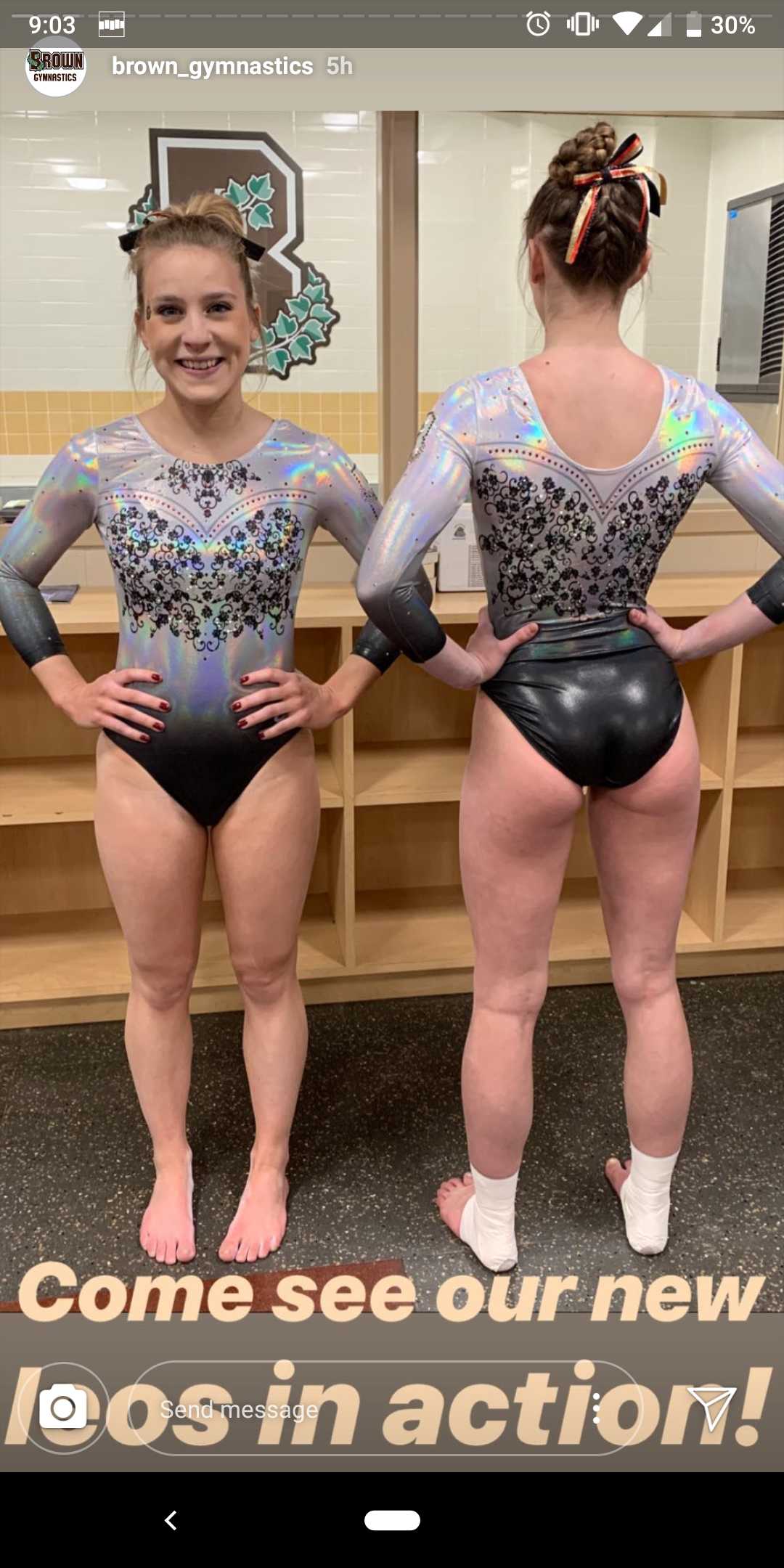
Brown: 7.467
| Design | Fabric/
Sparkle |
School
Spirit |
Overall
Appearance |
Total | |
| Elizabeth | 1.8/3 | 1.7/2 | 1.6/2 | 2.2/3 | 7.3/10 |
| Katherine | 2.3/3 | 1.2/2 | 1.5/2 | 2.6/3 | 7.6/10 |
| Mary Emma | 2.2/3 | 1.6/2 | 1.3/2 | 2.4/3 | 7.5/10 |
Elizabeth: I like this in theory, but the ivy (?) design all over is a bit much. I love the fabric and the black to white ombre. I even like the faux sweetheart neckline, but the design on top still puzzles me, and I can’t decide how I feel. I think it’s one I’d want to photograph because it’s 10 times better than any other leo Brown has and is also one that I think will grow on me more with time.
Katherine: It’s a little out there, but I’m into this! The shiny material definitely seems like it would stand out on the floor. I don’t really know why leaves are part of the theme for Brown, but this is a great interpretation of that. If anything, I would like to see the front look a little more like the back.
Mary Emma: These are very interesting! I’m not quite sure how I feel about them, but I love the shiny material and the ombre effect at the bottom. I’m not a huge fan of the flowery design (is that what it’s supposed to be?). Overall this is definitely a design I have never seen in a leotard before, so points for originality!
Florida: 7.400
https://twitter.com/GatorsGym/status/1086368389159825408
| Design | Fabric/
Sparkle |
School
Spirit |
Overall
Appearance |
Total | |
| Elizabeth | 1.8/3 | 1.5/2 | 1.6/2 | 2.1/3 | 7.0/10 |
| Katherine | 2.3/3 | 1.5/2 | 1.2/2 | 2.5/3 | 7.5/10 |
| Mary Emma | 2.5/3 | 1.7/2 | 1.3/2 | 2.2/3 | 7.7/10 |
Elizabeth: I like this leo as a whole. The shade of blue on the arms is stunning, and I really enjoy the back and front designs. However, in action, you couldn’t see the back orange rhinestones saying Florida really at all. It just looked like sparkle but nothing distinct. I could have done with plain sparkle there and maybe used orange rhinestones all over to bring up the school spirit factor instead?
Katherine: It’s definitely beautiful, but the reason I didn’t score it higher is the fact that it’s very…well…Florida. I feel like I’ve already seen the design on other leos, and there’s not much unique about it other than the back. But it doesn’t have to be original to look great, and this leo absolutely did.
Mary Emma: This one is just OK to me. There’s nothing really wrong with it, but it looks a lot like other leotards that Florida has. It just doesn’t do much for me. I do love the sparkles and the orange rhinestone “FLORIDA” on the back though.
Ohio State: 7.300
https://twitter.com/OhioStateWGYM/status/1086375599814389760
| Design | Fabric/
Sparkle |
School
Spirit |
Overall
Appearance |
Total | |
| Elizabeth | 1.4/3 | 1.6/2 | 1.6/2 | 1.5/3 | 6.1/10 |
| Katherine | 2.2/3 | 1.7/2 | 1.6/2 | 2.5/3 | 8.0/10 |
| Mary Emma | 2.4/3 | 1.3/2 | 1.9/2 | 2.2/3 | 7.8/10 |
Elizabeth: Yikes. If this leo had the same front everything and then was just a large hole in the back with no straps or lace, I’d be all for it. But I don’t like lace really at all, especially a random half band on the back, and the white straps just look like a sports bra that’s trying to match the design but failing.
Katherine: I’m all about elegance, and something about this leo just feels classy. Not that elite gymnastics is synonymous with those things and NCAA isn’t, but I can see this one being worn at the Olympics or Worlds. Now let’s talk about the back. I like the cutout, and I think the flowers could be effective…just on a different leo. They probably thought it needed that “one extra thing,” and it really didn’t.
Mary Emma: This one is alright, but it’s just kind of boring to me. I do love the shade of red, but overall it’s pretty plain. The logo on the front adds a lot of school spirit—and I do rather like the lace design on the back—but it kind of seems out of place.
Yale: 6.767
https://twitter.com/YaleGymnastics/status/1086629597398085639
| Design | Fabric/
Sparkle |
School
Spirit |
Overall
Appearance |
Total | |
| Elizabeth | 1.6/3 | 1.1/2 | 1.3/2 | 1.7/3 | 5.7/10 |
| Katherine | 2.1/3 | 1.3/2 | 1.1/2 | 2.4/3 | 6.9/10 |
| Mary Emma | 2.5/3 | 1.3/2 | 1.5/2 | 2.4/3 | 7.7/10 |
Elizabeth: This is OK if not a little boring. I do like this pointy/icicle take on a sweetheart neckline, but the designa s a whole just needs more from me. Maybe something as simple as a fun back or ombre sleeves. Just something to make it more than a navy leo with some rhinestones around the top.
Katherine: Another elegant leo. It’s a beautiful shade of blue, and the transition from the neckline into the rest of it is effortless. Not sure how I feel about the sparkles coming down in little lines, but it’s not horrible. Also, I had to see it in the Twitter header to realize that the front is meant to be shaped like a “Y,” so that’s clever of them.
Mary Emma: These are very elegant, and the touch of sparkles on the chest is nice but not too overpowering. I love the mesh sleeves, and the fact that the neckline is a subtle “Y” is really cool. It’s a little bit plain to me, but overall a solid leo!
California: 6.500
https://twitter.com/CalWGym/status/1087531610956681216
| Design | Fabric/
Sparkle |
School
Spirit |
Overall
Appearance |
Total | |
| Elizabeth | 2.3/3 | 1.4/2 | 1.7/2 | 2.5/3 | 7.9/10 |
| Katherine | 1.7/3 | 1.1/2 | 0.4/2 | 1.6/3 | 4.8/10 |
| Mary Emma | 2.0/3 | 1.2/2 | 1.3/2 | 2.3/3 | 6.8/10 |
Elizabeth: I actually really liked this leo. I could definitely do without the fake camisole white in the front, making it look like a middle schooler wanting to wear a V-neck to school but her mom saying it would be too low. I also could do without the weird back white—what is it even supposed to be? But I looove the white and navy Sather Stripe incorporated into the design on the body and sleeves, making it look old-timey yet classy and athletic. Maybe I would have preferred a script “Cal” on the front rather than “Golden Bears,” but overall I like this leo a lot.
Katherine: “Golden Bears” could be replaced with any other school name with some semblance of blue in the color scheme and I wouldn’t bat an eye. Normally school spirit isn’t that important for me, but this one is just egregiously out of place. And I’m really not a fan of the design either… The white stripes and the rhinestones just don’t mix. Cal, I love you, but do better.
Mary Emma: I do appreciate that Cal went for a retro look, but the design isn’t my favorite. The top half is really nice, but I’m not a fan of the two white stripes around the waist and wrists.
Illinois State: 4.933
| Design | Fabric/
Sparkle |
School
Spirit |
Overall
Appearance |
Total | |
| Elizabeth | 1.2/3 | 1.4/2 | 1.5/2 | 1.3/3 | 5.4/10 |
| Katherine | 1.2/3 | 0.9/2 | 1.1/2 | 1.3/3 | 4.5/10 |
| Mary Emma | 1.3/3 | 1.2/2 | 1.2/2 | 1.2/3 | 4.9/10 |
Elizabeth: I’m really undecided about this leo. First, it’s one of Illinois State’s best leos, so that’s saying something, but I don’t really like the vertical look. The front is way better than the back (even though it’s basically the same), and I like the matte white arm look. I just wish it was a little more sophisticated than it is. Good try though!
Katherine: Possibly the most haphazard color division I’ve ever seen on a leo. I also don’t understand how the sparkles are so structured on one half and random on the other. It looks slightly better on the front because of the extra design on the white side, but the back is like…did you put any thought into this? Actually, that’s kind of the whole thing.
Mary Emma: Not a huge fan of this one. There is a lot going on, and it seems like a bunch of things were just thrown together randomly. I do like the shade of red a lot—and the “ISU” on the sleeve is a nice touch—but overall this is not my favorite.
READ THIS NEXT: Leotard Rankings: Week Two
Article by Elizabeth Grimsley, Katherine Weaver and Mary Emma Burton
Like what you see? Consider donating to support our efforts throughout the year! [wpedon id=”13158″]