

With level 10 nationals this weekend—and with our recruit ratings team being in the heart of evaluating gymnasts for the next release of ratings and watching a lot of level 10 videos—we decided to step into the realm of club leos around the country. These designs are some that stood out to us while watching recruiting videos. We certainly hope college teams take note of some of the best elements. Which was your favorite of the group? Do you have a favorite from a U.S. club that we didn’t judge? Let us know in the comments or on social media!
Colorado Gymnastics Institute: 9.033
Elizabeth: 9.600
I really really love this. I noticed a lot of teams have been doing the cut off look this season, and it looks incredible in the green here. I also love the sleeve cuff stripes, and I don’t even mind the leaf pattern.
Carolyn: 10.000
Beautiful. Perfect. Phenomenal. Unique. Fabulous. I love this with my whole heart in case you couldn’t tell. 10/10.
Tara: 8.700
I didn’t expect to like this as much as I do! The cutoff design works, and I actually enjoy the leaf pattern (something I wouldn’t normally gravitate toward). The black and green work well together—it’s well balanced—and I love the green cuff stripes.
Katherine: 7.400
This shade of green is risky, but they pulled it off. That beautiful leaf pattern definitely helps. I don’t love the striped sleeves, but it’s overall a decent design.
Claire: 9.500
This is fabulous! The green, black and hints of white play off each other beautifully. The leaf design is balanced perfectly by the simplicity of the cut and other design elements. Fantastic!
Katie: 9.000
I’m impressed with this one. Perfect amount of mesh, green color and with a unique design. Even though the leaf pattern is not my favorite thing, it could not be executed any better than this right here.
Perfection: 8.633
Photo/@perfectiongymnastic, Instagram
Elizabeth: 9.400
I will always love white to black ombre (RIP black and white Nebraska leo that we’ll probably never see again). And while I typically don’t like side cutouts, they create a good shape here. This one is an overall win.
Carolyn: 6.500
I’ve seen this leo many times in many different colors, and that sparkle design is always hidden in movement and I don’t know why! I generally like this design, but I wish the sparkles were…manufactured differently? Just so that when the gymnast is moving and stretching you can still see it clearly.
Tara: 9.500
I love the white to black ombre! The side cutouts work here as well, and it has just the right amount of sparkle.
Katherine: 8.600
I’m not a fan of the side cutouts here, but I’ll forgive them because the rest of this is exquisite. I love the front design and the white going into the black.
Claire: 9.000
This is gorgeous! It’s hard to go wrong with black and white ombre. I’m not usually a fan of side cutouts, but these work really nicely. I also love the sparkle and mesh sleeves. All-in-all a great look!
Katie: 8.800
Simple black and white color scheme with sparkles and an ombre effect—it is a winner for me. I agree that the side cutouts in this leotard create a nice shape.
Gymnastics Academy of Rockford: 8.6166
Elizabeth: 9.800
I’m obsessed with this leo and wish I could have worn it when I was a gymnast since it has my club’s colors. The white to red to black ombre is fantastic, and the sparkles really make everything pop.
Carolyn: 7.500
Hmm. Mixed feelings on this one. I like the actual design, but something about the ombre just isn’t THERE for me.
Tara: 9.900
I absolutely love this! The ombre is gorgeous and the sparkle design is great as well.
Katherine: 7.400
Something about the zig-zag pattern is a little odd; it looks a little too busy on the front. But I do like the ombre of it all.
Claire: 8.500
When you hear “white to black ombre,” you don’t think “red,” but that is such a fun and unexpected twist. I love the criss-cross pattern on the back and wish it’d carried over to the front; the big patches of crystals are a bit too much and take away from the ombre.
Katie: 8.600
Ombre and Sparkles are the way to my heart. I absolutely love the ombre and the design on the back. I do agree with Katherine and Claire that the crystal zig-zag pattern on front could see some improvements.
Southeastern: 8.300

Photo/@victoria.gatz
Elizabeth: 7.900
This is one of those leos that looks a lot better in motion. I don’t not like it here, but when I can see the design more clearly, I don’t like it as much.
Carolyn: 9.500
Cute! Love it! Very appropriate J.O. leo: not too cutesy, not too crazy and still looks elegant and mature on the gymnast. I will be taking off half a point, however, because the color above the sweetheart neckline doesn’t match the color of the sleeves; but if that was changed then this would be a 10!
Tara: 8.600
This is simple yet pretty. I especially love the ombre sleeves and would tend to agree with Elizabeth that this would look better in motion.
Katherine: 7.300
I don’t love the dark pink line along the bodice, but otherwise this is super pretty. I’d love to see a college program take this on as their pink leo.
Claire: 8.500
I absolutely love the heavy crystals on the bodice. I also really like the pink to black ombre sleeves, but wish the shade along the sweetheart neckline matched.
Katie: 8.000
Is it my favorite design ever? Absolutely not. But I love how clean and classy it looks. I really like the way they incorporated pink into the design with the ombre sleeves and neckline border.
Airborne: 8.2833
Photo/@airbornegymnastics, Instagram
Elizabeth: 6.800
It’s a very unusual shade of purple that I can’t decide if I like or not. At the very least, it looks good with the white and ombre. I like the back, and it looks pretty elegant on everyone, but I just don’t know how to feel about the dusty purple.
Carolyn: 6.500
YESSS SPARKLES. I feel like Kendra Duggar going on and on about sparkles, but this is what needs to be done more often: cascading sparkle designs! The only thing I would change is the color, and I would make it a lighter purple.
Tara: 9.000
I love this! The cutoff between the mesh sleeves and the body is kind of abrupt and weird, but I love the rest of it, from the crossy back to the color, sparkles and ombre.
Katherine: 10.000
Perfect! What a classy, beautiful design. I think the shade of purple is beautiful and super regal, and along with the white it looks stunning. I have no issues.
Claire: 9.300
So apparently eggplant is a really flattering leo color? I love the white ombre sleeves and criss-cross back, and the sparkly rain of crystals on the bodice are stunning!
Katie: 8.100
I’m OBSESSED with the color on the leotard, but can we make the line rhinestone trend stop. I just don’t like the sparkle break in the middle of the bodice. The back is absolutely stunning and reminds me of a ballet leotard.
American Twisters: 7.300
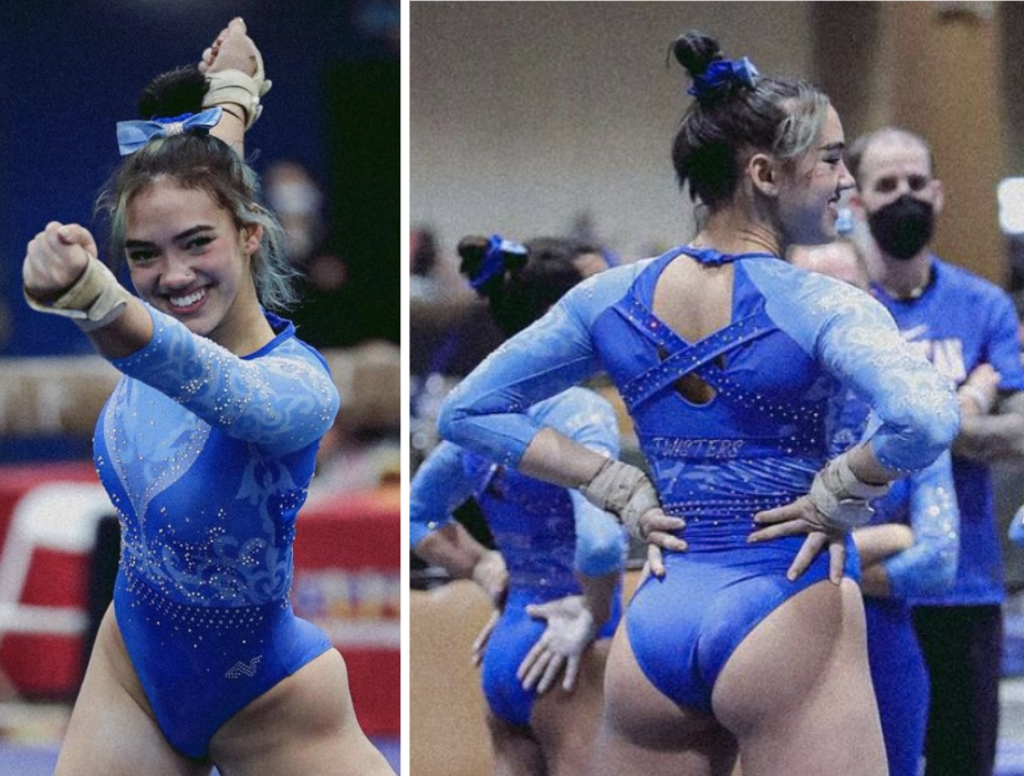
Photo/@bellamiller_, Instagram
Elizabeth: 7.400
I should hate this, but I don’t. I don’t love it either, but the blues work together, and the lack of contrast actually makes it so the design isn’t too busy. I don’t love the straps over the back, but it’s not offensive either.
Carolyn: 8.000
At first I didn’t like this, but the more I look at it the more I like it! The swirls don’t look great, but I like the color and placement of everything.
Tara: 7.600
I really enjoy the back of this. I don’t love the subtle printed light blue design on the front and sleeves and the V is kind of weird, but it somehow kind of works.
Katherine: 5.000
Another tendril/viney pattern I don’t really like. I also don’t like the neckline; it’s just kind of an awkward design overall. But it’s not terrible.
Claire: 8.300
These are beautiful shades of blue, and the subtle screen-printed design adds some interest without being too much. I wish the darker blue V wasn’t quite so deep and that they’d left off the back straps, but this is really pretty overall.
Katie: 7.500
It is very busy… But I like it. I really like the back design and the different shades of blue. I have to agree with Elizabeth here that if they used different colors it wouldn’t have the same effect.
American Gymnastics Academy of Long Beach: 7.133
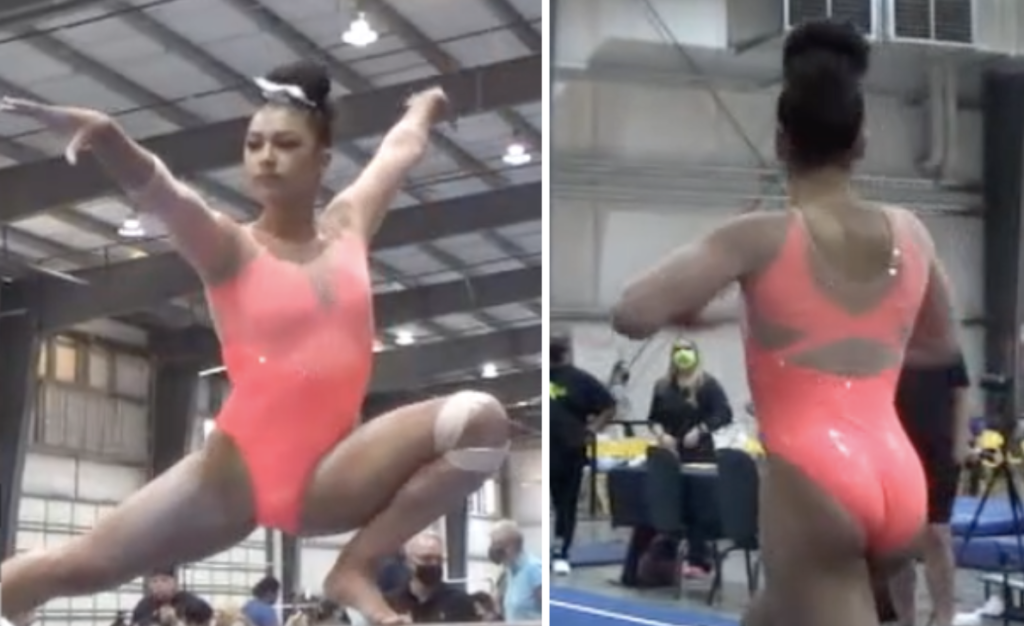
Elizabeth: 8.300
I really love this for some reason. I think it’s partly because the nude mesh works so well with the skin tone of all the gymnasts I saw it on while watching videos. Plus, the neon pink really pops.
Carolyn: 6.000
This one is OK. I certainly do not love this shade of pink or the nude mesh, but the design on the back is fun! I would also like to add some more sparkle to it, but it just might be the quality of the picture that doesn’t let me see the whole thing.
Tara: 8.500
I actually love this. Like Elizabeth said, it seems to work well with the skin tone of the gymnasts. I also love the shade of pink.
Katherine: 8.000
I LOVE this color. The back and the entire thing are a little boring overall, but you can’t say it doesn’t stand out.
Claire: 7.100
I’m pretty meh on the color, but the mesh is extremely well done and the hint of sparkle really shines in motion.
Katie: 4.900
It’s very rare I enjoy a neon bright leotard—specifically a neon pink leotard—so this one is definitely on my dislike side. I genuinely can’t find anything I specifically love.
Gymland, Arena Gymnastics: 6.9083
Photo/@alixbrook, Instagram
Elizabeth: 8.200
If you told me mostly white leo with pinkish red and gold, I’d say absolutely not. However, it somehow works?? I also saw this leo on someone with darker skin, and it looked fantastic.
Carolyn: 7.750
How original! Love the design and the colors used, but I would just add a different sparkle pattern on the chest to make it pop more.
Tara: 7.000
This is a solid leo. It’s not revolutionary, but it’s a good one. Red and white is a classic combo and I especially love how it goes to ombre on the sleeves and back. I also love the crossy gold lines on the back!
Katherine: 6.500
Ehhh. Like the GymJam leo, it looks a little costume-y and tacky. I think it’s the gold. The design overall is solid, but I want more out of it.
Claire: 7.500
The colors aren’t my favorite, but the overall design is nice. I feel like if they switched the colors around—say, a red bodice and white sleeves with gold piping—it could be pretty great.
Katie: 4.500
Well I’m definitely harsher on this one then my fellow editors, but I’m just really not a fan. The criss-cross pattern on the back would be the only thing I really like on the leotard.
Tampa Bay Turners: 6.550

Photo/@tbtgym_swim, Instagram
Elizabeth: 8.800
On the surface this is kind of boring, but I really like it overall. It has such an athletic look and is flattering on all the gymnasts. Plus, I like the purple and ombre. Simple yet not boring.
Carolyn: 4.000
I need more! It is a pretty ombre, don’t get me wrong, but I just need more sparkles or lace or something!
Tara: 7.500
I overall like this, though I agree with Carolyn that it could use more sparkles. My favorite parts are the purple color and the incorporation of ombre.
Katherine: 5.000
What is that line down the front? I hate it and the way it just goes into a plain black lower half. I love the purple shade used, but the black ruins it.
Claire: 8.000
The purple and black combo is excellent, which is beautifully emphasized by the black piping around the neck. Like Elizabeth, I really appreciate the simple athleticism. That necktie (?) and arrow combo is just bizarre, though.
Katie: 6.000
Purple is always one of my absolute favorite colors for a leotard, and I’m sad this one has a random black line on the top half. It’s unnecessary and completely takes away from the purple ombre on top.
Waller’s GymJam: 6.050
Photo/@wallersgymjam, Instagram
Elizabeth: 5.500
I like a blue and purple combo, but the design here just isn’t for me. The side cutouts with the black make no sense, and overall this falls flat.
Carolyn: 6.500
Soooo this one seems to be overdone. Lots of sparkles, lots of colors, good design but putting too much of it on one leo can be overkill.
Tara: 4.300
I have one question: why? There’s just too much going on here. I’m not a fan.
Katherine: 6.900
I don’t hate it. It looks a little costume-y (more than a typical leo), but it definitely stands out, and the colors look nice together.
Claire: 6.700
Underneath all the dots and rhinestones, the color scheme is solid and the underlying feathery floral pattern is actually pretty. Too much of a good thing, though.
Katie: 6.400
The color combination on the leotard is great, and I really like the concept behind the design. I think eliminating the side cutouts and limiting the amount of mesh would have helped its execution come across better.
Texas Dreams: 5.800
Photo/@texasdreamsgym, Instagram
Elizabeth: 6.700
I would like this a lot more without the, like, front shoulder hole thing going on. The ruching is also only OK, but I love the shades of purple used.
Carolyn: 5.000
Not the hole on the front! Again, the mesh on this one bugs me, and that hole in the corner doesn’t fit right with the concept of the leo. However, the shades of purple used are GORGEOUS.
Tara: 6.100
I agree with Elizabeh and Carolyn that the front shoulder hole is just not the move. I do love the shade of purple used and think this would be a great leo sans-shoulder hole.
Katherine: 5.200
This is pretty ugly. I like the colors, but the patterns and styles just don’t work well together at all. Also, the one sleeve looks baggy.
Claire: 5.000
2004 Svetlana Khorkina called and she wants her random shoulder cutouts back. Also, why did they screen print ruching onto the bodice instead of just adding ruching? The shades of purple are lovely and the crystals are extremely well done. Too bad they don’t get a chance to shine.
Katie: 6.800
My first reaction after seeing the color and ruching was that this would be a new favorite of mine. Then, on second glance I saw random cutouts and a high neck. The potential for this leotard is immaculate and unfortunately some design things take away from the gorgeous color.
Jamjev: 5.300
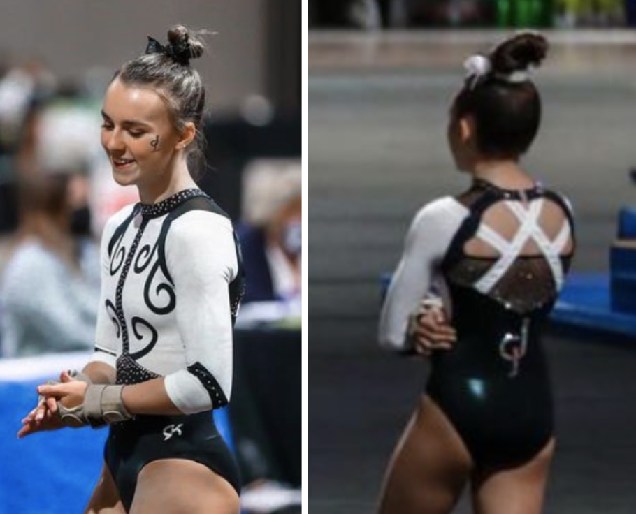
Photo/@ellajordan04, Instagram
Elizabeth: 7.900
So I love the back and of course the black and white, but the black line down the front of the chest kind of ruins the whole leo for me. I also wish the back was truly open, but I think they probably added in the sparkly black fabric due to the new club rules for coverage or whatever.
Carolyn: 3.000
It’s a no from me. The colors used look sharp and clean, but the design on the front is NOT IT. Granted, I will say the back looks pretty cool, but no no no on that front.
Tara: 3.700
I just can’t with the front, that’s definitely not the move. I do like the back, though.
Katherine: 6.200
The front definitely looks like a vintage leo; I just don’t love that vine/tendril pattern. That said, I do like the back a lot, so that brings the design up for me.
Claire: 6.700
This is another leo that suffers from not knowing when to stop. The white stripes on the open back are great, but the black mesh panel ruins the effect. Likewise, the black swirls on the front look dated and out of place. I wish this were just a clean, dramatic black and white leo.
Katie: 4.300
Carolyn and Tara summed it up for me. The front design kind of reminded me of vintage wallpaper and it’s just not something I prefer to see on a leotard.
READ THIS NEXT: Leotard Rankings: Cheer Uniforms Part 1
Article by Elizabeth Grimsley, Carolyn Lien, Tara Graeve, Katherine Weaver, Claire BIllman, Katie Walsh
Like what you see? Consider donating to support our efforts throughout the year!
One comment