

Despite the abbreviated season, there were still a ton of new leos debuted throughout 2020. So naturally it’s time for each of our editors to choose their top 10. Looking for more leo content? Don’t forget to head over to our Instagram and vote in the 2020 leotard bracket! Round two/sweet 16 voting begins Friday.
Elizabeth
10. TWU’s black beauty: This was such a departure from TWU’s normal maroon/crimson style, but I love it. It looks great on all the athletes, and it’s stylish and elegant to boot.
9. Maryland’s flag pride: I can’t get over how unique and clever putting the Maryland flag design on the sleeves is. Add in lots of sparkles on a black body with a cool back, and I’m sold.
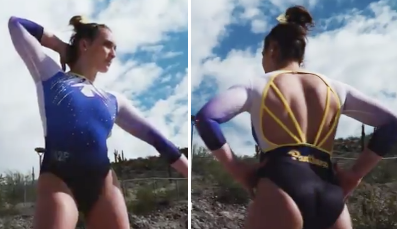
8. Pittsburgh’s strappy back: I’m normally not a fan of the blue and yellow combo Pitt’s been using lately, but this strappy back is too fantastic to ignore. Add in ombre and white, and I’ll make room in my top 10.
7. Penn State’s shimmery blue belted: Everything about this leo is good—from the shimmery blue used to the amount of sparkles and the thick belted design.
6. Nebraska’s black strap ombre: The black/silver faux straps and the red ombre complement each other nicely, and normally I’m not a fan of the belt design, but it works here
5. Southern Connecticut’s ombre: A lovely blue ombre plus a strappy back and the use of matte white? This leo basically checks all my favorite design boxes.
4. Ohio State’s gunmetal: I’m a huge fan of metallic silver on leos, and it works so well with the matte black and open back design. The use of red rhinestones gives it that extra punch.
3. Centenary’s fleur de lis: I love this leo more every time I see it. The design is so clever and ties in school and state spirit perfectly, and the back is gorgeous. The amount of white really is the cherry on top.
2. Arizona’s white on white: I normally don’t go for white leos, but this one’s a stunner. The touch or red really pops and ties it all together.
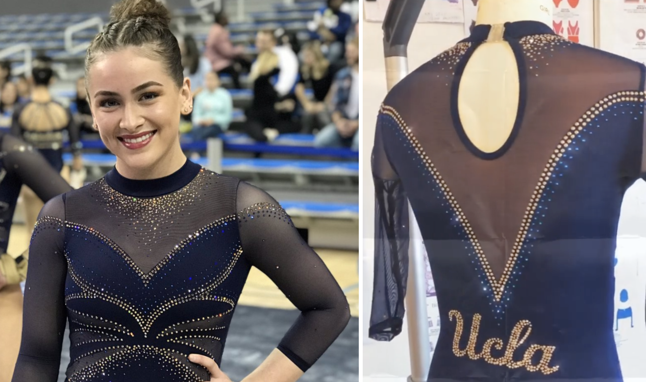
1. UCLA’s centennial: This leotard is nearly flawless. From the ombre to the use of Bruin blue and yellow/gold, plus the athletic look, I can hardly find anything wrong.
Honorable mentions: Temple’s pink design, Florida’s open back from the Georgia meet, Cal’s navy and white with lots of yellow, New Hampshire’s deep-v ombre, Utah’s UCLA-defeating design, Springfield’s blush and triangles, UWL’s sparkle bomb, Brockport’s green and gold, UNC’s metallic silver, Oklahoma’s geometric/tribal design, Rutgers’ throwback, Illinois’ navy with a dash of orange
Plus I need to give a special shoutout to Ohio State’s white beauty that it would have worn at Big Ten’s. It’s gorgeous, and I can’t wait to see it in 2021.
Katherine
10. Illinois’ navy with a dash of orange: I love Illinois’ embrace of orange, and this was a cool way to do it; the accents still made a statement amidst the navy blue.
9. New Hampshire’s V-neck ombre: The whole design is great, but I love the color especially. The collar is also a beautiful element; it looks very regal.
8. Springfield’s blush and triangles: A little went a long way with this design. The contrast of the sleeves and the body is lovely, and I always like triangles.
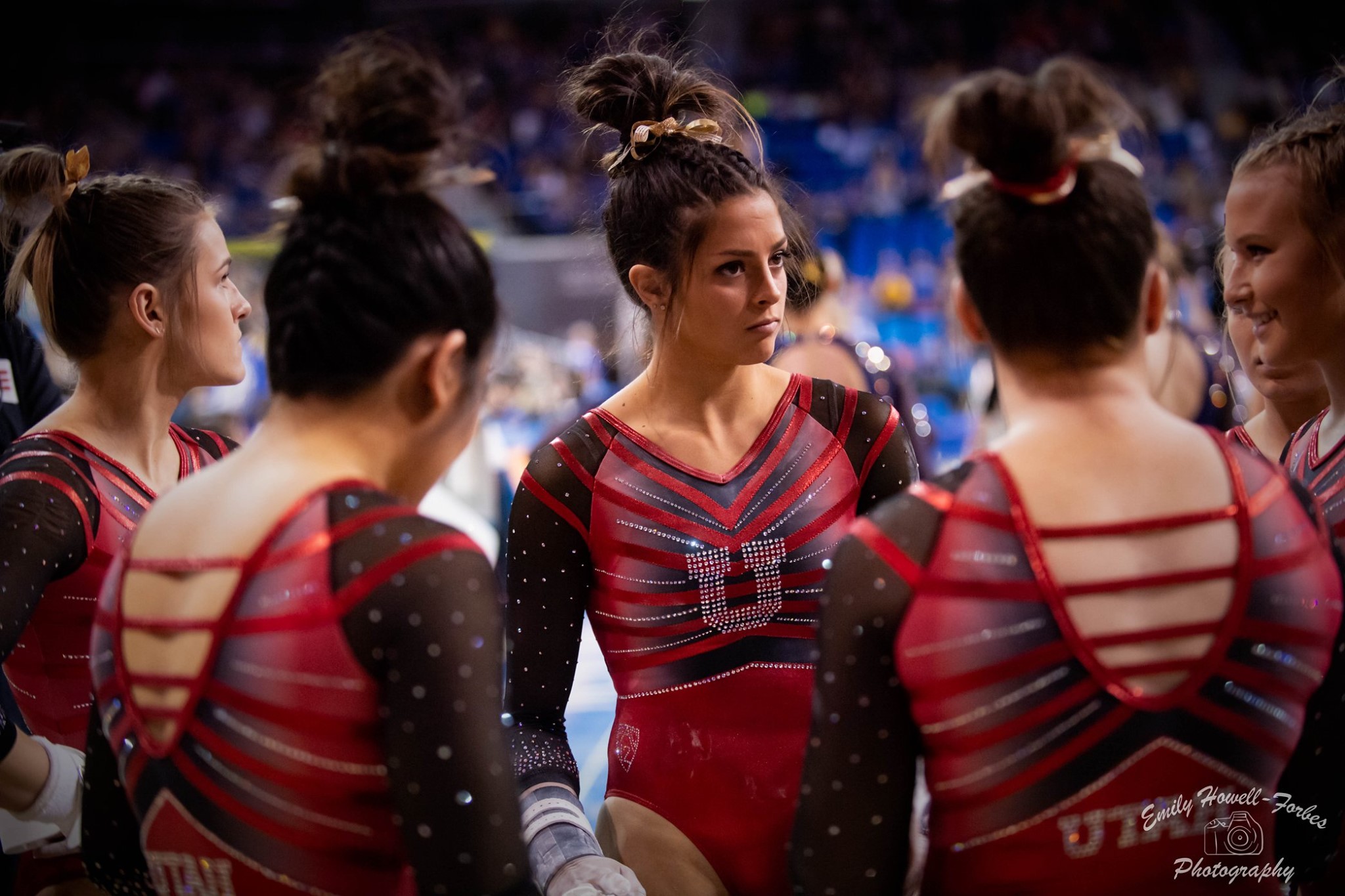
7. Utah’s UCLA-defeating design: This was so fierce and unique. I get claw mark vibes from that front design, which is fitting considering the meet’s result.
6. La Crosse’s hearts: So much great stuff here. It’s really unique and incorporates a lot of different but well-meshing elements; my favorite is the blink-and-you’ll-miss-it heart on the sleeve.
5. Oshkosh’s “everything” black: Another busy but great design. The front is incredible, and the sparkles look so beautiful in that setting.
4. Brockport’s green and gold: Obviously DIII killed it this year, and this was my favorite of the bunch. It’s very glamorous, and the gold V design looks really good against the black and green.
3. Arizona’s white on white: Pretty much nothing is wrong with this. The “A” is very spirited and stands out, but it’s also subtle enough to fit with the rest of the clean design.
2. BYU’s floral V-neck: This is so pretty and steps outside all the boxes. It just looks aesthetically pleasing all around. I want it made into a regular person’s top so I can wear it.
1. Bowling Green’s orange and black: This is serving Halloween glamour realness (who cares that it was January?). That collar is probably my favorite element of any leo this year. The orange ombre looks fabulous on the sleeves, and the back just…goes for it. I LOVE this.
Honorable Mention: Oklahoma’s geometric/tribal: This would be on my list if not for two things: the mid-length sleeves (potentially my least favorite leotard element) and the fact that the colors are kind of dull. But it’s yet another daring design from OU, which I overall really like. So I wanted to recognize it.
Allie
10. Brockport’s green and gold: I love how the design included both of the school colors by adding the gold sparkles, and those green to white ombre sleeves are just gorgeous.
9. Arizona’s white on white: I’m a little skeptical with all-white leos, but the bling and school spirit of the “A” makes this one a big success.
8. Rutgers’ sword strapped back: I’m a sucker for leos with school spirit, so the swords on the straps on the back of this leo help this one stand out.
7. Maryland’s flag pride: Anything with some sparkle and a black body is a great start to any leo. The use of the Maryland flag on the sleeves push this one over the top.
6. Centenary’s fleur de lis: Again here with the school spirit. I could sit and stare at this leo for hours. The strappy back helps complete this look.
5. Utah’s UCLA-defeating design: The color scheme of this leo is so pretty. It’s almost like the black color and sparkles are bursting from the “U”.
4. Nebraska’s black strap ombre: I really like the use of the black belt here. It helps make this leo just look powerful and stand out from the rest.
3. Oshkosh’s “everything” black: I jump for joy every time a DIII team gets to debut a new leo. The pattern on the sleeves could have made this leo too busy but the black body compliments the sleeves and sparkles so well. Just incredible.
2. Penn State’s shimmery blue belted: I am obsessed with the deep V look this leos gives. This is the definition of pretty.
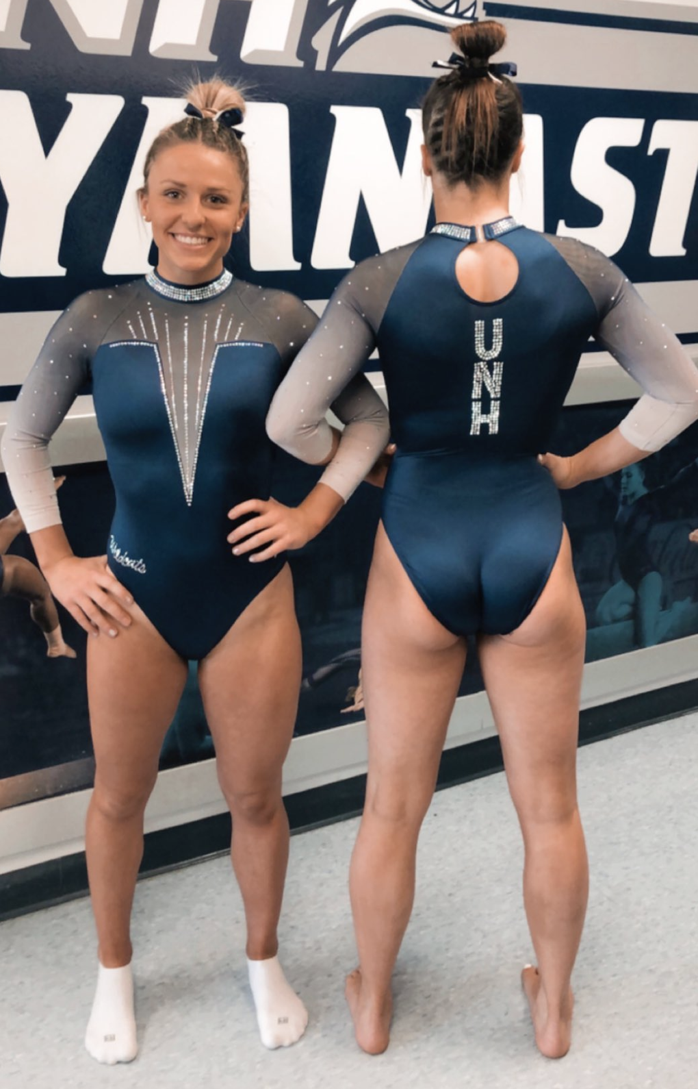
1. New Hampshire’s V-neck ombre: After Penn State’s leo it’s no surprise UNH has my top spot. This deep V is just beautiful. The sparkly collar and keyhole opening on the back make for such an elegant leotard. I didn’t know it was possible to fall in love with a leo until I saw this one.
Mary Emma
10. Penn State’s shimmery blue belted: I love the overall look of this leo, especially the velvet accents. I also have to say that this leo looks even better in person.
9. Brockport’s green and gold: I’m sure it will come as a surprise to no one that my favorite aspect is the green ombre sleeves. It’s great to see DIII teams stepping up the leo game this year!
8. Pittsburgh’s strappy back: I was on the fence about this one at first, but seeing it in motion sealed the deal. I especially love the blue ombre sleeves.
7. Southern Connecticut‘s ombre: The blue to gray ombre is beautiful, as are the sparkles on the front.
6. Centenary’s fleur de lis: I absolutely love the red and white contrast, as well as the nod to Louisiana with the fleur de lis pattern.
5. UCLA’s centennial: I normally dislike UCLA leos, but this year, there were two that almost made my top ten, so color me surprised! I love the sleek look of this one as well as the UCLA on the chest.
4. La Crosse’s sparkle bomb: I love the red color used as well as the sparkles all along the front and sleeves. This is not normally a design you would see in DIII, and I love to see it.
3. Michigan’s Flip for Chip: I love that Michigan finally got a Flip for Chip themed leo this year, and it’s absolutely stunning. I love the shade of purple used as well as the purple ombre sleeves.
2. Nebraska’s black strap ombre: I absolutely love the shade of red used as well as the red ombre sleeves. It was definitely a tough decision between No. 2 and No. 1.
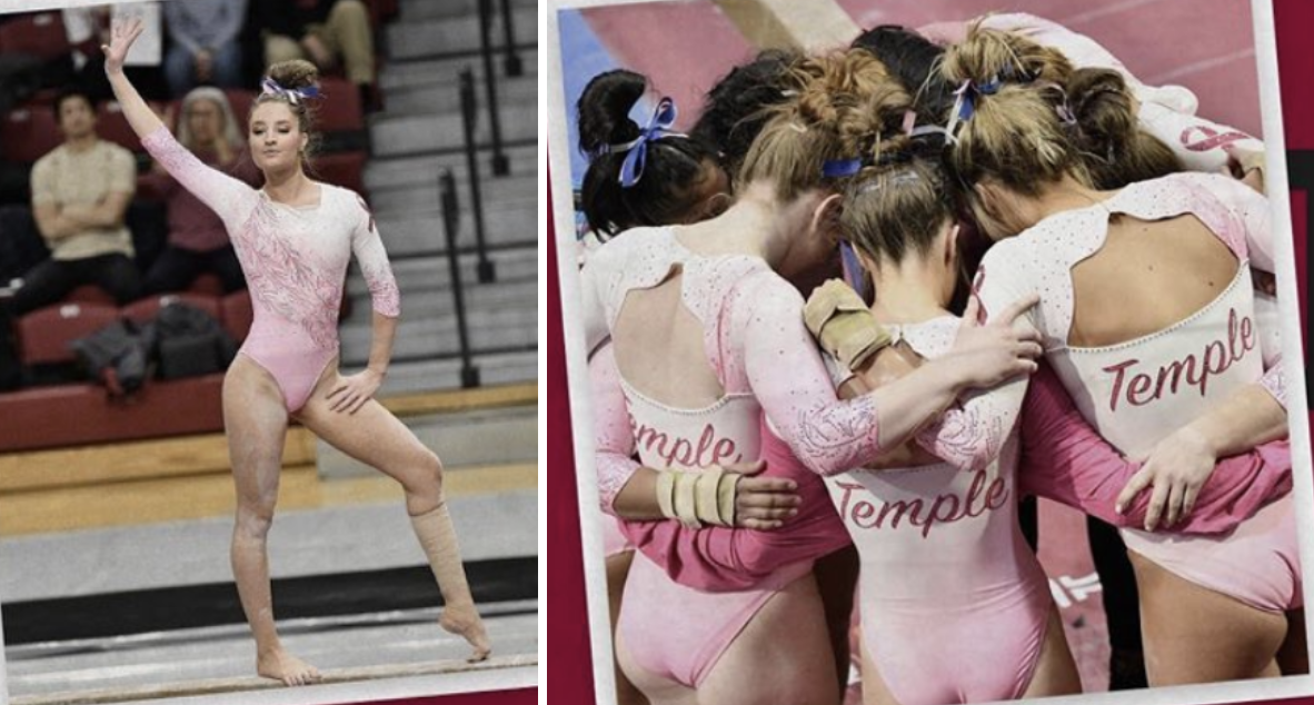
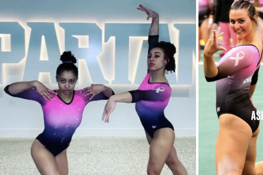
1. Temple’s pink meet: I never would have thought a pink leo would be my No. 1 leo of the year, but here we are. I absolutely love the shade of pink used and paired with the feather design, this is a pretty perfect design.
Honorable mentions: Denver’s red shimmer, UCLA’s feathers, Yale’s blue ombre, New Hampshire’s V-neck ombre.
Claire
10. La Crosse’s latticed back: The Eagles crushed the leo game this season. The ombre sleeves and red and white feather designs are gorgeous, but the lattice back is the best part (especially the crystal details)..
9. Penn State’s belted V: Not only does this look great in photos, but it really shines in motion. Also, bonus points for the velvet accents.
8. Rutgers’ sword straps: I love, love, love the combination of white and red crystals, and they really pop against the grey. I’m even willing to overlook the keyhole on the chest. Finally, the crossing swords on the back straps are such a fun and unique detail.
7. Florida’s black and blue: The ombre mesh sleeves are obviously great, but the high collar and combination of blue, orange, and white crystals are equally stunning. It’s nice to see the Gators in something a little different from their usual.
6. Utah’s stripes: Who knew tri-colored ombre overlaid with horizontal red stripes could look so good? The Utes are never afraid to try something completely unique; they took a risk, and it paid dividends.
5. Centenary’s fleurs-de-lis: The combination of black mesh, matte white, and shiny red is killer and the various crystal explosions really help tie the whole thing together.
4. SCSU’s B&W: It’s hard to go wrong with black and white, but I love how the sleeves and body are one continuous ombre. The open back with criss-cross straps is fabulous, the perfect back for such an already dramatic design. The “crystal rain” is the finishing touch, providing movement and added depth.
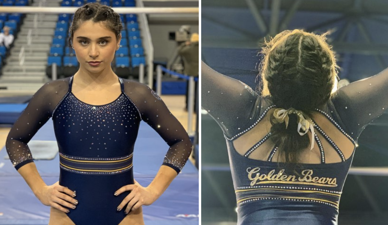
3. Cal’s perfect piping: That yellow piping is so good and the straps coming off the opening in back are a fun and unexpected element; both add a lot of punch for relatively simple elements. The icing on the cake? The crystals provide just the right amount of sparkle without overpowering those subtle elements.
2. Arizona’s white: White leos are tricky to pull off, but boy, did they pull it off! The white mesh sleeves and red piping are great touches that add visual interest but let that huge crystal A stand out. Also, the scalloped deep V back is so, so good.
1. Temple’s pink meet: There’s a lot going on in this leo, yet every detail is purposeful and impeccably well-done. The pastel pink and white make a perfect ombre backdrop for the feathery bandelier accentuated with crystals. Best of all, the unexpected scalloped neckline and cutout in back add some drama to an otherwise sweet leo. Flawless leo. Temple, can you please wear this during non-pink meets, too?
Honorable Mentions: Maryland’s flag sleeves, Nebraska’s hidden husks, Alaska’s ombre seawolf, UCLA’s retro vibe, Arkansas’s sparkle hog
Kalley
10. Michigan State’s pink leo: I am not a big fan of pink, and generally speaking I’m really not a fan of most pink leos. This one, however, is like a highlighter in the best way. I also love the combination of black and HOT pink. Well done.
9. Utah’s snazzy new red leo: Utah uses a lot of black in its leos, so I appreciated the added emphasis on the red in this one. I love the shades of black and grey built into the stripe pattern on the chest, and the way the red carries to the shoulders.
8. Centenary fleurs-de-lis leo: I really like the way this entire leo comes together. I also especially love the use of matte white. More teams need to use it.
7. Southern Connecticut navy ombre: The thing that stands out to me the most is the neckline—I love how simple but unique it is. I love the sparkle droplets on the body of this leo, it almost looks like raindrops. And it’s ombre, so that’s an obvious win for me.
6. Eastern Michigan green ombre: This shade of green might be my all-time favorite color for a leo, and it is used so beautifully here. I also love the simple sparkle E on the chest. The only thing truly holding this one back is the straps—it looks like bra straps, and I’m not a huge fan of that. Otherwise, this is stunning.
5. Bowling Green black and orange: I love the high color, the orange and black ombre sleeves, the splash of sparkle – basically I love everything about this.
4. Nebraska’s black stripe ombre: At face value this isn’t my favorite design, but the way everything combines really, really works for me. I love the ombre sleeves, the black belt, and the design on the chest.
3. New Hampshire’s navy leo: Sometimes I’m wary of deep cuts like this, but everything about this design just works for me. I absolutely love the color of this leo.
2. Florida’s black and blue ombre: I love black leos and I love ombre, and i think the way the blue is used here is absolutely stunning, even though it is a relatively simple leo.
1. UCLA’s centennial: I am OBSESSED with this leo. It proves why I wish UCLA would embrace its colors more. The ombre, the light blue and yellow, the athletic stripe – it is all just straight up perfection.
Honorable Mentions: Cal’s navy perfect piping, Rutgers’ sword straps, and Illinois State’s red ribbon with black and grey ombre.
Brandis
10. Arizona’s white on white: It’s so simple but yet so pretty thanks to the giant rhinestone logo on the front. The red along the edges also just makes all the white really standout.
9. Brockport’s green and gold: Incorporating the green into this leo is what takes it to the next level. The design is unique and the gold rhinestones juxtaposed on the black body make this easily my DIII leo of the year.
8. Denver’s: The rhinestone design on the front looks so regal on such an elegant shade of red. The patterned rhinestone designs along the opening on the back also are a nice added touch to an otherwise simplistic leo.
7. California’s perfect piping: Normally when your mascot is as long as “Golden Bears”, I wouldn’t recommend putting it on a leo. California proves me wrong here, having it standout on a really classy looking leo. The mix of dark blues and bright yellows play off each other really well here.
6. Centenary’s fleurs-de-lis: I give this design so much respect for how bold it is. The fleurs-de-lis pattern really stands out on the white background, and that contrasts so well alongside the rest of the dark red body and black sleeves.
5. Utah’s UCLA-defeating design: The red here is so vibrant and really pops with the black sleeves. I also can’t get enough of the subtle ombre beaming out of the rhinestone “U” that’s front and center and how the red extends to the back on the leo by striping over the shoulders.
4. UC Davis’ rhinestone design: I cannot get over how intricate and stunning the design on the chest is on this leo. Overall the rest of the leo is quite plain, but the perfect use of silver and blue rhinestones here makes this one stand out.
3. Penn State’s shimmering blue belted: There’s a lot going on here but it works! We get so many pretty shades of blue throughout just the torso of this leo along with a combination of jarring designs and rhinestones that actually manage to work well together.
2. UCLA’s centennial: The Bruins finally fully embraced their true blue and yellow schools colors and produced one of my favorite leo’s ever. It’s a perfect combination of simple, bright and athletic that also features my favorite leo element – ombre!
1. Nebraska’s black stripe ombre: This leo just has it all. The red and white pairing is so gorgeous, and I love how it’s broken up so bold on the body with the black belt but is done in ombre on the sleeves. Also, the metallic design on the chest is just the icing on the cake.
Honorable mentions: Yale’s shades of blue, Maryland’s flag pride, Rutgers’ sword straps, Illinois State’s ribbon and ombre, Arkansas’ sparkle hog
Christina
10. TWU’s black beauty: It’s so simple yet so elegant. It’s a gorgeous look, with the sparkles raining down on the front, the straps on the back, and the TWU logo in red sparkles to add a little contrast to the whole thing.
9. Maryland’s flag pride: It’s not easy to somehow incorporate Maryland’s flag on a leo, but this one is a winner. I am obsessed with the sleeves, and of course the cascade of sparkles on the front.
8. Bowling Green’s orange and black: The ombre sleeves, first of all, are a winner. I love the added orange along the neckline, and the back is beautiful. A great look with school colors that might not be easy to work with.
7. Nebraska’s full body ombre: Nebraska’s other leo seems to be more popular with my fellow editors, but this one is the winner for me. I love the white to black ombre and the red mesh sleeves so all school colors are included. The design is gorgeous and sparkly, and I am obsessed with the key holes in the back.
6. UCLA’s Operation Peacock: I know I am in the minority here, but I loved this look when Norah first wore it at Operation Peacock, so I was thrilled to see it as a competition leo. I love this shade of navy and the use of yellow sparkles, and I just find the whole design quite elegant. Yes, this is something Cal could wear and I wish UCLA would stop using navy, but it’s too pretty to not list it.
5. Brockport’s green and gold: I love how the green has been incorporated in this look. Naturally, I love the ombre, but really it’s the gold sparkles and the symmetry with the green straps that make this whole design stand out to me.
4. California’s perfect piping: Cal has been killing it these last few years with new leos, and this one is right at the top for me. I love the elegant yet athletic overall look, the straps in the back, the mesh sleeves, and the coloring are beautiful.
3. Temple’s pink meet: One of my favorite pink leotards out there. The shade of pink is lovely and of course I’m a sucker for the ombre. The design on the front and the back (!) are so gorgeous, and the neckline is so unique. I love it all.
2. Arizona’s white on white: I’m usually critical of Arizona’s love for having gigantic As on its leos, but this one is so stunning that I don’t even care. The red bands, the sparkly logo that’s subtle enough, and the whole white look with a gorgeous open back… I wouldn’t change a thing.
1. UCLA’s centennial: I knew from the start this would be my No. 1. The ombre is gorgeous, all the school colors are there, the athletic look is stunning. I can’t find anything bad to say.
Honorable mentions: Oklahoma’s tribal look, Rutgers’ sword straps, Florida’s open back and ombre sleeves from the Georgia meet and Denver’s red shimmer.
Rachel
10. Temple’s pink meet: I love, love, love this pink leo! Not only does it represent the theme, but it still incorporates a lot of school spirit with the feathers on the front and the “Temple” on the back.
9. Ohio State’s gunmetal: Usually I’m not a fan of big letters across the chest, but the rest of this was just too good to leave off of my top ten. I love the unique, silver bodice of this leotard, the sparkly back band, and the black sleeves are lovely.
8. Southern Connecticut’s ombre: This is such a classy look. It’s hard to go wrong with a solid white to black (or is it a dark navy blue?) ombré and criss-crossy back.
7. Stout’s shades of blue: This is another sleek and classy look. In particular, I love the open back with the UW-Stout below it.
6. MSU’s green armor: This is such a fierce look, and I love how it embodies the school’s mascot by resembling Spartan armor.
5. Penn State’s shimmery blue belted: It’s hard to pinpoint what it is exactly that I love about this leo because there is a lot going on, but I think it’s just that all these components work together to create a unique look that isn’t like anything we’ve really seen before.
4. New Hampshire’s navy leo: I’m not usually a deep-V kinda gal, but this one changed my mind. I love the material they chose, the ombré sleeves, and the “Wildcats” on the hip. The sparkly UNH on the back is just the cherry on top.
3. La Crosse’s sparkle bomb: Though this isn’t as bright and flashy as its other new leo, the sparkles and ombré make this a beauty in motion, and I love how they incorporated the heart on the sleeve.
2. Centenary’s fleur de lis: School spirit, state spirit, sparkles… you name it, this leo has it.
1. UCLA’s centennial: This leo proves that sometimes less is more. From the gorgeous ombré to its retro athletic stripe, it’s a simple, athletic look that allows each of its components to shine.
Honorable mentions: UNC’s metallic silver, Brockport’s green and gold, Springfield’s blush and triangles, La Crosse’s fiery floral
Emily M
10. Temple’s pink leo: I can’t believe I’m picking a pink leo. Who am I?! I just love the creativity and colors of this one. More scalloped details on all leos, please.
9. North Carolina’s silver leo: I love a silver leo, and this one works so well with the white and very light blue detailing. It’s a really elegant look.
8. Arizona’s white leo: I’m so into the way Arizona balances the red, white and blue in a way that avoids rah rah USA looks, and this one is another solid entry. I told you I like scallops!
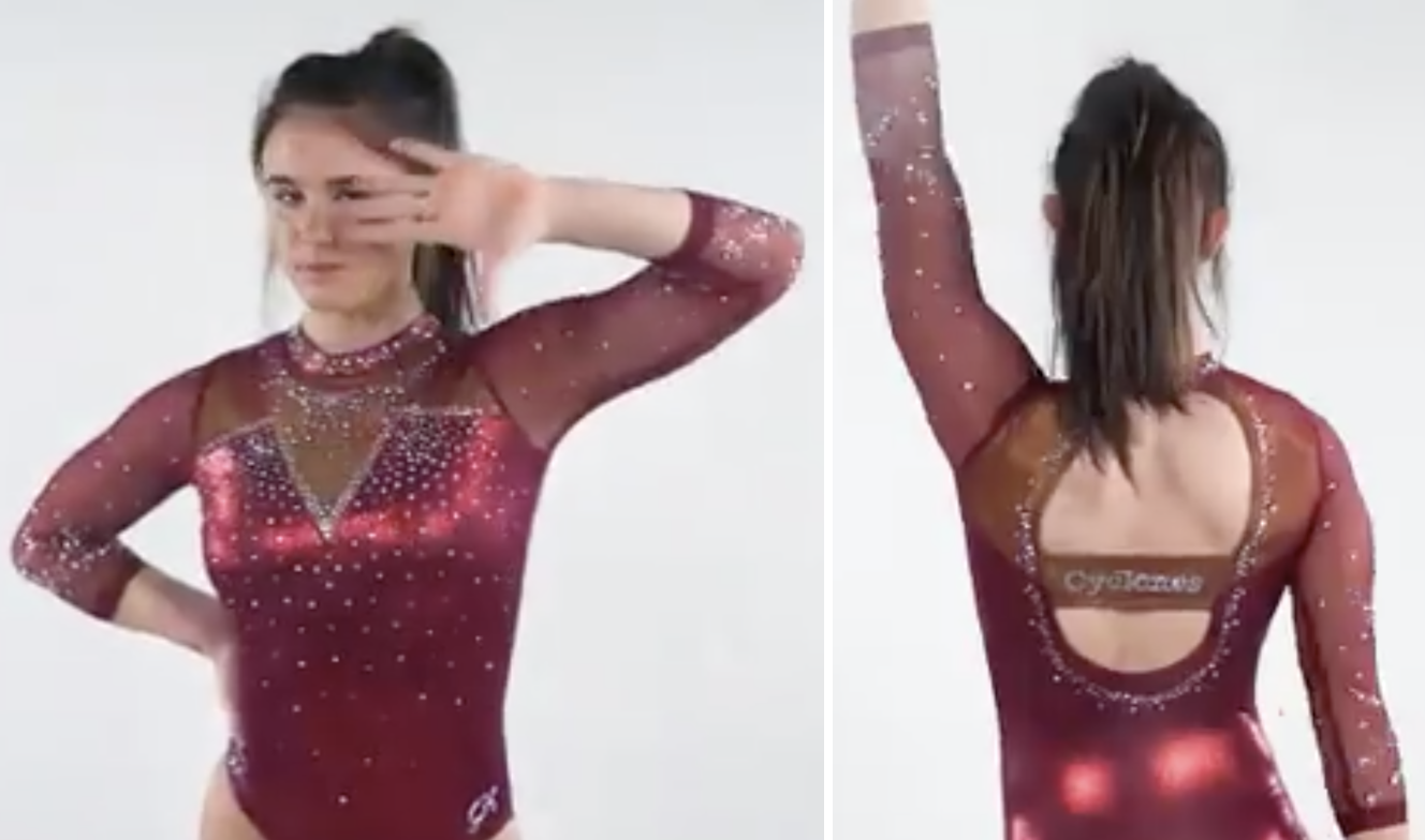
7. Iowa State’s elegant maroon leo: This is so simple, classy and flattering. Just a win all around.
6. Florida’s ombre sleeve leo: A different Florida leo! That doesn’t blend in with the rest! More, please.
5. Southern Connecticut’s ombre leo: I love a good blue/white ombre look, and this one works so well with that open back.
4. Maryland’s flag sleeve leo: I’m so into Maryland’s commitment to its whacky state flag, and this execution is excellent. The sleeves are a lot, but balanced by the simpler black bodice. And MAN this thing is sparkly in motion.
3. Ohio State’s gunmetal leo: I am so here for a gunmetal leo. Ohio State has another older one that I like, but this one is even better. It looked great on camera and I have to imagine it’s stellar in person. We also learned that the back stripe is a Buckeye trademark; I love it when teams incorporate details like that.
2. UCLA’s retro ombre leo: This is what dreams are made of. Throwback elements, athletic styling, ombre, true Bruin blue.
1. Pittsburgh’s open back leo: The back of this leo is everything. I’m here for the skinny back strap detailing we’ve seen emerge this year, and this iteration is so well done. The vibrant ombre puts it over the top.
Rebecca
10. Centenary’s fleur de lis: I saw this for the first time and fell in love immediately. What a perfect way to celebrate the school’s location
9. West Virginia’s circus tent: I really love a lot of West Virginia leotards, and this one hits the right buttons. The stripes on the front are bold but the colors play so well together that it’s not weird, and I love the back.
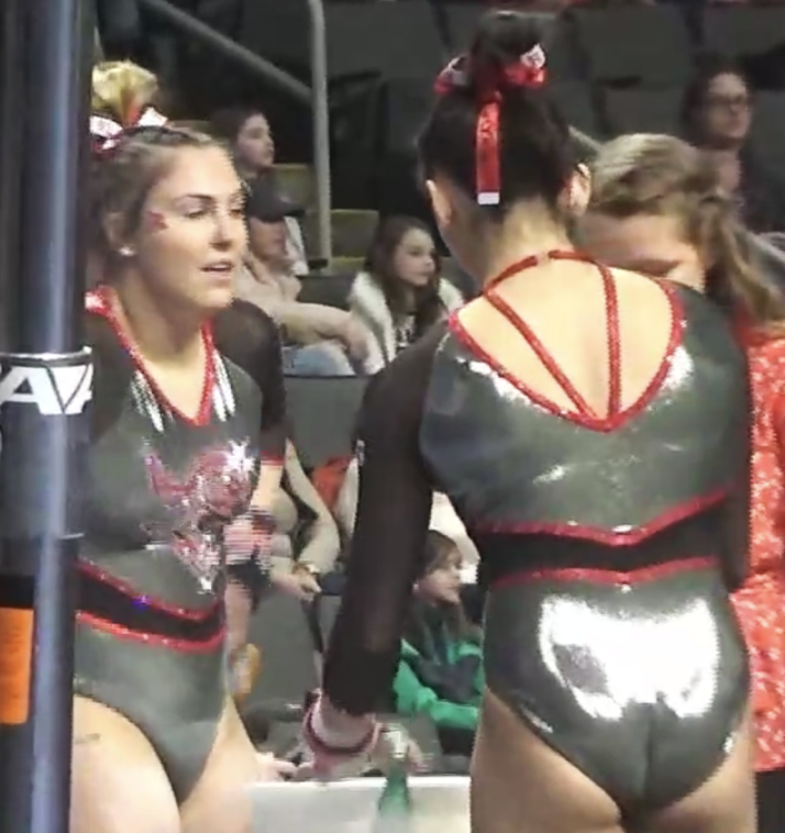
8. Rutgers’ gunmetal: Rutgers dropped a huge number of new leotards this year, and for the most part I didn’t think they got the appreciation they deserved. I LOVE the silver on this one, the Scarlet Knight pops on the front and the strappy back is simple and effective.
7. UW-La Crosse’s butterfly wings: Different aspects of this stood out to different people, but I always saw a butterfly. It’s intricate and glamorous without being busy, and the back is lovely.
6. UCLA’s feathers: I’m a big fan of the UCLA-Sylvia P. partnership after this year, and this was the leotard that really sold me. It’s so different that it took most of us a second to warm up to it, but its uniqueness is its strength as well. It’s not goofy or garish or plain unflattering in the way that many risk-taking designs are. Everything works.
5. Iowa State’s plain maroon: This is a “less is more” design and it’s executed PERFECTLY. I love the bold neckline, the simple open back and the understated but interesting sleeve sparkles.
4. Maryland’s flag arms: I love how much Maryland loves the state flag, and this was such a unique and perfect way to show it off. The body being on the simple side allowed the sleeves, with their strategic colored sparkles, to really pop.
3. SCSU’s ombre masterpiece: This one floored us all when it came out. It’s virtually perfect. It’s hard to execute leotards that don’t look plain on a Division II budget, but the Owls have pulled off one of the year’s best two years in a row.
3. UNH’s deep V: I often don’t like deep mesh necklines, because I fundamentally think that when you see a false neckline on a leotard, you imagine what it would look like without the mesh, and a lot of leotard designs would look completely ridiculous (ahem). This one passes that test and also nails pretty much everything else. The sparkle choker! The perfect mesh ombre! The color is just one shade more teal than typical Wildcat navy, and the plain matte body lets it shine. It’s fantastic.
1. UCLA’s veins: THIS LEOTARD DESERVED BETTER! I audibly gasped when I saw it the first time. It’s truly glamorous in a grown-up way you almost never see in leotard designs. It’s creepy cool spectacular. It’s not just my favorite NCAA leotard from this year, it has a case to be my favorite all-time. It could be a ballgown. I didn’t go to prom, but if I had, this is what I would want to wear. I’ve rarely loved anything more. If I get married I’d consider wearing this to my wedding. I don’t care that no one agrees with me. It’s my personal leotard now.
Honorable mentions: I love UCLA’s centennial just like everybody else, but wanted to highlight the more unique ones. Western Michigan can be a little on the leotard struggle bus, but this black and gold rocks. I liked Arizona’s new leotards more than most people this year, and this plain blue with fun sparkles is a favorite. Nebraska really slow-rolled one of the best leotards of the season by not even giving us a photo until the second time it was worn, but it’s still a beauty.
Tara
10. UCLA’s Operation Peacock: I’m glad they adapted this into a full-on team leo! I love that UCLA used gold sparkles instead of the traditional clear or silver. It’s a subtle way of including both school colors without being. overbearing with gold fabric.
9. Arkansas’ inverted red V: This is simple, but elegant. I like the mix of fabric to mesh and it has the perfect amount of sparkle. I also enjoy how “Arkansas” is incorporated on the back in sparkles.
8. Denver’s red shimmer: I adore the front of this one! The strappy back is also a great touch and so different from what Denver normally does.
7. Illinois’ navy with a dash of orange: I love the cascading sparkles on the front. My favorite part is the criss cross back and how the orange is incorporated but not overpowering.
6. Ohio State’s gunmetal leo: Words and mascots on the chest can be hit and miss, but I really like it here. The font is nice and the sparkles around it accentuate it beautifully. I also really like the red strap on the back and the rhinestone collar.
5. New Hampshire’s deep V: This is simple, but nice. It has just the right amount of sparkle and I like how the sparkles accent the V. The mesh ombre is the cherry on top.
4. Brockport’s green and gold: I love how the straps on top flow into the sparkle design below. I appreciate the use of gold sparkles as well; they’re an underrated and underused way to incorporate gold into a leo. The green to white ombre is gorgeous, too.
3. Southern Connecticut’s ombre: This is just plain gorgeous. You can’t go wrong with navy to white ombre and the sparkles and crossy back seal the deal.
2. La Crosse’s sparkle bomb: If the pretty ombre wasn’t enough, the sparkles are. I absolutely love the geometric sparkle design as well as the sparkle band beneath the main design. It’s hands down one of my favorite leos of this season, if not all time.
1. Nebraska’s black strap ombre: OK, I loved just about all of the new Nebraska leos this season, but this one is my favorite. I love the top paired with the ombre and it all goes together nicely. I don’t think I have one complaint about it. (bonus: the hidden rhinestone corn)
Honorable mentions: Florida’s mostly black with orange and blue ombre mesh sleeves, Nebraska’s red and black with triangle sides, LSU’s deep V, North Carolina’s silver leo
Jenna
10. Michigan State’s hot pink: I’m shocking myself by including a pink leo in this list, but this one is too outstanding to leave out. The hot pink ombre is what dreams are made of.
9. West Virginia’s circus tent: The originality and boldness of this design earns it a place in my top 10. I love the colors and this leo just screams fun to me.
8. Utah’s UCLA-defeating design: I love leos that have one continuous design on the front and back and this is the epitome of that. The ombre around the U on the chest seals the deal for me.
7. Centenary’s fleur-de-lis: I love that they incorporated fleur-de-lis so prominently in this design as an ode to Louisiana, and the design as a whole just works in a beautiful way.
6. Penn State’s shimmery blue belted: The white sleeves really pop compared to the navy bodice, and the multiple patterns in the design work really well together.
5. Arizona’s blue sparkles: I’m not a huge fan of the Wildcats’ white leo like my fellow editors seem to be, but this all-blue sparkly design is simply stunning!
4. La Crosse’s sparkle bomb: This leo is just plain pretty, from the colors to the sparkles to the sleeves.
3. UCLA’s centennial: This leo is sporty and retro without being too retro, plus it uses UCLA’s actual colors! Dear UCLA: please use these colors more in the future.
2. Ohio State’s gunmetal: I love gunmetal leos, and this one is executed so well! The red sparkles are great, the black sleeves provide a nice contrast to the gunmetal, and the “BUCKEYES” on the chest provides the perfect amount of school spirit.
1. Nebraska’s black stripe ombre: This leo is perfection: the upper bodice design is unique, the band at the middle is well executed, and the red pops in typical Nebraska fashion. Best leo of the year!
Honorable mentions: Nebraska’s full-body ombre, UCLA’s Operation Peacock, Western Michigan’s black and gold, Cal’s perfect piping, UCLA’s feathers
READ THIS NEXT: Leotard Rankings: Theme Meet Leos
Article by the editors of College Gym News
Like what you see? Consider donating to support our efforts throughout the year!
