Teams brought their A-game for conference championships, and the new designs did not disappoint! The criteria is the same as always: up to three points for design; two points for fabric and sparkle; two points for school spirit; and three points for overall appearance. This week’s guest judges are Katherine, our SEC editor, and Rachel, our DIII editor.
Missouri: 8.733
https://twitter.com/MizzouGym/status/1109634511082586112
| Design | Fabric/
Sparkle |
School
Spirit |
Overall
Appearance |
Total | |
| Elizabeth | 2.2/3 | 1.7/2 | 1.9/2 | 2.3/3 | 8.1/10 |
| Katherine | 2.6/3 | 1.8/2 | 1.6/2 | 2.6/3 | 8.6/10 |
| Rachel | 2.8/3 | 1.9/2 | 2.0/2 | 2.8/3 | 9.5/10 |
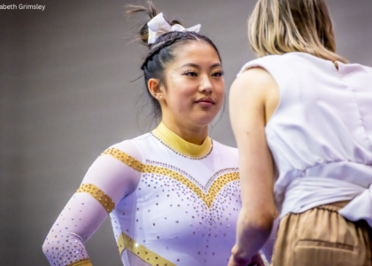
Elizabeth: This is so nice! It’s subtle but has a ton of school spirit. Plus, I love the use of yellow sparkles to accent some of the stripes. Missouri has been killing the new leo game the past couple of seasons.
Katherine: Hey LSU, THIS is how tiger stripes should be done. Love the mix of sheer and gold, and the sparkle is so pretty. I also like how the logo is incorporated in the front. This is a big hit for me!
Rachel: This is amazing!!! I LOVE the sparkly gold tiger stripes and the retro feel of the design!
Michigan State: 8.433
https://twitter.com/msugymnastics/status/1109483415227772930?s=21
| Design | Fabric/
Sparkle |
School
Spirit |
Overall
Appearance |
Total | |
| Elizabeth | 3.0/3 | 2.0/2 | 2.0/2 | 2.0/3 | 10.0/10 |
| Katherine | 1.6/3 | 1.4/2 | 1.4/2 | 1.9/3 | 6.3/10 |
| Rachel | 2.8/3 | 1.7/2 | 1.6/2 | 2.9/3 | 9.0/10 |
Elizabeth: I’m about to say something really bold, so get ready. This is my favorite leotard of all time. Yes, really. It’s absolutely gorgeous, and I’m considering coming out of retirement, forging my birth certificate and walking on to Michigan State just so I can wear it.
Katherine: I love the light green ombre, and the sparkle pattern looks amazing on the chest and the sleeves! The entire front is basically perfect, which is a shame because the back is just…not. It’s a little too open and simple compared to the front, and the rhinestones on the criss-cross don’t look the best either. But I’m still giving it a high score because I love the front.
Rachel: This is BEAUTIFUL! I love the ombre! I love the back! I love the sparkles! If I’m being really picky, the only thing I’d maybe change is starting the front rhinestones at the top of leotard and not below the white part.
Alabama: 8.300
https://twitter.com/BamaGymnastics/status/1109533607125757952
https://www.instagram.com/p/BvYJxBNn8Qu/
| Design | Fabric/
Sparkle |
School
Spirit |
Overall
Appearance |
Total | |
| Elizabeth | 2.5/3 | 1.6/2 | 1.8/2 | 2.6/3 | 8.5/10 |
| Katherine | 2.2/3 | 1.5/2 | 1.8/2 | 2.5/3 | 8.0/10 |
| Rachel | 2.3/3 | 1.7/2 | 1.7/2 | 2.7/3 | 8.4/10 |
Elizabeth: I LOVE intricate and unique backs. You should know this about me by now. So this leo definitely did it for me. The front may be a touch busy, but overall I really enjoyed it. Also, I’d like to take a minute to point out that the sports bra is separate but made to look like it’s part of the design on the back, which is GENIUS and a clever way to have an open back yet allow the girls to wear bras.
Katherine: I like that Alabama has created its own brand with leos where they don’t have to say “Alabama” for you to know which school is wearing it. This leo really exemplifies that; I love the detailed design on the front and the way it’s replicated on the shoulders. The back is also my favorite of the week.
Rachel: I liked this much more when I actually saw it on the team than I did in the new leo announcement because at first it looked a little too similar to one of its others. But wow, did it turn out to be gorgeous! In particular, I love back and the white around the neckline and wrists.
Georgia: 8.067
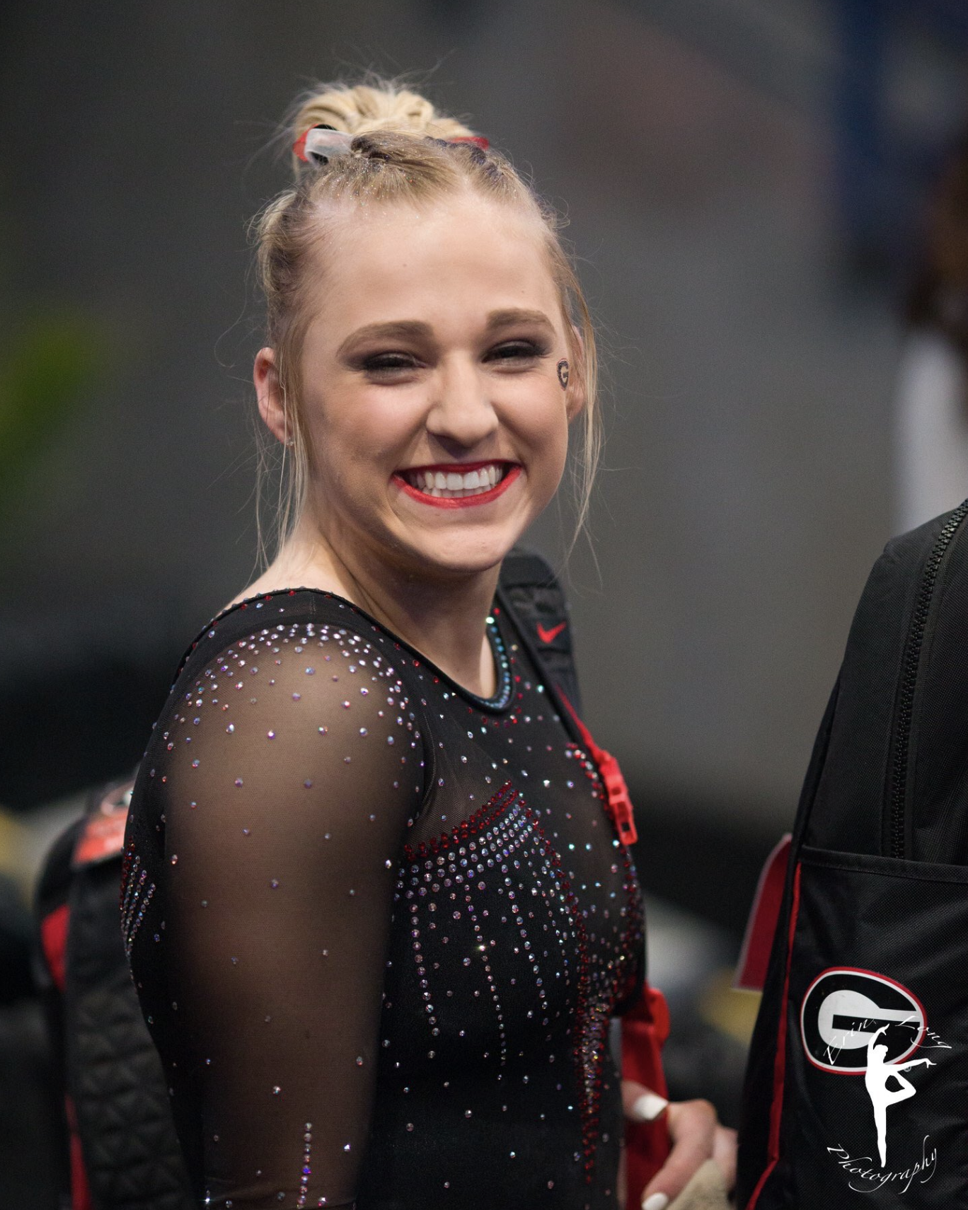
Photo courtesy of Erin Long
| Design | Fabric/
Sparkle |
School
Spirit |
Overall
Appearance |
Total | |
| Elizabeth | 2.7/3 | 1.9/2 | 1.8/2 | 2.8/3 | 9.2/10 |
| Katherine | 1.5/3 | 1.8/2 | 1.3/2 | 2.2/3 | 6.8/10 |
| Rachel | 2.2/3 | 1.9/2 | 1.5/2 | 2.6/3 | 8.2/10 |
Elizabeth: LOVE! The incorporation of red is subtle, but gorgeous, and I love the more angular, squared-off V. I also like the mostly black design, the amount of sparkle and the Super G on the hip. A total win!
Katherine: This is kind of a departure from Georgia’s usual, but I really like it. The chest is really pretty, and I like the red border against the sheer material. The amount of sparkles is also perfect. My one complaint is the fact that the G looks like it was placed as an afterthought, or maybe it just seems that way because Georgia usually features its logo (or some UGA reference) more prominently.
Rachel: Ooh lala! This is very pretty! I think the sparkles are perfect, especially the outline of the back “V.”
Central Michigan: 7.900
https://twitter.com/collegegymnews_/status/1109529009992413185
| Design | Fabric/
Sparkle |
School
Spirit |
Overall
Appearance |
Total | |
| Elizabeth | 2.0/3 | 1.7/2 | 1.7/2 | 2.3/3 | 7.7/10 |
| Katherine | 2.4/3 | 1.6/2 | 1.8/2 | 2.5/3 | 8.3/10 |
| Rachel | 2.3/3 | 1.5/2 | 1.7/2 | 2.2/3 | 7.7/10 |
Elizabeth: When Emily M and I saw this leo in person, we rated it nearly as well as the Michigan State leo from this weekend. While I don’t like it as much seeing all the details—it’s a bit overboard for me—it looked absolutely great in person.
Katherine: If the Harry Potter houses had leos, this would be Gryffindor’s, which should tell you a lot about how much I like it. This is gorgeous; the design on the front has a very regal feel to it, like it was meant to be worn by royalty. Also love the unique incorporation of all the school’s colors.
Rachel: I agree with Katherine that this leo has a very royal feel, and for the most part I really like it! For my taste though, I think they may have gone a little overboard in the design department… It just has one too many features. Without the side sparkle things that swoops and goes down to their hips, I think this would have been perfect!
San Jose State: 7.867
| Design | Fabric/
Sparkle |
School
Spirit |
Overall
Appearance |
Total | |
| Elizabeth | 2.3/3 | 1.6/2 | 1.7/2 | 2.4/3 | 8.0/10 |
| Katherine | 2.2/3 | 1.4/2 | 1.6/2 | 2.4/3 | 7.6/10 |
| Rachel | 2.5/3 | 1.3/2 | 1.7/2 | 2.5/3 | 8.0/10 |
Elizabeth: Finally a new leo for San Jose State! I loved this. It basically pairs all my favorite design features together with the sweetheart neckline, ombre and subtle school spirit. I do wish there was a touch more yellow though.
Katherine: Very pretty; love this color scheme! However, I probably would have made the entire sleeves black instead of white going into the wrists; it doesn’t quite go with the rest of the leo.
Rachel: I feel like we’ve seen a lot of schools do variations of this leo this season, but it’s still really nice. However, I agree with Katherine… bottom half of the sleeves just aren’t doing it for me.
Ball State: 7.767
https://twitter.com/BallStateGYM/status/1109526794959552514
| Design | Fabric/
Sparkle |
School
Spirit |
Overall
Appearance |
Total | |
| Elizabeth | 1.7/3 | 1.6/2 | 1.7/2 | 2.2/3 | 7.2/10 |
| Katherine | 2.2/3 | 1.7/2 | 1.5/2 | 2.1/3 | 7.5/10 |
| Rachel | 2.6/3 | 1.7/2 | 1.7/2 | 2.6/3 | 8.6/10 |
Elizabeth: Yay for Ball State finally getting a new leo that’s not super meh! Sure it’s a stock design that a lot of other teams have, but I love the color combo, and the shiny white is a nice touch. I also appreciate the little bird on the back.
Katherine: The front is deceptively simple, but the sparkles going down toward the bottom are actually really intricate. It’s a pretty effect. I would have chosen another font for the letters of “Ball State,” or maybe I wouldn’t have put the name at all; I think the cardinal logo on the back would work on its own and still be very spirited.
Rachel: Yes! I like this! This is very different from other Ball State leos I’ve seen, which is a good thing! The black and white contrast with red accents was a good choice, and I actually really like the “Ball State” down the sleeve.
Michigan: 7.667
Senior Emma McLean gets the first 9.900 of the championships on vault. #GoBlue pic.twitter.com/d6FrU886mv
— Michigan Women’s Gymnastics (@UMichWGym) March 23, 2019
| Design | Fabric/
Sparkle |
School
Spirit |
Overall
Appearance |
Total | |
| Elizabeth | 1.8/3 | 1.7/2 | 1.9/2 | 1.9/3 | 7.2/10 |
| Katherine | 2.2/3 | 1.7/2 | 1.7/2 | 2.4/3 | 8.0/10 |
| Rachel | 1.8/3 | 2.0/2 | 2.0/2 | 2.0/3 | 7.8/10 |
Elizabeth: This is a good leo, but kind of boring and quite similar to a lot of other Michigan leos. I do appreciate the incorporation of yellow through rhinestones vs. fabric though. And Michigan’s school spirit is always on point.
Katherine: I’m going to sound like a broken record, but this has to be my favorite I’ve seen all season from Michigan! I feel like their leos get a little repetitive, but this was refreshingly different in a way. I like that most of the leo is a solid color except for the neckline going into the chest; it makes the “M” stand out as its surrounded by the sparkles.
Rachel: This isn’t my favorite of the week, but there’s also not that much I can critique. The sparkles are absolutely gorgeous; however the rest is just a little too basic for me.
Iowa: 7.400
Clair Kaji starting the GymHawks on bars with a 9.850! pic.twitter.com/rO5RJKdJjl
— Iowa Gymnastics (@IowaGymnastics) March 23, 2019
| Design | Fabric/
Sparkle |
School
Spirit |
Overall
Appearance |
Total | |
| Elizabeth | 1.5/3 | 1.5/2 | 1.7/2 | 1.7/3 | 6.4/10 |
| Katherine | 2.2/3 | 1.2/2 | 1.4/2 | 2.1/3 | 6.9/10 |
| Rachel | 2.7/3 | 2.0/2 | 1.5/2 | 2.7/3 | 8.9/10 |
Elizabeth: Oh, Iowa… You were doing so well this season. Take away the weird shimery white chest part, and I actually really like this. But with it there, I can’t rank it super high.
Katherine: This reminded me a little of Bailie Key’s tuxedo leo from 2015, but on a new level in terms of the sparkles. There’s a lot going on here, and I had some mixed feelings, but I think I like it. The details and organization are something you don’t always see from Iowa leos. It’s probably my favorite from their repertoire this season.
Rachel: I love this! It’s so unique and so sparkly! I remember judging one of Iowa’s new leos earlier this season and complaining that it was too boring… This is anything but boring!
California: 7.267
https://twitter.com/calwgym/status/1109602204321603584?s=21
| Design | Fabric/
Sparkle |
School
Spirit |
Overall
Appearance |
Total | |
| Elizabeth | 2.0/3 | 1.5/2 | 1.7/2 | 2.1/3 | 7.3/10 |
| Katherine | 2.3/3 | 1.3/2 | 1.4/2 | 2/3 | 7.0/10 |
| Rachel | 2.4/3 | 1.3/2 | 1.5/2 | 2.3/3 | 7.5/10 |
Elizabeth: I really liked the back on this and how the band went underneath the mesh part. I do wish the front was a bit more interesting though. The leo as a whole looked great on TV though.
Katherine: This could be the first time I’ve ever liked the back of a leo more than the front! Well, it’s not that I don’t like the front… I just think it’s a bit boring compared to the back. I love that there’s so many elements there, but it all works well—the cutout, the sheer bracket shape and of course the C for spirit. Leos don’t often utilize the back like this one does, so points for creativity!
Rachel: Overall, this is a really nice leo—just a little boring compared to its competitors this week. That said, I love, love, love the back of this, especially where the diamonds on the lower back. But I think my favorite piece it the C with the Bear in the center… Maybe that’s a pretty standard thing the school does with their logo (I’m not too familiar), but I think it’s an interesting way to incorporate more school spirit.
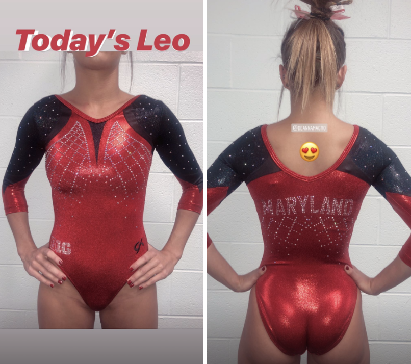
Maryland: 6.933
| Design | Fabric/
Sparkle |
School
Spirit |
Overall
Appearance |
Total | |
| Elizabeth | 1.9/3 | 1.4/2 | 1.7/2 | 2.0/3 | 7.0/10 |
| Katherine | 2.1/3 | 1.3/2 | 1.4/2 | 2.2/3 | 7.0/10 |
| Rachel | 2.3/3 | 1.1/2 | 1.3/2 | 2.1/3 | 6.8/10 |
Elizabeth: Another good one from Maryland! I especially like how the flag design wa made with sparkles on the back. I also like the gunmetal grey fabric and shade of red used.
Katherine: Definitely my favorite Maryland leo of the season! I love the intricacy of the chest, and the division of red and black is perfect. I just want to know what’s going on with the pattern below “Maryland;” it doesn’t work as well as the same design on the front.
Rachel: I feel like I’d like this a lot more without the fake “V” in the front… something about it is weird to me and feels more like a Nebraska leo than Maryland. I really like that this is different, though! We haven’t seen much like it this season.
Auburn: 6.366
https://twitter.com/auburngym/status/1109500150223912960?s=21
| Design | Fabric/
Sparkle |
School
Spirit |
Overall
Appearance |
Total | |
| Elizabeth | 1.4/3 | 0.6/2 | 1.7/2 | 1.5/3 | 5.2/10 |
| Katherine | 2.4/3 | 2/2 | 1.8/2 | 2.7/3 | 8.9/10 |
| Rachel | 1.0/3 | 1.2/2 | 1.8/2 | 1.0/3 | 5.0/10 |
Elizabeth: It’s a no from me. There is way too much sparkle weirdness going on, especially on the boobs and around the ovaries. Take that away and it wouldn’t be a half-bad design.
Katherine: Absolutely stunning! Probably in my top five of the entire season—this is so gorgeous. The beading is perfectly arranged, and the design on the orange part reminds me of Spiderman, which gives it a very superhero vibe. It looked even cooler in motion.
Rachel: This is too much for me. I think I might be alone in this opinion, but I’m really not feeling this. Maybe it’s because I can’t get over the top part looking like a spider web.
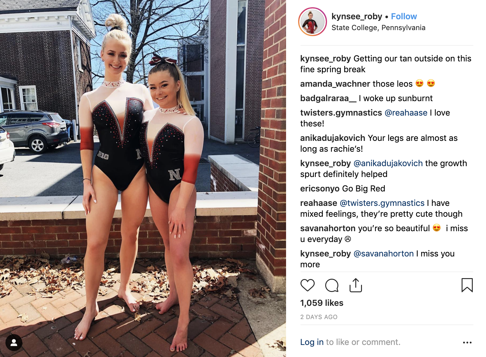
Nebraska: 6.233
| Design | Fabric/
Sparkle |
School
Spirit |
Overall
Appearance |
Total | |
| Elizabeth | 2.1/3 | 1.5/2 | 1.7/2 | 2.2/3 | 7.5/10 |
| Katherine | 1.4/3 | 1/2 | 1.2/2 | 1.2/3 | 4.8/10 |
| Rachel | 1.7/3 | 1.5/2 | 1.7/2 | 1.5/3 | 6.4/10 |
Elizabeth: I like this to an extent. The ombre is super abrupt, but I see what it was trying to do with the cutoff right where the chest ombre stopped as well. I do like the mostly black and white design with a deep V though. Plus, I normally don’t like high necks, but that one looks so neat with the multi-colored rhinestone design.
Katherine: This design seemed to have had a lot of good ideas but couldn’t decide which ones to leave off the leo. It just looks cluttered with different concepts. Some of them, like the collar, I love! But others just don’t look good together, like the “zipper” border in contrast with the more scattered sparkles on the black.
Rachel: This is… so close to great. I’ve never been a fan of the deep “V” that Nebraska seems to love; however, I think this one could have been fine had the red not been added?? It’s just such an abrupt color change as it is right now. But I really enjoy the sparkles that outline the “V” and the gorgeous collar!
Seattle Pacific: 6.167
https://twitter.com/Emilykhf/status/1110216922958716929
| Design | Fabric/
Sparkle |
School
Spirit |
Overall
Appearance |
Total | |
| Elizabeth | 2.6/3 | 1.7/2 | 1.6/2 | 2.7/3 | 8.6/10 |
| Katherine | 1.2/3 | 1.1/2 | 1.4/2 | 1.4/3 | 5.1/10 |
| Rachel | 1.2/3 | 0.8/2 | 1.6/2 | 1.2/3 | 4.8/10 |
Elizabeth: SPU finally made a competition leo from the warm up design I like so much! I love the sort of ribbon design on the back and how it’s replicated on the sleeves. I also love the color. My favorite Falcon leo by far.
Katherine: I like parts of this, but it doesn’t work as a whole. The criss cross pattern looks good on the back, but adding it to the sleeves was not the move; it doesn’t go with the rest at all. I also don’t know how I feel about the white stripe in the front. The purple color is really regal, and it feels like the white in that pattern takes away from it.
Rachel: I think the white criss-crossing on the sleeves and back is cool and different. But I kinda feel like I did about Washington’s… It just doesn’t feel new. I think it’s the muted body fabric and the font they chose for the SPU.
Florida: 5.800
https://www.instagram.com/p/BvW77tcj1er/
| Design | Fabric/
Sparkle |
School
Spirit |
Overall
Appearance |
Total | |
| Elizabeth | 1.2/3 | 1.0/2 | 1.7/2 | 1.3/3 | 5.2/10 |
| Katherine | 1.7/3 | 1.3/2 | 1.6/2 | 1.9/3 | 6.5/10 |
| Rachel | 1.5/3 | 1.3/2 | 1.3/2 | 1.6/3 | 5.7/10 |
Elizabeth: Meh. This is blah, and I don’t like the highlighter orange used, which I realize is kind of ironic because I’ve been wanting Florida to incorporate more orange for years now. The design also just just sort of stock leo design-y without actually being a stock design. As with many Florida leos, I feel like I’ve seen something like it before.
Katherine: I wish this was a little more cohesive. The orange swirls and stripes look a little disorganized against the blue and white backdrop… Honestly, I probably would have chosen an entirely different pattern for the orange. I liked it in this preview video, but it wasn’t my favorite in motion.
Rachel: I appreciate that Florida did something a little more different than usual, but the orange is a bit weird to me. It feels a little too neon-y and “meh” against the white.
LSU: 5.400
HEY @RubyHarrold! It's a 9.90https://t.co/aSrzjRDl9U pic.twitter.com/EuXGY8nLNh
— LSU Gymnastics (@LSUgym) March 24, 2019
| Design | Fabric/
Sparkle |
School
Spirit |
Overall
Appearance |
Total | |
| Elizabeth | 0.5/3 | 1.4/2 | 1.7/2 | 0.5/3 | 4.1/10 |
| Katherine | 1.8/3 | 1/2 | 1.4/2 | 1.9/3 | 6.1/10 |
| Rachel | 1.7/3 | 1.3/2 | 1.3/2 | 1.7/3 | 6.0/10 |
Elizabeth: Nope. The more I stare at this leo, the more I hate it, especially the Egyptian-style necklace armor thing. That can’t be comfortable. I would have had an anxiety attack wearing it or something. Plus, the gold looks like a breast plate. I hope I never have to see this leo again. Sorry.
Katherine: With a little more detail on the gold portion, I think I’d have liked it more. But the way it is, it seems mismatched with the intricacy of the neckline and sleeves. That said, I do like the neck a lot, and the keyhole back is one of the better ones I’ve seen (I’m not usually a fan of those).
Rachel: Meh, why do I feel like they have one that looks like this already? It’s OK… The neckline is very interesting, but the rest is pretty standard LSU.
Washington: 4.800
https://twitter.com/UWGymnastics/status/1109552047517372417
| Design | Fabric/
Sparkle |
School
Spirit |
Overall
Appearance |
Total | |
| Elizabeth | 1.3/3 | 1.6/2 | 1.8/2 | 1.8/3 | 6.5/10 |
| Katherine | 1.0/3 | 1.3/2 | 0.6/2 | 1.1/3 | 4.0/10 |
| Rachel | 1.2/3 | 0.7/2 | 1.0/2 | 1.0/3 | 3.9/10 |
Elizabeth: This is fine. I like the shade of purple, and the sleeves being a pale gold vs. nude is also a nice touch—I’ve always wanted Washington to utilize its gold more than it does. However, I’m tired of the flamey chest design. Be more inventive.
Katherine: At first I thought this was a throwback leo because almost everything about it feels outdated. Nothing about this worked for me. The pattern in front is really jagged and awkward, and I didn’t like the lack of detail in the sparkles. I will say that the pale gold back is a bold choice, and I applaud the risk, but I’m not a big fan of how it turned out.
Rachel: Yet again, I have to agree with Katherine. This is super throwback-y and the color of the sleeves looks like it has been washed just a few too many times.
READ THIS NEXT: Leotard Rankings: Week 11
Article by Elizabeth Grimsley, Katherine Weaver and Rachel Riesterer
Like what you see? Consider donating to support our efforts throughout the year!

