

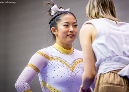
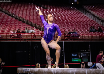
While some teams debuted new designs, others brought back old faves that we’d never judged before. Which was your favorite of the week? The criteria is the same as always: up to three points for design; two points for fabric and sparkle; two points for school spirit; and three points for overall appearance. This week’s guest judges are Rebecca, our senior editor, and Tara, our Big 12 and MRGC editor.
North Carolina: 8.233
| Design | Fabric/
Sparkle |
School
Spirit |
Overall
Appearance |
Total | |
| Elizabeth | 2.4/3 | 1.6/2 | 1.8/2 | 2.5/3 | 8.3/10 |
| Rebecca | 2.2/3 | 1.7/2 | 1.7/2 | 2.4/3 | 8.0/10 |
| Tara | 2.4/3 | 1.8/2 | 1.8/2 | 2.4/3 | 8.4/10 |
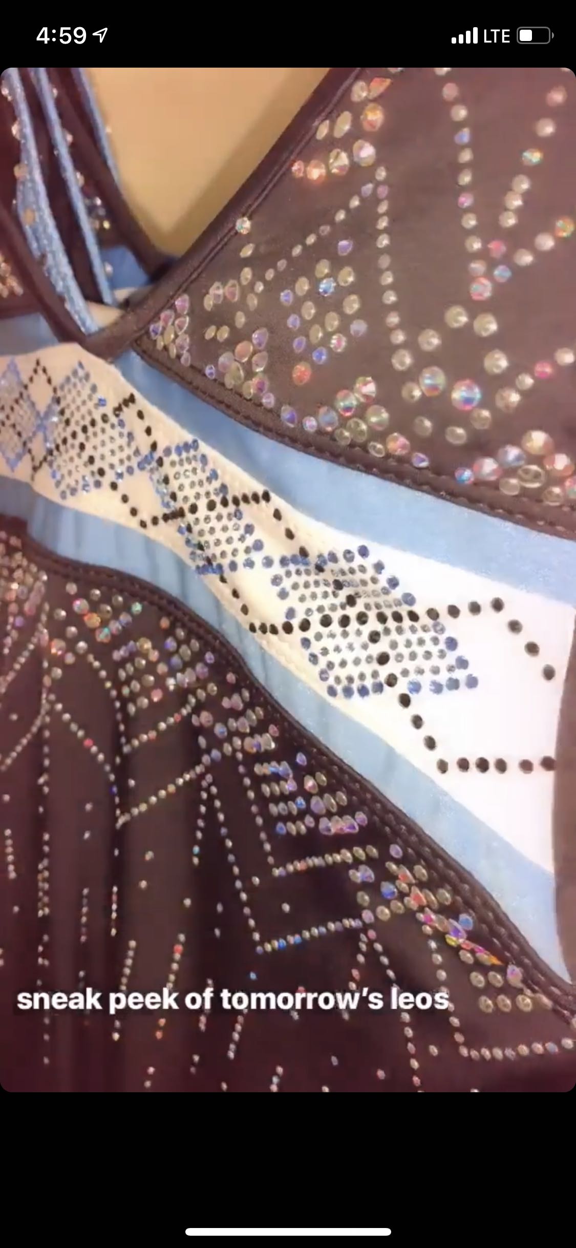
Elizabeth: I like this a lot. It screams UNC, and what I’m assuming is grey fabric for the majority of the leo is one of my favorite leo colors, especially when it’s the matte type rather than shimmery. Overall, this looks like a great leo—I just wish I could have seen a pic of the whole thing.
Rebecca: I looked everywhere to try to find this in action, including squinting at the background of the W&M stream that only shows W&M athletes and came up empty handed. It looks great but it’s hard to judge with only about 40 percent of the necessary information.
Tara: I really like this! It screams UNC, and it’s a great implementation of the pattern that UNC is known for. The intricate sparkles and pairing it with black is just lovely. Like Elizabeth, I wish we had a picture of the whole thing.
Denver: 7.800
Tonight's leo! #PioneerTogether pic.twitter.com/yyOvVTWuFh
— Denver Gymnastics (@DU_Gymnastics) March 2, 2019
| Design | Fabric/
Sparkle |
School
Spirit |
Overall
Appearance |
Total | |
| Elizabeth | 1.6/3 | 1.4/2 | 1.5/2 | 1.8/3 | 6.3/10 |
| Rebecca | 2.5/3 | 1.9/2 | 1.5/2 | 2.5/3 | 8.4/10 |
| Tara | 2.5/3 | 1.9/2 | 1.6/2 | 2.7/3 | 8.7/10 |
Elizabeth: This is fine. I don’t really like the one-armed look, but it’s not a bad leo by any means. I like the color and rhinestones as well. Not my fave Denver leo, but not its worst either.
Rebecca: Denver leotards are usually solid—the biggest problem is that they can sometimes be boring. This one definitely isn’t, and I actually really like it. The asymmetrical design is funky but not outright ridiculous, the colors are nice and the sparkle pattern is restrained. I like the choice of using larger gemstones to make a more distinct pattern too.
Tara: I definitely like this leo more when it’s in action and not a still, leo-posing picture. I think Elizabeth pointed out what’s off for me in the different colored arms, but I like the rest! The asymmetrical design is interesting but it works, and I like how elegant it looks overall. Denver’s definitely figured out how to use its colors right over time (see that throwback leo it wore three weeks ago against Illinois State; not pretty).
Minnesota: 6.800
https://twitter.com/GopherWGym/status/1101969214330585098
| Design | Fabric/
Sparkle |
School
Spirit |
Overall
Appearance |
Total | |
| Elizabeth | 2.4/3 | 1.8/2 | 1.6/2 | 2.6/3 | 8.4/10 |
| Rebecca | 0.5/3 | 1.0/2 | 1.5/2 | 0.7/3 | 3.7/10 |
| Tara | 2.4/3 | 1.8/2 | 1.6/2 | 2.5/3 | 8.3/10 |
Elizabeth: I like this! I was worried Minnesota leos were getting to all be pretty similar with the red/yellow ombre sleeves and central front design. But this leo is really nice, and looks great on the gymnasts. Again, I don’t love high necks, but this one covered in sparkles isn’t bad (as long as I don’t have to wear it). I also like the cascading sparkle design on the front and LOVE the back.
Rebecca: I will stan Minnesota until the end of time, but I really dislike this one. I don’t like the high neck. I especially don’t like that it’s so sparkly and looks like a choker, and the sparkle pentagon on the front is nonsense. I don’t like the rustier red shade versus the usual maroon. While the open back is solid, the pattern on the middle back looks like either a messed up Union Jack or a dead dragonfly.
Tara: I like this! It’s super elegant, the sparkles are lovely and I think it looked great in motion! I also LOVE the back. The Minnesota “M” on the side is also a nice touch of spirit. My only complaint is that it reminds me of a design that we’re seeing from more and more teams.
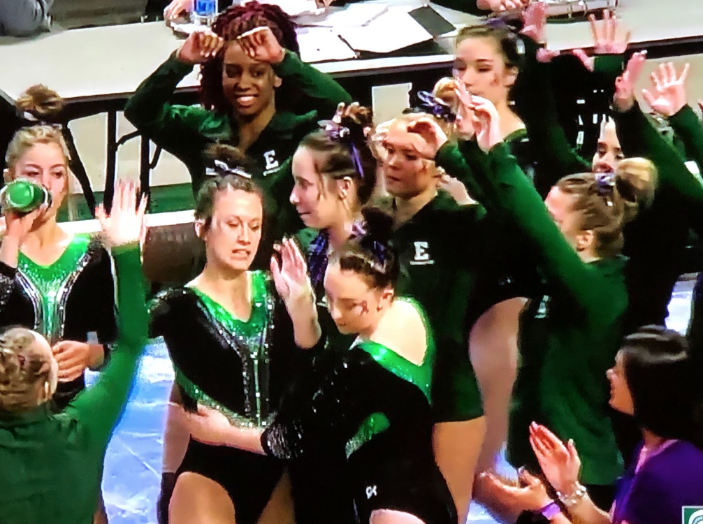
Eastern Michigan: 6.667
| Design | Fabric/
Sparkle |
School
Spirit |
Overall
Appearance |
Total | |
| Elizabeth | 2.3/3 | 1.7/2 | 1.7/2 | 2.4/3 | 8.1/10 |
| Rebecca | 1.0/3 | 1.9/2 | 1.5/2 | 1.2/3 | 5.6/10 |
| Tara | 1.5/3 | 1.6/2 | 1.5/2 | 1.7/3 | 6.3/10 |
Elizabeth: The design is actually pretty flattering. I like how it cuts in and almost gives a slimming illusion. I love the shade of green, and the use of the silver as well.
Rebecca: OK, I love green but what? Maybe the huge Y shape on the front stands for Ypsilanti, but I think it’s more likely that it’s just weird. If that weren’t enough, the diagonal stripes up the side that cut off halfway across the back add another level of confusion. On the bright side, I love all that matte black, and the green color is quality too.
Tara: This isn’t my favorite, but it’s not terrible. I wish there was more to it to jazz it up a bit, especially with the more symmetric and straight-lined design. This is a good way to use green in a leo though.
Illinois State: 6.033
https://www.instagram.com/p/BsZmZ9ln9J1/
| Design | Fabric/
Sparkle |
School
Spirit |
Overall
Appearance |
Total | |
| Elizabeth | 1.2/3 | 1.0/2 | 1.1/2 | 1.3/3 | 4.6/10 |
| Rebecca | 2.0/3 | 1.7/2 | 1.5/2 | 1.7/3 | 6.9/10 |
| Tara | 1.8/3 | 1.7/2 | 1.3/2 | 1.8/3 | 6.6/10 |
Elizabeth: This is fine if not a little boring. I wish overall there was more school spirit, and I’m not typically a fan of “vertical” designs.
Rebecca: In action this looked pretty wild to me, but in stills it’s actually solid. The pattern is unique but not nonsensical, and the colors are basic but work for me. It’s definitely not anything exceptional though.
Tara: I actually don’t mind this! I like the idea of the geometric pattern and the balance of red and black. It’s unique, which I appreciate, and it’s actually done well. The sparkles are a nice touch and not overbearing too.
Michigan State: 5.667
| Design | Fabric/
Sparkle |
School
Spirit |
Overall
Appearance |
Total | |
| Elizabeth | 1.7/3 | 1.2/2 | 1.4/2 | 1.8/3 | 6.1/10 |
| Rebecca | 1.0/3 | 1.7/2 | 1.5/2 | 1.3/3 | 5.5/10 |
| Tara | 1.4/3 | 1.0/2 | 1.5/2 | 1.5/3 | 5.4/10 |
Elizabeth: Meh. I don’t mind the nude parts since it’s kind of funky, and I tend to like unusual designs; I even like the back hole. But I’m not really a fan of the design only being on one sleeve and not the other. I think I would have preferred the nude to be on both, as well as a touch more green throughout.
Rebecca: It’s hard to tell for sure if I like this with such limited information, but random chunks of nude mesh are a pretty hard no for me. I’m going to take a wild guess that the colors are solid, and the back looks okay.
Tara: Um what? This just isn’t doing it for me. I like the Spartan on the arm and how the neckline jazzes up an otherwise simple leo. The nude mesh on the shoulder and arm is just a no, and I’m not a huge fan of the keyhole back in this case.
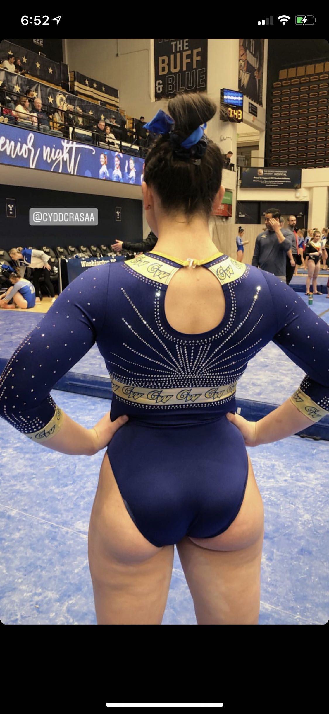
George Washington: 5.333

| Design | Fabric/
Sparkle |
School
Spirit |
Overall
Appearance |
Total | |
| Elizabeth | 1.5/3 | 1.6/2 | 2.0/2 | 1.7/3 | 6.8/10 |
| Rebecca | 0.3/3 | 1.5/2 | 2.0/2 | 0.4/3 | 4.2/10 |
| Tara | 0.7/3 | 1.3/2 | 2.0/2 | 1.0/3 | 5.0/10 |
Elizabeth: I would really like this if the gold bands were just gold and didn’t have little GW logos all over… I can’t fault the leo for school spirit though.
Rebecca: AHHHHHH. I hate every leotard George Washington has ever worn because they’re universally bonkers (sorry, you guys are wonderful in every other way), and this is somehow the worst of the lot. I like the colors, but the tiny GWs are clearly not cool and the shape of the front doesn’t make sense either. In short, yikes.
Tara: Well… This certainly has school spirit, but the repeating of the tiny GW logos all over the gold is what’s not working for me. It’s just such a contrast to the rest of the leo and draws away from all the good qualities. I agree with Elizabeth that if the gold bands weren’t entirely filled with GWs that I would like it more. Maybe just one on the back center and slightly thinning the band would look good?
BONUS! Nastia Liukin Cup: 6.633
Tonight's @gkelite leos for #NastiaCup! pic.twitter.com/GPlbEbWdFu
— USA Gymnastics (@USAGym) March 1, 2019
| Design | Fabric/
Sparkle |
Nastia
Spirit |
Overall
Appearance |
Total | |
| Elizabeth | 1.4/3 | 1.3/2 | 1.8/2 | 1.7/3 | 6.2/10 |
| Rebecca | 1.5/3 | 1.7/2 | 2.0/2 | 1.5/3 | 6.7/10 |
| Tara | 1.6/3 | 1.6/2 | 2.0/2 | 1.8/3 | 7.0/10 |
Elizabeth: This is fine, but I’m not really ever a fan of high necks (I hated wearing leos with them, so it’s probably a residual hatred). I also think the sparkle pattern on the front looks a bit weird. I like the ombre though.
Rebecca: It’s OK. I’m not in love with it. The ombre is nice, but the sparkle pattern is a bit random and the faux-neckline is WAY too low. I don’t love the high collar either, and I’ve heard that some of the athletes found that part super uncomfortable.
Tara: I like this in theory, but I don’t love the execution. It’s very Nastia’s style. I like the ombre and sparkles, but it’s not quite there for me. There’s just something awkward about how the ombre is executed, and I notice it especially on the black where there is less pink (hello, this is the Nastia Cup, I love the black but give me a little more pizazz please).
READ THIS NEXT: Leotard Rankings: Week Eight
Article by Elizabeth Grimsley, Rebecca Scally and Tara Graeve
Like what you see? Consider donating to support our efforts throughout the year!
One comment