
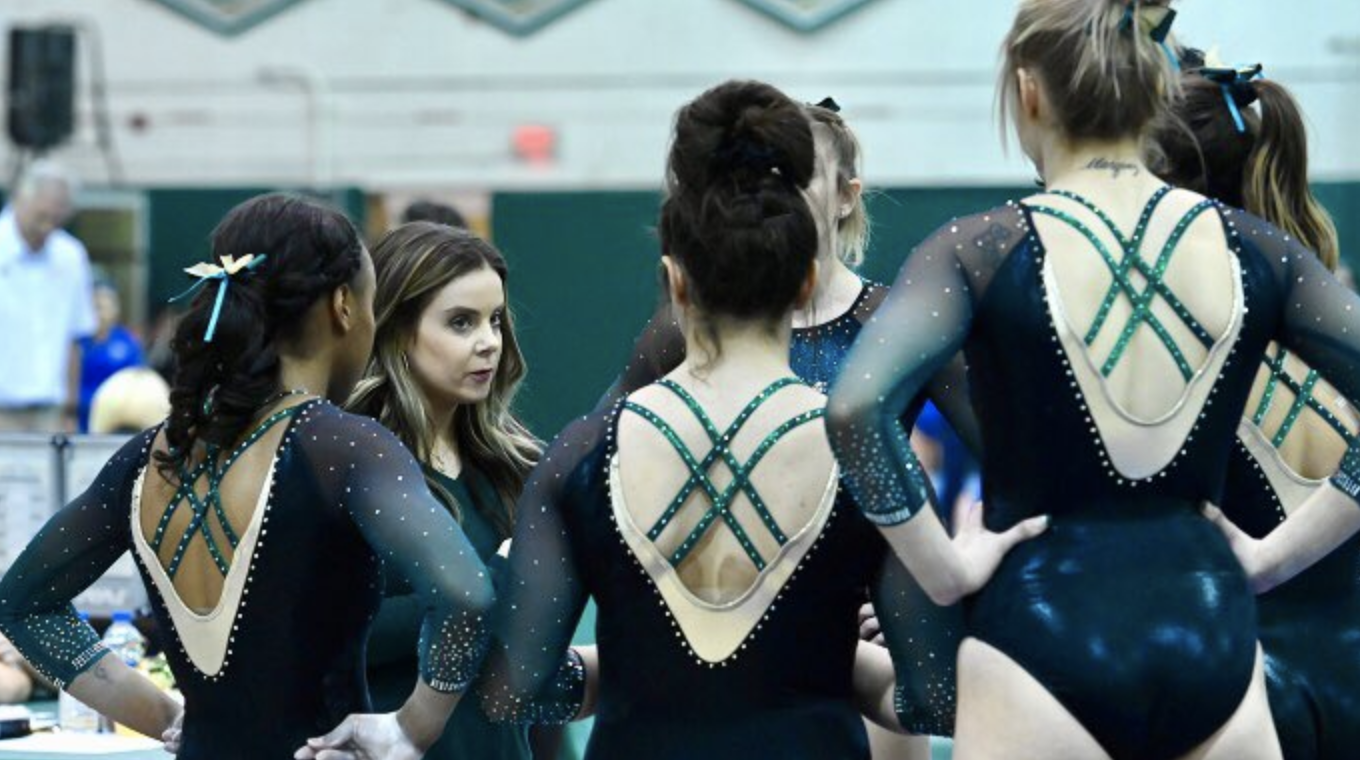
Everyone’s favorite weekly feature is back! The criteria is the same as always: up to three points for design; two points for fabric and sparkle; two points for school spirit; and three points for overall appearance. This week’s guest judges are our men’s editor, Brandis, and our senior editor in charge of the Pac-12 conference, Christina.
Big thanks to Southern Utah, Sacramento State, Rutgers and Bridgeport for sending us pictures to use for this week’s rankings!
Utah: 9.000
Who’s ready to kickoff the 2019 SLC Edition season with the Red Rocks in 3 days?!?!? #GoUtes #SLCedition pic.twitter.com/Cj0GWk9QVX
— Utah Gymnastics (@UtahGymnastics) January 2, 2019
| Design | Fabric/
Sparkle |
School
Spirit |
Overall
Appearance |
Total | |
| Elizabeth | 2.8/3.0 | 1.6/2.0 | 2.0/2.0 | 2.7/3.0 | 9.1/10 |
| Brandis | 2.7/3.0 | 1.7/2.0 | 2.0/2.0 | 2.8/3.0 | 9.2/10 |
| Christina | 2.7/3.0 | 1.5/2.0 | 2.0/2.0 | 2.5/3.0 | 8.7/10 |
Elizabeth: I first saw this leo on Maddy Stover in a Utah camp promo and couldn’t quite tell if it was new or photoshopped or what. But it’s finally surfaced, and I’m fully in love. The incorporation of the mountains, the ombre from black to red and the sparkle has set this leo up for one of my favorites of the year already—and it’s only week one!
Brandis: Big fan of this leo! The combination of the skyline on the mountains is very unique and gives the leo a different way of showing school spirit that is new and different. The color combinations are beautiful and it has just the right amount of sparkle. Not sure that it looked as great from a distance, but up close it’s gorgeous.
Christina: I love the mountains and the city skyline; it’s really well done, and you can’t do any better in terms of school spirit. The small ones on the sleeves are great too. I like the ombre as well, but I feel like a lot of Utah’s leo are always more or less the same, with the design at the top and the same-ish, very simple neckline. However, I have to say this one is amongst my favorites for Utah.
Auburn: 8.800
https://twitter.com/AuburnGym/status/1081291532093792256
| Design | Fabric/
Sparkle |
Pink Meet
Spirit |
Overall
Appearance |
Total | |
| Elizabeth | 2.2/3 | 1.5/2 | 1.8/2 | 2.3/3 | 7.8/10 |
| Brandis | 2.3/3 | 1.2/2 | 2.0/2 | 2.4/3 | 8.8/10 |
| Christina | 2.9/3 | 2.0/2 | 2.0/2 | 2.9/3 | 9.8/10 |
Elizabeth: This is definitely one of my favorite pink leos. The hue looks great with the navy, and the design is unique and subtle. I’ve been pretty impressed with Auburn’s new leos over the last couple of seasons, and this is no different.
Brandis: So refreshing to see a pink meet leo that isn’t hot pink! I think the lacy design gets a bit lost with the sparkles in the same area, but overall a good look for a good cause.
Christina: I love this one! It reminded me of one of OU’s leo with all the crazy lace design at the top, but I much prefer this version. The ombre is gorgeous, and it’s absolutely perfect for a pink meet (no more hot pink please). The color, the sparkle, the neckline, the overall design—I love it all.
New Hampshire: 7.867
https://twitter.com/UNHGymnastics/status/1082395461955117056
| Design | Fabric/
Sparkle |
School
Spirit |
Overall
Appearance |
Total | |
| Elizabeth | 2.0/3 | 1.4/2 | 1.6/2 | 2.4/3 | 7.4/10 |
| Brandis | 2.2/3 | 1.7/2 | 1.6/2 | 2.5/3 | 8.0/10 |
| Christina | 2.3/3 | 1.6/2 | 1.7/2 | 2.6/3 | 8.2/10 |
Elizabeth: I really like parts of this, and the leo as a whole. The ombre is a stunning combo of shades of blue, and the subtle UNH in sparkle there is a nice tough. I do wish the wave-like design was a big thicker/less thin, as it looks a tad awkward as it is now. But overall, I’d call this a win I think.
Brandis: I like the overall asymmetry of this leo! I’m not sold on the size of the wave, but the ombre is my favorite. The UNH in sparkles in the wave is a little muddled, but in general it’s not overkill with the sparkle.
Christina: Interesting! At first I was taken by surprise by the asymmetry, but the more I look at it, the more I like it. The ombre is absolutely gorgeous as well.
Michigan: 7.800
Tonight's leo #GoBlue pic.twitter.com/16a0JVdBGx
— Michigan Women’s Gymnastics (@UMichWGym) January 4, 2019
| Design | Fabric/
Sparkle |
School
Spirit |
Overall
Appearance |
Total | |
| Elizabeth | 2.1/3 | 1.6/2 | 1.9/2 | 2.2/3 | 7.8/10 |
| Brandis | 2.5/3 | 1.5/2 | 1.8/2 | 2.0/3 | 7.8/10 |
| Christina | 2.3/3 | 1.6/2 | 1.7/2 | 2.2/3 | 7.8/10 |
Elizabeth: This is one of my favorite Michigan leo designs. It’s athletic thanks to the stirpe design yet still classy and sparkly thanks to the mystique fabric used. Plus, the school spirit is obviously there.
Brandis: I like simple and I like this leo. It checks off all the boxes for me, but it just seems like another Michigan leotard—nothing too special.
Christina: This is a nice one, simple and easy. I like the vertical bands on the sleeves and across the upper back.
SEMO: 7.567
Southeast totals a 46.775 on floor in the opening rotation!! Anna Kaziska leads the Redhawks with a 9.725 in the anchor position. Mackenzie Slee notches a 9.700. Gabrielle Adams was third on SEMO with a 9.550. #LetsSoar #TheTeam pic.twitter.com/YoXicnTgMc
— Redhawks Gymnastics (@SEMOGymnastics) January 5, 2019
| Design | Fabric/
Sparkle |
School
Spirit |
Overall
Appearance |
Total | |
| Elizabeth | 2.7/3 | 1.8/2 | 1.5/2 | 2.8/3 | 8.8/10 |
| Brandis | 2.4/3 | 1.6/2 | 1.5/2 | 2.4/3 | 7.9/10 |
| Christina | 1.8/3 | 1.2/2 | 1.3/2 | 1.7/3 | 6.0/10 |
Elizabeth: LOVEEEEE. I can’t get enough of this leo—good job SEMO! The design is similar to one of my favorite UCLA patterns, the ombre is to die for, and the back is great too! Overall a stunning edition to SEMO’s leo lineup that already has some good numbers.
Brandis: I’m a sucker for some ombre sleeves, especially with white. The sparkly design on the front could be more emphatic or include a SEMO logo to give it some more school spirit, but in general I can get behind this leo.
Christina: Maybe a tad too dark for my tastes, but it’s a refreshing change from what we usually see from SEMO. I like the neckline and the ombre to white, but I wish there was overall less-solid black to the design.
Texas Woman’s: 7.433
https://twitter.com/collegegymnews_/status/1081717450666782720
| Design | Fabric/
Sparkle |
School
Spirit |
Overall
Appearance |
Total | |
| Elizabeth | 2.5/3 | 1.7/2 | 1.8/2 | 2.7/3 | 8.7/10 |
| Brandis | 2.0/3 | 1.7/2 | 1.5/2 | 2.0/3 | 7.2/10 |
| Christina | 2.3/3 | 1.8/2 | 1.8/2 | 2.2/3 | 8.1/10 |
Elizabeth: This leo was great in person, and I LOVE the TWU on the back left shoulder blade—it made for some cool pics. I also love the ombre and the design for the most part. I do think the weird double neckline/necklace is weird on the front and could have done without, but at least it’s not a triple like Russia has?
Brandis: Yay for more ombre sleeves! I like the sparkles on the sleeve and the design of the body, but to me the design around the chest and the shoulders doesn’t mesh them together well.
Christina: Oooh I love the shades used here, and the ombre is gorgeous. However, the front looks super odd to me. It looks like that red band above the V-neck was almost added afterward? I don’t know what’s going on. I want it higher up along the neckline because it creates weird empty spaces here. Love the back and the deep V though.
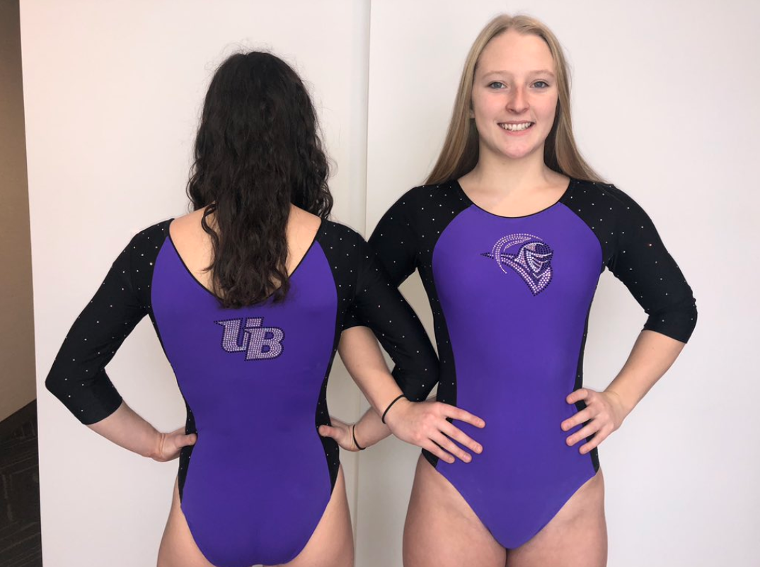
Bridgeport: 7.433
| Design | Fabric/
Sparkle |
School
Spirit |
Overall
Appearance |
Total | |
| Elizabeth | 1.8/3 | 1.6/2 | 2.0/2 | 2.2/3 | 7.6/10 |
| Brandis | 1.5/3 | 1.5/2 | 1.7/2 | 2.2/3 | 6.9/10 |
| Christina | 2.1/3 | 1.6/2 | 1.8/2 | 2.3/3 | 7.8/10 |
Elizabeth: I love the purple color here, and the way the sparkles are positioned on the arms almost made it look like the sleeves were glittery velvet on the live stream. I also appreciate the UB on the back and the Purple Knight on the front—A+ for school spirit.
Brandis: Another one that may be a little too simple, but I like how the black from the sleeves carries down the sides. The shade of purple is also mesmerizing and draws me in. If there was just a little more to the design, I think I would absolutely love it.
Christina: Interesting! I think I kind of like it? It looks very athletic. I’m usually not the biggest fan of solid colors like that, but I don’t mind it here. I like the simplicity, the UB logos on the front and back and the sparkly black sleeves.
Rutgers: 7.233
Thank you!! pic.twitter.com/tzUhXPxkVW
— Rutgers Gymnastics (@RUGymnastics) January 5, 2019
— Rutgers Gymnastics (@RUGymnastics) January 5, 2019
| Design | Fabric/
Sparkle |
School
Spirit |
Overall
Appearance |
Total | |
| Elizabeth | 2.1/3 | 1.5/2 | 1.8/2 | 2.3/3 | 7.7/10 |
| Brandis | 1.8/3 | 1.5/2 | 1.6/2 | 2.1/3 | 7.0/10 |
| Christina | 1.9/3 | 1.3/2 | 1.7/2 | 2.1/3 | 7.0/10 |
Elizabeth: I’m into this. I was excited to see what Umme Salim-Beasley came up with for the Scarlet Knights since I liked a lot of Temple’s new designs the past season or so, and this one didn’t disappoint. I uncharacteristically like the black cutouts breaking up the solid ready body, and you all know I always love a funky back no matter what it looks like.
Brandis: Not a fan of the open back, but I’m digging the front of the leo. The different cutouts with the mesh are a welcome change, and I hope we see more of that from teams this season.
Christina: On the contrary, I do like the open back, but I’m really not digging the front with the random black mesh patch in the middle of the torso. I do, however, like the sharp edges overall of this one, and I like that the funky back straps do fit with this entire theme.
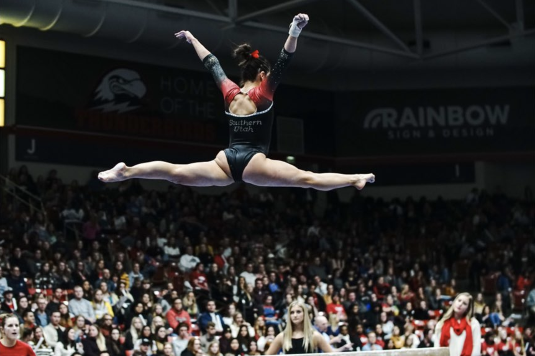
Southern Utah: 7.033
| Design | Fabric/
Sparkle |
School
Spirit |
Overall
Appearance |
Total | |
| Elizabeth | 1.8/3 | 1.6/2 | 1.7/2 | 2.0/3 | 7.1/10 |
| Brandis | 1.8/3 | 1.4/2 | 1.8/2 | 2.2/3 | 7.2/10 |
| Christina | 1.6/3 | 1.6/2 | 1.7/2 | 1.9/3 | 6.8/10 |
Elizabeth: I like this in theory but just wish the white band around the shoulders wasn’t there. Also the font used for “Southern Utah” is a little strange, but I don’t hate it. Otherwise, the ombre is amazing of course, and the mostly black design looks good on the gymnasts. I also like the flames on the front.
Brandis: So much ombre this week, and I love it! At first I thought this design overall was a bit busy, but the longer I looked, the more I disagreed with myself. The only big knock for me with this one is the white shoulder bands, which we all agree on.
Christina: Love the ombre sleeves, but I wish the rest of the bodice wasn’t as simple and dark as it is. I do agree with Elizabeth on the white bands, as it makes it look like they are wearing a tiny, tiny vest.
Arizona State: 6.867
https://twitter.com/SunDevilGym/status/1081314068265222145
| Design | Fabric/
Sparkle |
School
Spirit |
Overall
Appearance |
Total | |
| Elizabeth | 2.0/3 | 1.4/2 | 1.7/2 | 2.4/3 | 7.4/10 |
| Brandis | 1.7/3 | 1.5/2 | 1.8/2 | 2.5/3 | 7.5/10 |
| Christina | 1.2/3 | 1.3/2 | 1.6/2 | 1.6/3 | 5.7/10 |
Elizabeth: I of course love the Arizona sunset color combo, but I don’t love the design; I prefer some of the 2018 leos we saw debuted with the ombre. I think it’s the fact that I prefer a non-printed-on design.
Brandis: I like the more subtle use of flames in this leo. Like Christina, I like the use of the pastel tones, but I think it makes it look a tad dull and loses a bit of luster. Usually I think ASU leo’s can get a little busy with its designs, but I like this one!
Christina: I was pretty pumped about a new ASU leo, but I’m not sure how to feel on this one. I remember seeing this on UNH also and feeling a bit torn. I like the ombre on the sleeves with the Arizona sunset colors, and the overall use of pastel tones. However, I don’t think I’m a fan of this vest design unfortunately. I don’t find it flattering.
Sacramento State: 6.567
| Design | Fabric/
Sparkle |
School
Spirit |
Overall
Appearance |
Total | |
| Elizabeth | 2.0/3 | 1.5/2 | 1.7/2 | 2.1/3 | 7.3/10 |
| Brandis | 1.3/3 | 1.3/2 | 1.3/2 | 2.0/3 | 5.9/10 |
| Christina | 1.7/3 | 1.5/2 | 1.5/2 | 1.8/3 | 6.5/10 |
Elizabeth: I’m here for those sleeves. I love a good emerald green, and the black to green ombre is subtle yet still noticeable. I also like the back. While the gold looks a bit weird, it does incorporate school spirit, which I appreciate.
Brandis: Earlier I said I like simple, but this may be too simple. I’m usually not a fan of open backs with fabric going across, and this leo doesn’t change that. I do like the amount of sparkle though—just enough for me!
Christina: A bit too simple for me. I do like the sleeves, but I wish the ombre was more obvious (there is an ombre, right?). I dislike the random bit of white or gold fabric on the back, and I find it disrupts the whole look. I really like the criss-crossed straps, but why is that clear patch here?
Cortland: 6.100
https://www.instagram.com/p/BsO1UvvndaN/?utm_source=ig_share_sheet&igshid=1i7h0zmt4n4bc
| Design | Fabric/
Sparkle |
School
Spirit |
Overall
Appearance |
Total | |
| Elizabeth | 1.7/3 | 1.3/2 | 1.7/2 | 2.0/3 | 6.7/10 |
| Brandis | 1.0/3 | 1.2/2 | 1.0/2 | 1.5/3 | 4.7/10 |
| Christina | 2.0/3 | 1.2/2 | 1.5/2 | 2.2/3 | 6.9/10 |
Elizabeth: I agree with Christina about not being a big fan of the rounded neckline, but the red color used is really nice, and the sparkles making the C is another fun touch. I like the detail on the back too.
Brandis: Not a fan of the red on red color pairing, especially when there’s barely any contrast between the two tones. I think the actual design is simple and nice, but it would’ve come across a lot better for me with different shades of red.
Christina: I’ve never been a fan of the reverse curve neckline, and I’ve never found it flattering at all unfortunately. I like the use of red mesh, and the solid straps on the mesh in the back look fine.
READ THIS NEXT: Leotard Retrospective
Article by Elizabeth Grimsley, Brandis Heffner and Christina Marmet
Like what you see? Consider donating to support our efforts throughout the year!
One comment