
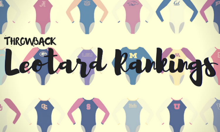
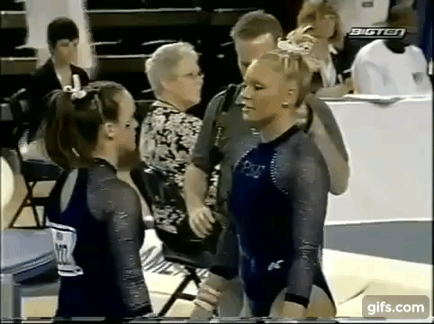
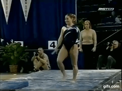
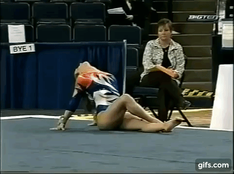
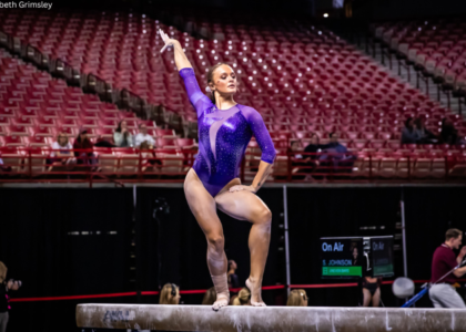
We’re bringing back throwback leo rankings this offseason to tide you over until 2019 arrives! The criteria is the same as always: up to three points for design; two points for fabric, sparkle, etc.; and two points for school spirit; three points for overall appearance. Guest judges this week will be Emily HF, our senior photographer, and Emily M, our Big Ten and MIC senior editor. The meet? The 2008 Big Ten championship.
Minnesota: 8.633
| Design | Fabric/
Sparkle |
School
Spirit |
Overall
Appearance |
Total | |
| Elizabeth | 2.6/3 | 1.8/2 | 1.6/2 | 2.7/3 | 8.7/10 |
| Alicia | 2.6/3 | 1.9/2 | 1.7/2 | 3/3 | 9.2/10 |
| Emily M | 2.4/3 | 1.7/2 | 1.4/2 | 2.5/3 | 8.0/10 |
Elizabeth: I loooove this. The low back is stunning, and the mega-sparkly sleeves are also great. Plus, velvet, duh. I actually saw this leo in action in person when Hannah Nordquist wore it for event finals at nationals one year. It lives up to the hype.
Emily HF: Yes please!! There’s literally no part of this I don’t like. Minnesota, could we bring this back please? So pretty.
Emily M: Oh my gosh if this doesn’t take you back. So much classic 2000s, from the velvet to the firework crystal pattern. But I love how Minnesota changes it up with the back. Together, it all works for me.
Michigan State: 8.400
| Design | Fabric/
Sparkle |
School
Spirit |
Overall
Appearance |
Total | |
| Elizabeth | 2.3/3 | 1.8/2 | 1.8/2 | 2.4/3 | 8.3/10 |
| Alicia | 2.4/3 | 1.6/2 | 2.0/2 | 2.5/3 | 8.5/10 |
| Emily M | 2.4/3 | 1.6/2 | 1.9/2 | 2.5/3 | 8.4/10 |
Elizabeth: I love this color of green! I want Michigan State to use is way more! And on this leo, I don’t even dislike the rounded neckline. Maybe the script Michigan State on the border breaks it up. Overall, a classy yet simple leo I can’t get enough of.
Emily HF: Always more green! I actually really like the cut on this neckline, and the script is pretty. This one’s a winner, MSU.
Emily M: More green leos, please. This color is excellent. I wish the Michigan State script were bigger, so it could be read from farther away, but bring an updated version of this one back, MSU.
Iowa: 7.967
| Design | Fabric/
Sparkle |
School
Spirit |
Overall
Appearance |
Total | |
| Elizabeth | 2.1/3 | 1.4/2 | 1.4/2 | 2.2/3 | 7.1/10 |
| Emily HF | 2.6/3 | 1.6/2 | 1.6/2 | 2,7/3 | 8.5/10 |
| Emily M | 2.5/3 | 1.6/2 | 1.6/2 | 2.6/3 | 8.3/10 |
Elizabeth: I like this! It’s rather simple but has enough uniqueness to it that I don’t find it boring. I like the neckline, as well as the unusual back. The little “I” on the sleeve is a nice touch of school spirit as well.
Emily HF: Always here for a black leo. It’s simple, but it works.
Emily M: This is so simple, but it works. The all black with the neckline is really elegant. The “I” on the sleeve almost looks silly, given the rest of the design. School spirit points because Iowa has been rocking black leos for a long time; it’s a signature look.
Penn State: 7.467
| Design | Fabric/
Sparkle |
School
Spirit |
Overall
Appearance |
Total | |
| Elizabeth | 2.0/3 | 1.2/2 | 1.6/2 | 2.1/3 | 6.9/10 |
| Emily HF | 2.2/3 | 1.5/2 | 1.5/2 | 2.5/3 | 7.8/10 |
| Emily M | 2.3/3 | 1.5/2 | 1.5/2 | 2.4/3 | 7.7/10 |
Elizabeth: I like cut of this leo with the high neck and way the design cuts the arms. It looks athletic yet elegant. I’m not a huge fan of the sparkly mesh sleeves, though, but don’t hate it either.
Emily HF: Hmm. Not the biggest fan of the cut between the bodice and the arms but overall a solid leo!
Emily M: I randomly love this. I’m normally not a fan of the high neck, but with the cut of the sleeves it works. Just a solid, classic leo, from the velvet to the keyhole back.
Michigan: 5.800
| Design | Fabric/
Sparkle |
School
Spirit |
Overall
Appearance |
Total | |
| Elizabeth | 1.8/3 | 1.3/2 | 1.5/2 | 1.9/3 | 6.5/10 |
| Alicia | 1.2/3 | 1.2/2 | 1.4/2 | 1.2/3 | 5.0/10 |
| Emily M | 1.2/3 | 1.5/2 | 1.8/2 | 1.4/3 | 5.9/10 |
Elizabeth: This makes me think “Kent State” more than it makes me think “Michigan.” I think it’s the gold used vs. maize.The design is definitely very athletic, but I don’t LOVE it as a whole. I am appreciating the block M on the hip, though.
Emily HF: As Elizabeth frequently says… meh. The colors aren’t quite right for Michigan and I don’t think the design across the shoulders is very flattering.
Emily M: HA. No. I agree with Elizabeth that it’s very Kent State. The gold-ish is the wrong color; I have no idea what the pattern is trying to do. I’m a fan of very athletic-looking leos (think the Adidas national team leos), but this one misses for me.
Illinois: 5.667
| Design | Fabric/
Sparkle |
School
Spirit |
Overall
Appearance |
Total | |
| Elizabeth | 1.3/3 | 1.4/2 | 1.8/2 | 1.4/3 | 5.9/10 |
| Alicia | 1.4/3 | 1.4/2 | 1.7/2 | 1.2/3 | 5.7/10 |
| Emily M | 1.2/3 | 1.5/2 | 1.7/2 | 1.0/3 | 5.4/10 |
Elizabeth: Illinois, all your leos look the same. At least until Walsh took over this past season. Anyway, this is meh to me. It’s the same tired fabrics on the same tired design. Thankfully the recent leos are moving in a beautiful direction.
Emily HF: Agreed with Elizabeth and the other Emily! I feel like I’ve seen, like, four other leos that are almost exactly like this from Illinois.
Emily M: I’ve said it before, and I’ll say it again: Until the new leos in 2018 (THANK YOU), all of Illinois’ looked the same for a solid decade. They just run together. Blah.
Ohio State: 5.200

| Design | Fabric/
Sparkle |
School
Spirit |
Overall
Appearance |
Total | |
| Elizabeth | 1.0/3 | 1.4/2 | 1.8/2 | 1.1/3 | 5.3/10 |
| Emily HF | 0.8/3 | 1.3/2 | 1.8/2 | 1.2/3 | 5.1/10 |
| Emily M | 0.9/3 | 1.6/2 | 1.9/2 | 0.8/3 | 5.2/10 |
Elizabeth: Oh, Honey… Let’s not. I typically don’t mind holes too much, but these are just in a weird place. Plain and simple. A for effort on school spirit but the execution is horrid.
Emily HF: Um how about not… Those holes in the arms just ruin the whole thing.
Emily M: I love a black leo but those arm cutouts ruin everything else about this. It’s creative, I guess. But.
READ THIS NEXT: Throwback Leotard Rankings: 1984 NCAAs
Article by Elizabeth Grimsley, Emily Howell-Forbes and Emily Minehart
Like what you see? Consider donating to support out efforts throughout the year!
Can I say first….see the gymnasts from 2008 (Sarah, Brandi, Rebecca..) made this topic worth it.
Also as a Michigan fan….I’m going to say something positive about OSU 🙂 … at first I didn’t like the holes but then I realized they were O’s and thought that was creative.