
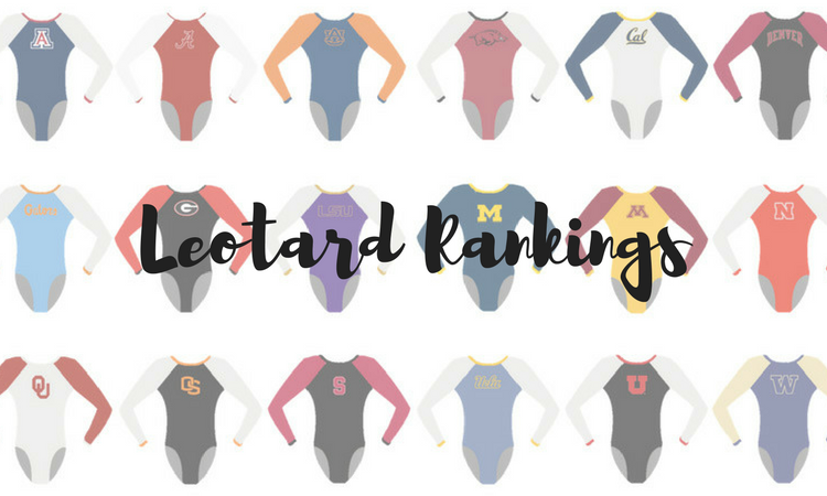
Another week, another slate of fantastic new leotards. Which did you like the best? The criteria is the same as always: up to three points for design; two points for fabric, sparkle, etc.; and two points for school spirit; three points for overall appearance. We’ve got multiple guests this week, including our recruiting editor Luci, EAGL and ECAC editor Alicia and our MPSF editor and star photographer Emily HF!
Stanford: 8.983
https://www.instagram.com/p/BhUNFk2lBmy/?taken-by=rachaelflam
| Design | Fabric/
Sparkle |
School
Spirit |
Overall
Appearance |
Total | |
| Caroline | 2.5/3 | 1.7/2 | 1.6/2 | 2.8/3 | 8.6/10 |
| Christina | 2.6/3 | 1.8/2 | 1.6/2 | 2.7/3 | 8.7/10 |
| Elizabeth | 2.9/3 | 1.9/2 | 1.7/2 | 2.9/3 | 9.4/10 |
| Luci | 2.9/3 | 1.8/2 | 1.8/2 | 2.8/3 | 9.3/10 |
| Alicia | 2.6/3 | 1.9/2 | 1.5/2 | 2.6/3 | 8.6/10 |
| Emily HF | 2.9/3 | 1.9/2 | 1.8/2 | 2.7/3 | 9.3/10 |
Caroline: This ombre is beautiful! I’m practically singing it’s so gorgeous. The sweetheart neckline, the cascade of sparkle, the Stanford logo on the back in the crook of the V—it’s the classiest, most classic look all week, and I love it. Thank you Tabitha!
Christina: Stanford has really nailed the leo game this season. This is gorgeous. I love the sweetheart neckline and the black to red ombre on the sleeves. It has the perfect amount of sparkles. I also love the very subtle Stanford logo incorporated in the deep V on the back.
Elizabeth: This is my fave of the weekend, so thanks Tabitha for not only introducing a new leo for Stanford but a pretty one at that. I LOVE the ombre and the neckline is perfect. The Stanford logo on the back ties it all together nicely.
Luci: This one has everything I love—flattering neckline and design, beautiful ombre sleeves, great school spirit and it’s classic yet not boring. This is my favorite from the weekend.
Alicia: Beautiful! Red and black ombre can either look really botched and muddy or really amazing, and luckily this leads towards amazing, especially with the shade of red used on the arms. Black mesh is not utilized enough, and it should be. It looks gorgeous here with the shape of the red.
Emily HF: Preeeeettty! That black to red ombre on the sleeves is a yes please! Love the Stanford S in the back V and the cut of the front is great—perfect neckline. I’m not sure about the red on the neckline, though. I think I would have rathered black there and wish they’d done some red sparkles on the black mesh, but that’s very nit picky.
Michigan: 8.717
Here are some photos from tonight. #GoBlue pic.twitter.com/WO3qpt8UV5
— Michigan Women’s Gymnastics (@UMichWGym) April 8, 2018
| Design | Fabric/
Sparkle |
School
Spirit |
Overall
Appearance |
Total | |
| Caroline | 2.2/3 | 1.7/2 | 2.0/2 | 2.4/3 | 8.3/10 |
| Christina | 2.4/3 | 1.8/2 | 2.0/2 | 2.3/3 | 8.5/10 |
| Elizabeth | 2.0/3 | 1.7/2 | 1.9/2 | 2.3/3 | 7.9/10 |
| Luci | 2.2/3 | 1.7/2 | 2.0/2 | 2.5/3 | 8.4/10 |
| Alicia | 2.8/3 | 1.8/2 | 2.0/2 | 2.8/3 | 9.4/10 |
| Emily HF | 3.0/3 | 1.9/2 | 2.0/2 | 2.9/3 | 9.8/10 |
Caroline: This is so retro and athletic, and I surprisingly love it? I love the sleeve detail and the blinged out logos, both on the back and the front. I do wish there were some more detail of some kind, even just a smattering of stones, in the navy section on the bottom. But overall a great showing!
Christina: This is probably one of my favorites from this weekend! I love the throwback feel, and it’s such a refreshing change from what we are used to seeing from Michigan. I love the athletic feel of the design, and I am a big fan of the shades used. The “M” on the front and “Wolverines” on the back are the perfect size. A great one!
Elizabeth: This is very throwback-y, and I like it for the most part. The solid white top with the thin lines in school colors is really nice, and I’m digging the not-too-big Black M on the front. I just wish the white didn’t cut off the gymnasts so abruptly in the design on the body.
Luci: I love the top of this throwback leotard. The one thing that I don’t love is the row of yellow rhinestones in the middle which look like they came straight from the craft store onto the leotard. Overall, though this is a great design with a nice blend of the old and the new and lots of school spirit.
Alicia: I am obsessed with this leo. Is my total high? Absolutely. But I’m obsessed with this, and it’s by far my favorite leo of the week. THIS is how throwback leos should be done. You know it has a throwback feel, but it has some modernity in it as well.The blue and white cut off is amazing, the different colored rhinestones are beautiful, the “M” on the front… I LOVE IT.
Emily HF: Oh wow! I LOVE THIS! So so so pretty! I’m on board with Michigan’s last couple of new leos. Where they’ve placed the band is super flattering, I love the use of both gold and blue sparkles (I wish more leos would do this where they use the sparkles as colors) and the blue matte is super pretty.
Boise State: 7.933
https://twitter.com/BroncoSportsGYM/status/982739998087827462
| Design | Fabric/
Sparkle |
School
Spirit |
Overall
Appearance |
Total | |
| Caroline | 2.4/3 | 1.6/2 | 1.8/2 | 2.5/3 | 8.3/10 |
| Christina | 2.3/3 | 1.5/2 | 1.7/2 | 2.0/3 | 7.5/10 |
| Elizabeth | 2.3/3 | 1.4/2 | 1.7/2 | 2.4/3 | 7.8/10 |
| Luci | 2.3/3 | 1.4/2 | 1.8/2 | 2.0/3 | 7.5/10 |
| Alicia | 2.5/3 | 1.7/2 | 1.9/2 | 2.5/3 | 8.6/10 |
| Emily HF | 2.3/3 | 1.5/2 | 1.8/2 | 2.3/3 | 7.9/10 |
Caroline: Oooooh. This is really different than most of what Boise has shown this season, and I’m kinda digging it. It has a very athletic look to it, especially with the racerback design and the athletic stripes around the front. Definitely a favorite of theirs.
Christina: I really love the back, and I love the bands of orange and blue going across the whole leo. It’s great way to incorporate the school colors without it being too much. This leo looked nice in motion, but it does look a bit unfinished from up close, like things got patched up or added in a rush and the finishing touches are missing. That said, it’s a nice and refreshing change from Boise State.
Elizabeth: The back is my favorite part of this leo—it’s intricate, unusual and flattering on everyone. I also like the subtle incorporation of the school colors without going overboard with school spirit.
Luci: I really liked how this leotard looked on the competition floor. Up close, the fabric looks a bit puckered and the stripes across the stomach are strange. I love the classy vibe that still has school spirit, though, and the back is super unique and looked great on all the athletes.
Alicia: This is so different than what I’m used to seeing from Boise. For the most part, I’m super into it. The sparkles in the center of the leo are gorgeous along with the sleeves, it reminds me of a meteor shower. The only thing I dislike is the blue and orange ribbons on the bottom—it seems a tad patchy, and I think it would have been better without.
Emily HF: I like! Very different from Boise State’s usual leos, and that’s a good thing! Love the back! I’d like a little more flow between design elements looking at it up close.
Arkansas: 7.800
https://www.instagram.com/p/BhR-BgYgsUK/?taken-by=razorbackgym
| Design | Fabric/
Sparkle |
School
Spirit |
Overall
Appearance |
Total | |
| Caroline | 2.1/3 | 1.5/2 | 1.5/2 | 2.2/3 | 7.3/10 |
| Christina | 2.3/3 | 1.6/2 | 1.6/2 | 2.2/3 | 7.7/10 |
| Elizabeth | 2.0/3 | 1.4/2 | 1.6/2 | 2.1/3 | 7.1/10 |
| Luci | 2.5/3 | 1.7/2 | 1.7/2 | 2.5/3 | 8.4/10 |
| Alicia | 2.7/3 | 1.8/2 | 1.5/2 | 2.8/3 | 8.8/10 |
| Emily HF | 2.2/3 | 1.6/2 | 1.5/2 | 2.2/3 | 7.5/10 |
Caroline: This is very similar to some others we’ve seen this year, but the halter neck is what makes it stand out. I think it’s interesting to have both the halter and the V/quasi-sweetheart thing. It’s not my personal favorite, but it’s better than most halters for me. The open back is also lovely, though I think the strap across the back of the neck is too thin to be functional and too tight to be comfortable, so I don’t quite understand its inclusion.
Christina: I like this one: simple and elegant. But some of these Arkansas leos are honestly starting to blend in together for me at this point. The V/triangle neckline on the front of this one is a bit odd, but I love love the back.
Elizabeth: I like it, but it’s also not anything special since it looks like just another red leo with white sleeves. At least it wasn’t all red? I do like the neckline, and the school spirit, though.
Luci: Overall, I’m a big fan of this leo. It’s super classy and classic. I’m not a huge fan of the thin strap at the top of the back, although I’d take that over completely backless. I love the sparkly white sleeves and that it’s not just another all-red leotard from Arkansas.
Alicia: This leo is beautiful! Arkansas has really put out some gorgeous leos, and this new one is no exception. I love how the sparkles and the white mesh blend so well that the red piping disappears—very unique. I think it has the right amount of pizazz without being too boring or overwhelming. I wish the sleeves didn’t have the random rhinestones on them though.
Emily HF: Very classy! I think the V goes a little far for my taste. However, for the back it does kinda blend together with a number of other leos this year. Too many teams have red and white for colors I think. Love that back though.
Georgia: 7.667
Some more views of the retro UGA leo! #LeoWatch #NCAAgym pic.twitter.com/Wp89NEEZ02
— NCAA Gym News (@NCAAGymNews) April 7, 2018
| Design | Fabric/
Sparkle |
School
Spirit |
Overall
Appearance |
Total | |
| Caroline | 2.2/3 | 1.7/2 | 2.0/2 | 2.1/3 | 8.0/10 |
| Christina | 1.7/3 | 1.8/2 | 2.0/2 | 2.0/3 | 7.5/10 |
| Elizabeth | 2.7/3 | 1.9/2 | 1.9/2 | 2.9/3 | 9.5/10 |
| Luci | 2.0/3 | 2.0/2 | 1.8/2 | 2.0/3 | 7.8/10 |
| Alicia | 1.5/3 | 1.8/2 | 1.9/2 | 2.0/3 | 7.2/10 |
| Emily HF | 1.0/3 | 1.7/2 | 1.8/2 | 1.5/3 | 6.0/10 |
Caroline: More retro! I kinda like it, but the asymmetry isn’t my favorite in motion as it draws the eye to the wrong place at times. I love the velvet and sparkle combo; it really elevates the design as a whole and marries the old with the new nicely.
Christina: VELVET! I do like the retro ‘90s vibe, and of course I’m obsessed with the velvet. I like the white neckline and the “Georgia” on the sleeve. The only thing about this leo is I did not find that side flag design flattering. Other than that, I am so here for the velvet.
Elizabeth: I’m obsessed with this, and you can’t convince me otherwise. It’s so 80s geometric with the triangle and velvet, and I’m in love. I love the addition of millions of sparkles to modernize the design a little but wish the Dawgs was a Super G instead.
Luci: I like that this one is different and retro. I’m all for a good velvet leo. However, I dislike the pennant-like shape across the stomach… The placement just seems odd. I love that it’s sparkly, though, without being rhinestone-y and the weird flag thing did look a lot better in motion than it did in pictures.
Alicia: When I first saw the leo, I really disliked it. I still don’t love it, however as someone who is embracing the reemergence of velvet, I did have to reconsider. Overall, the fabric is great—velvet is a win in all situations—but the weird flag is so…odd. It feels out of place. I get the throwback, and I love throwbacks, but this is a little strange.
Emily HF: Same as the Arizona leo earlier this year, I just am not a fan of the pennant/triangle extending onto the stomach that way it draws my eyes and not in a positive way and pretty much ruins the rest of the leo for me.
Minnesota: 7.500
https://instagram.com/p/BhRSf7QHaIc/
| Design | Fabric/
Sparkle |
School
Spirit |
Overall
Appearance |
Total | |
| Caroline | 2.1/3 | 1.3/2 | 1.7/2 | 2.0/3 | 7.1/10 |
| Christina | 2.1/3 | 1.5/2 | 1.7/2 | 2.2/3 | 7.5/10 |
| Elizabeth | 2.1/3 | 1.5/2 | 1.6/2 | 2.2/3 | 7.4/10 |
| Luci | 2.0/3 | 1.7/2 | 1.6/2 | 2.2/3 | 7.5/10 |
| Alicia | 2.0/3 | 1.6/2 | 1.7/2 | 2.2/3 | 7.5/10 |
| Emily HF | 2.4/3 | 1.6/2 | 1.7/2 | 2.3/3 | 8.0/10 |
Caroline: The back of this is easily my favorite part, but I could’ve done without some of the mesh on the bodice. And, to me, the sleeve mesh looks yellow?? That might just be the light, but that yellow color is not cute. I do love the use of the bling and all the school spirit!
Christina: Unsurprisingly, I LOVE the back although I could have gone without the mesh on the upper part. The front is alright; I am never a big fan of a straight line across the chest like this one. The big “M” in all sparkles is nice, though.
Elizabeth: I really like this, especially the back (duh), but there’s something about that back design that seems too much. I do like the simplicity of the colors and Minnesota on the front but with the neckline wasn’t straight.
Luci: This design is a bit boring to me. The cutouts on the back are definitely the best and most interesting part, but the front reminds me of a tube top and the neckline isn’t my favorite. I will say, it looked great on them during the competition, and I loved how much the “M” sparkled.
Alicia: The back is lovely! Intricate backs have really grown on me this past season, and I think Minnesota does this one perfectly. The “M” in sparkles is fantastic, but I agree with Christina in that I really dislike a straight line across the chest! I find it cuts gymnasts off.
Emily HF: One of my favorite Minnesota leos this year! This back was gorgeous and the red was super shimmery in person! That picture is kinda deceptive about the color of the sleeves; they really were much more nude than yellow and could trick the eye on certain gymnasts into wondering if there were sleeves at all from a distance.
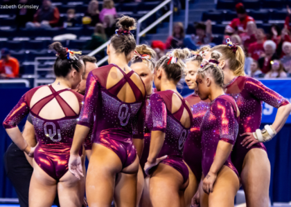
Oklahoma: 7.150
https://twitter.com/OU_WGymnastics/status/982719908881551361
| Design | Fabric/
Sparkle |
School
Spirit |
Overall
Appearance |
Total | |
| Caroline | 1.7/3 | 1.4/2 | 1.9/2 | 2.1/3 | 7.1/10 |
| Christina | 1.6/3 | 1.5/2 | 1.7/2 | 1.8/3 | 6.6/10 |
| Elizabeth | 2.4/3 | 1.6/2 | 1.8/2 | 2.5/3 | 8.3/10 |
| Luci | 1.7/3 | 1.7/2 | 1.8/2 | 1.9/3 | 7.1/10 |
| Alicia | 1.5/3 | 1.7/2 | 1.8/2 | 1.8/3 | 6.8/10 |
| Emily HF | 1.7/3 | 1.6/2 | 1.8/2 | 1.9/3 | 7.0/10 |
Caroline: Standing still and looking really hard, I really have issues with this leo, but from afar and in motion all the different pieces actually all work together really well. The lines across the front are uneven and kinda throw off the design on the front for me, but I actually love the back and how it draws into the school logo.
Christina: This looked a lot better in motion, but overall I have mixed feelings. I really like the back, and the ombre sleeves are lovely. But the film strip on the front really bugs me. It just draws the eye to their chest right away, which is a no-no, and I thought the sparkles emanating out of that made the gymnasts look much larger than they actually are.
Elizabeth: Unlike many others, I really like this like I pretty much like all OU leos. The introduction of black is a nice change for the Sooners’ typically primarily white and crimson palate. I liked the front design and the ombre on the sleeves. Plus, the back is my favorite.
Luci: The ombre sleeves are the highlight of this leotard for me. The back is so nice too, particularly the placement of the OU. I just really don’t like the weird ladder thing, and the neckline isn’t my favorite. Great school spirit, though and nice to see Oklahoma doing something a bit different.
Alicia: The ladder design in the front draws so much away from this leo. It looks out of place and unfinished, not to mention uncentered and messy. That being said, the ombre on the arms is beautiful and by far my favorite part, and the OU on the back is incorporated in such a nice way.
Emily HF: So here’s the thing… I do like the back of this and most of the front but wish the fake lacing was tapered or something. It draws the eye and is not flattering on all body types—same with the pattern of the sparkles a bit. It did work well on some gymnasts, but I feel like a good leo needs to be flattering to all. I adore the sleeves, though, and the Sooners down the sleeve is really nice.
LSU: 6.650
https://twitter.com/LSUgym/status/982710368337358850
| Design | Fabric/
Sparkle |
School
Spirit |
Overall
Appearance |
Total | |
| Caroline | 2.0/3 | 1.7/2 | 1.4/2 | 2.1/3 | 7.2/10 |
| Christina | 1.7/3 | 1.7/2 | 1.5/2 | 1.9/3 | 6.8/10 |
| Elizabeth | 1.8/3 | 1.4/2 | 1.5/2 | 1.9/3 | 6.6/10 |
| Luci | 1.9/3 | 1.5/2 | 1.5/2 | 1.9/3 | 6.8/10 |
| Alicia | 1.5/3 | 1.8/2 | 1.5/2 | 1.9/3 | 6.7/10 |
| Emily HF | 1.4/3 | 1.5/2 | 1.4/2 | 1.5/3 | 5.8/10 |
Caroline: For a flame design, I really like this one! I like how it almost looks like a mosaic—the way the sparkle is melded with the fabric. I would have appreciated some gold accents rather than the silver, just to pay more tribute to the school colors.
Christina: I loooove these shades of purple. This leo is nice, although I am a bit meh on the whole flames design that seems to be trendy these days among many teams. I guess for LSU, this is a bit too simple and common. But the colors really are lovely.
Elizabeth: Eh, this is fine but nothing special. I kind of like how the flames are accentuated with rhinestones, but otherwise I need more.
Luci: Like a lot of the leotards, this one looked a lot better in motion. I’m not the biggest fan of flames on leotards in general, and I especially don’t like them over top of the sweetheart-esque neckline and weird diamond thing in the middle—just too much going on. I do really like all the shades of purple and the white sleeves.
Alicia: I want to like this so much more than I do! It has so much I love—beautiful shades of purple, nice neckline, simple sparkles—but ugh, the flame design! I know it’s trendy, but it’s my least favorite leo trend. If it didn’t have that, this would be at the top of my list!
Emily HF: I’m sorry but… no. I’m just not a fan of the recent LSU leos it seems. I really want to see someone do a flame leo with blended edges to the flames… Because flames really aren’t pointy and it turns me off every time.
Oregon State: 6.333
The Beavers' season came to an end Saturday in Raleigh. Recap: https://t.co/jOXTxPEYMy pic.twitter.com/2sqNeGi2LK
— Oregon State Gymnastics (@BeaverGym) April 8, 2018
| Design | Fabric/
Sparkle |
School
Spirit |
Overall
Appearance |
Total | |
| Caroline | 1.7/3 | 1.4/2 | 1.4/2 | 1.9/3 | 6.4/10 |
| Christina | 1.7/3 | 1.3/2 | 1.4/2 | 1.6/3 | 6.0/10 |
| Elizabeth | 1.7/3 | 1.3/2 | 1.6/2 | 1.8/3 | 6.4/10 |
| Luci | 1.5/3 | 1.4/2 | 1.6/2 | 1.8/3 | 6.3/10 |
| Alicia | 1.6/3 | 1.5/2 | 1.5/2 | 1.6/3 | 6.2/10 |
| Emily HF | 1.7/3 | 1.6/2 | 1.6/2 | 1.8/3 | 6.7/10 |
Caroline: This is just nice. It’s not exciting, but it’s not bad. The random swirlies are never my favorite, and these are particularly lackluster, and the suspender-style orange straps on the back feel like very much an afterthought.
Christina: This is alright. I’m not too keen on the random sparkly squiggles on the front. The back is interesting, although OSU really does have a weird thing for random straps in the back. The orange is nicely incorporated into this look though. But yeah, just nothing special on this one for me.
Elizabeth: Another meh. The only real perk of this leo is the neon orange back straps, but those almost seem out of place on the otherwise classic black and white leo. I do like the neckline and sparkle design, though.
Luci: I love the concept of this leotard but am really not a fan of the random thin straps in the back. I thought it was distracting and took away from the simple elegance of the rest of the leotard. I like the color of the strap ,though and loved that overall the leo was much subtler than a typical OSU leo.
Alicia: It’s a pretty leo, but it’s nothing too special. One thing I love is the white portion of the leo. It looks so shiny and not how white is typically incorporated into leos, so I give OSU props on that. The orange spaghetti straps in the back throws me off, though. It’s like something just attached to the leo, rather than a real part of it.
Emily HF: I feel like OSU has a number of leos kind of similar to this so it doesn’t really stand out to me? I’m also not sure about straps going over the top of the other fabric? That just seems odd. I actually really like the sparkle design and think it’s classy/flattering.
Iowa State: 6.133
Pretty, unusual leo for Iowa State! #LeoWatch #NCAAgym pic.twitter.com/KFkPXVCJEt
— NCAA Gym News (@NCAAGymNews) April 7, 2018
| Design | Fabric/
Sparkle |
School
Spirit |
Overall
Appearance |
Total | |
| Caroline | 1.9/3 | 1.3/2 | 1.2/2 | 2.1/3 | 6.5/10 |
| Christina | 1.5/3 | 1.2/2 | 1.2/2 | 1.4/3 | 5.3/10 |
| Elizabeth | 1.7/3 | 1.5/2 | 1.0/2 | 1.8/3 | 6.0/10 |
| Luci | 1.5/3 | 1.7/2 | 1.2/2 | 2.0/3 | 6.4/10 |
| Alicia | 1.8/3 | 1.4/2 | 1.5/2 | 1.8/3 | 6.5/10 |
| Emily HF | 1.6/3 | 1.6/2 | 1.2/2 | 1.7/3 | 6.1/10 |
Caroline: While a common design, I actually really like this, and I love the back with the keyhole! The bling is easily the star, but it definitely loses points for lack of uniqueness and school spirit.
Christina: This is a fairly common design we’ve seen on a few teams. I’m not really a fan of it as it looks like the girls are being choked by a boob-topus. There is too much mesh on this leo for my own taste as well. I do, however, like the back and the shade of red used.
Elizabeth: I like this as a whole, but it doesn’t scream Iowa State to me. The color and fabric combo is nice, but I wish there was a little something extra to it to make it stand out more: maybe a cool back or more intricate sparkle design.
Luci: As others have noted, this seems to be a design we’ve seen often. I like the sparkly front, but the back design isn’t my favorite—and there’s a bit too much mesh for my liking. I do think it looked really flattering on the athletes, though.
Alicia: I have to agree with Christina on this one. It’s a common design, and I dislike how much mesh is being used. That being said, the red color is beautiful, and I think the design on the back is gorgeous and made me rank it a bit higher than what I would have otherwise.
Emily HF: This red color was super pretty in person! This design was really pretty, too, but it was missing something that screamed Iowa State to me. With both Iowa State and Minnesota in similar red leos with tan sleeves, it was a little too much of that color scheme at the meet.
Want to receive the latest collegiate gymnastics news in your inbox? Sign up for the NCAA Gym NewsLetter here.
Article by Caroline Medley, Christina Marmet, Elizabeth Grimsley, Luci Lantos, Alicia Bettano and Emily Howell-ZForbes
I really like the GWU leos! So much intricate bling!