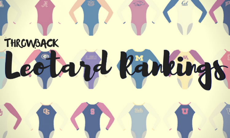
Continuing with the throwback leotard theme, this week we’re taking a look back at the fashion at the 2004 Pac 10 Championship. You are going to love what this meet has in store. We won’t spoil the fun…
The criteria is the same as during the season. But to refresh your memory: up to three points for design; two points for fabric, sparkle, etc.; and two points for school spirit; three points for overall appearance.
Oregon State: 7.8

Caroline
- Design: 2.2/3
- Fabric/Sparkle: 1.3/2
- School Spirit: 1.8/2
- Overall Appearance: 2.1/3
- Total: 7.4/10
This look is SO different from what we see Oregon State wearing nowadays. I love this classic athletic look, though the design is a bit plain, and I’m not a huge fan of the stripes on the sides of the bodice. I do like the color contrast, with the silver to black on the front and back, and just a hint of orange trim. Overall, it’s a solid showing, especially compared to some of the rest of these.
Christina
- Design: 2.4/3
- Fabric/Sparkle: 1.5/2
- School Spirit: 1.9/2
- Overall Appearance: 2.4/3
- Total: 8.2/10
I actually quite like this one. It’s not very flashy or mind-blowing, but the simplicity of the design works well for me, it incorporates all the school colors and the ‘OSU’ in the front, and I like the stripes on the side. I think it does the job, and it’s a nice look overall for the Beavers.
Elizabeth
- Design: 2.4/3
- Fabric/Sparkle: 1.4/2
- School Spirit: 1.7/2
- Overall Appearance: 2.3/3
- Total: 7.8/10
I like this one a lot! It’s very athletic, has just enough sparkle and orange and is a classic look that looks good on all the gymnasts. I like the square neckline as it’s unusual and the OSU on the front is simple but still a good showing of school spirit. Plus, I’m going to pretend the orange stripes on the side are beaver claw marks.
Arizona: 7.45

Caroline
- Design: 1.9/3
- Fabric/Sparkle: 1.5/2
- School Spirit: 1.6/2
- Overall Appearance: 1.8/3
- Total: 6.8/10
There’s a way to do the split color design, and there’s a way not to do it. This particular design chosen by Arizona is only somewhat effective when the color on the lighter half is visible. Thanks to the lower quality of the broadcast video, it’s nearly impossible to tell that there’s red sparkle on that until the very end of our clip, when the camera finally zooms in on the gymnast. The slashes/stripes are kind of a cool idea, especially with the Wildcats being Arizona’s mascot, but overall this one just feels a bit off to me.
Christina
- Design: 2.3/3
- Fabric/Sparkle: 1.7/2
- School Spirit: 1.7/2
- Overall Appearance: 2.4/3
- Total: 8.1/10
I think I like this one. The velvet and mesh work well together, and I’m really digging the red stripes along the deep navy velvet. Great colors, and points for school spirit. The ‘Cats’ on the arm is another nice addition. The mesh is sparkly enough to make the leo stand out. The one small issue I have with this one is the mesh on the front that is a bit too low on the chest.
Elizabeth
- Design: 1.7/3
- Fabric/Sparkle: 1.1/2
- School Spirit: 1.5/2
- Overall Appearance: 1.8/3
- Total: 6.1/10
I like that this uses both blue and red, but I wish there was less blue (or maybe a brighter blue used) and more red. There’s something about the leo I just don’t love. I wish it was brighter and more fun? It’s kind of muted right now and meh to me.
Washington: 6.766

Caroline
- Design: 2/3
- Fabric/Sparkle: 1.3/2
- School Spirit: 1.4/2
- Overall Appearance: 2.1/3
- Total: 6.8/10
The asymmetrical design is actually kind of cool, and I like the contrast between the mesh and the bodice fabric (is that velvet I spy?). But other than the white flower petal-type things at the neckline, this design is a bit plain, and in the lower-quality footage, it’s hard to tell that it’s purple versus like a navy blue.
Christina
- Design: 1.8/3
- Fabric/Sparkle: 1.9/2
- School Spirit: 1.6/2
- Overall Appearance: 2/3
- Total: 7.3/10
I am torn on this one. On one hand, I LOVE the shade of purple of both velvet and mesh fabrics, and I like that the mesh sparkles. I think I can live with the asymmetrical design even though it’s not my favorite. But the random white ‘leafs’ on the front are just… so random. It kind of ruins the whole look for me. Without them, I definitely would have said the leo is missing something, but I am not a fan of them being here either.
Elizabeth
- Design: 1.7/3
- Fabric/Sparkle: 1.2/2
- School Spirit: 1.5/2
- Overall Appearance: 1.8/3
- Total: 6.2/10
Is this deep purple or black? I guess since Christina says purple, I’ll go with that. Anyway, I think this leo is fine but kind of boring for my taste. The design on the front is weird and too random (I don’t get what it’s trying to be), but the purple is nice and I like the different use of fabrics.
California: 6.1

Caroline
- Design: 1.6/3
- Fabric/Sparkle: 1.1/2
- School Spirit: 0.5/2
- Overall Appearance: 2/3
- Total: 5.2/10
Okay, so this only gets school spirit points because of how often we’ve seen Cal wear a generic dark blue/black leotard. It’s almost as bad as UCLA that I’d say that Cal is almost “known” for it. (Hint hint, wink wink, let’s fix that this year?) I like the classic look and the transition between mesh and solid fabric, but this is far too plain for my taste. Too blah.
Christina
- Design: 2.2/3
- Fabric/Sparkle: 1.4/2
- School Spirit: 1/2
- Overall Appearance: 2.1/3
- Total: 6.7/10
This is lovely, although a bit too simple for me. The design overall looks nice, and it still is one we see nowadays. I like the sparkly sweetheart neckline and the mesh V in the back. The sparkly cuffs are nice as well. I do wish this leo incorporated some more gold, or more school spirit in the way of a logo… just something to make it pop and stand out more.
Elizabeth
- Design: 1.8/3
- Fabric/Sparkle: 1.3/2
- School Spirit: 1.4/2
- Overall Appearance: 1.9/3
- Total: 6.4/10
I like this fine, but it’s very plain. The shade of blue is nice and there’s a good definition between the sleeves and body. I do like the little bit of sparkle on the neckline but I just need something more. Maybe some more gold sparkles on the arms or body or something?
UCLA: 4.6

Caroline
- Design: 1.7/3
- Fabric/Sparkle: 1/2
- School Spirit: 0.3/2
- Overall Appearance: 2/3
- Total: 5.0/10
So the only way this earns any school spirit is because it’s always impossible to tell that a UCLA leo actually belongs to UCLA. The white and black swirl/zebra thing is definitely a departure from the norm, too, which we should always expect from UCLA. I actually don’t hate it as much as I thought I would, though it is a bit odd, and I could use some more sparkle on the plainer parts of the bodice. But it actually looks decent on camera and in motion, so I’m not terribly opposed.
Christina
- Design: 1.6/3
- Fabric/Sparkle: 0.8/2
- School Spirit: 0/2
- Overall Appearance: 1.5/3
- Total: 3.9/10
If you had shown me this without telling me who it was, I would have never guessed in a million years that this was UCLA. This is so unlike the Bruins, and there is really non school spirit on this one. The whole look is a bit too dark for my taste, even though I of course love the use of velvet. Now for the super shiny, silvery, zebra-like fabric… No thanks. The symmetrical design between the front and back is pleasing although simple, and I like the keyhole in the back. Anyways, I am overall not a fan of this one because this is not UCLA.
Elizabeth
- Design: 1.6/3
- Fabric/Sparkle: 1.1/2
- School Spirit: 0.5/2
- Overall Appearance: 1.7/3
- Total: 4.9/10
UCLA, despite never really having a ton of school spirit, does have a signature style and this is definitely not it. If you didn’t know this was UCLA, you’d have no idea. It’s not bad, it’s just not that great either. The zebra design is kind of cool but I don’t love it, and the leo as a whole is a bit dark for me.
Stanford: 4.266

Caroline
- Design: 0.7/3
- Fabric/Sparkle: 0.8/2
- School Spirit: 1.1/2
- Overall Appearance: 2/3
- Total: 4.6/10
Stanford. What are you doing? There literally is no design here. It’s a little Stanford logo on the hip of a plain, shiny black leotard. The open back is nice looking, but completely without function. This is just a mess. Not the worst mess, but definitely not great.
Christina
- Design: 1/3
- Fabric/Sparkle: 0.4/2
- School Spirit: 0.6/2
- Overall Appearance: 1.1/3
- Total: 3.1/10
Stanford was way ahead of UCLA in terms of open back leos, uh? I think I remember Stanford bringing this one back not too long ago, and even then I was like… why? This almost like pleather a la Cat Woman, but this just doesn’t work. The front is boring, no school color, no nothing… But it does make sense if you’re going to go all out (literally) in the back. I don’t find the overall look flattering at all, and I feel like the high neck makes them look even shorter. School spirit is non-existent except for a small “Stanford” on the hip.
Elizabeth
- Design: 1.3/3
- Fabric/Sparkle: 1.3/2
- School Spirit: 1.3/2
- Overall Appearance: 1.2/3
- Total: 5.1/10
Oh Stanford… At least we know now where the catwoman bodysuit came from that the team wore a couple years ago. I actually quite like the back. But the high neck and all black with nothing else on it is way too boring to me. You have another school color—heck, your mascot is named after that color—use it!
Arizona State: 4.033

Caroline
- Design: 1/3
- Fabric/Sparkle: 0.5/2
- School Spirit: 2/2
- Overall Appearance: 1/3
- Total: 4.5/10
WOW. Talk about bold. The pitchforks, the flames, the different colored sleeves, the overly shiny gold… there is way too much going on here and almost none of it is good. I have to give ASU props on its school spirit though – that is the most spirited leo I have ever seen. I do like the color contrast with the white, gold and black, and it actually seems to broadcast decently from far away, so it gets a few bonus tenths for overall appearance. Still, just… what do you even say about something like this?
Christina
- Design: 0.2/3
- Fabric/Sparkle: 0.8/2
- School Spirit: 1.9/2
- Overall Appearance: 0.2/3
- Total: 3.1/10
Oh. My. God. Thankfully I wasn’t drinking at the time I first saw this leo because I definitely would have made a mess spitting it out and choking laughing. This is so bad, it’s amazing. First of all, I am LIVING for the literal flames and gigantic pitchfork all over this leo. Second of all, WHAT ARE THOSE SLEEVES? It’s like a rat chewed through them. Or the Devil, I guess. And they aren’t even the same color! I am screaming laughing. It wouldn’t have been as bad if the sleeves had been… “normal”, but this is just a hot mess. I guess points for school spirit and uniqueness, but good lord at what price?!
Elizabeth
- Design: 0.6/3
- Fabric/Sparkle: 1.2/2
- School Spirit: 1.9/2
- Overall Appearance: 0.8/3
- Total: 4.5/10
Oh. My. God. This is brilliant and ugly and fantastic and hideous all at the same time. First impressions: The arms look like a ratty T-shirt that’s been ripped up for a Halloween costume mixed with a tape job you’d use for a hurt elbow. Plus, on top of that one’s white and one’s gold? AND there’s flames and a pitchfork?! I think if the sleeves were solid, this would actually be a semi-decent leotard but there’s all those unnecessary holes…
Have a throwback meet you want us to judge? Stick it in the comments or hit us up on Twitter, and we’ll try to get to it in the coming weeks!
Article by Elizabeth Grimsley, Christina Marmet and Caroline Medley