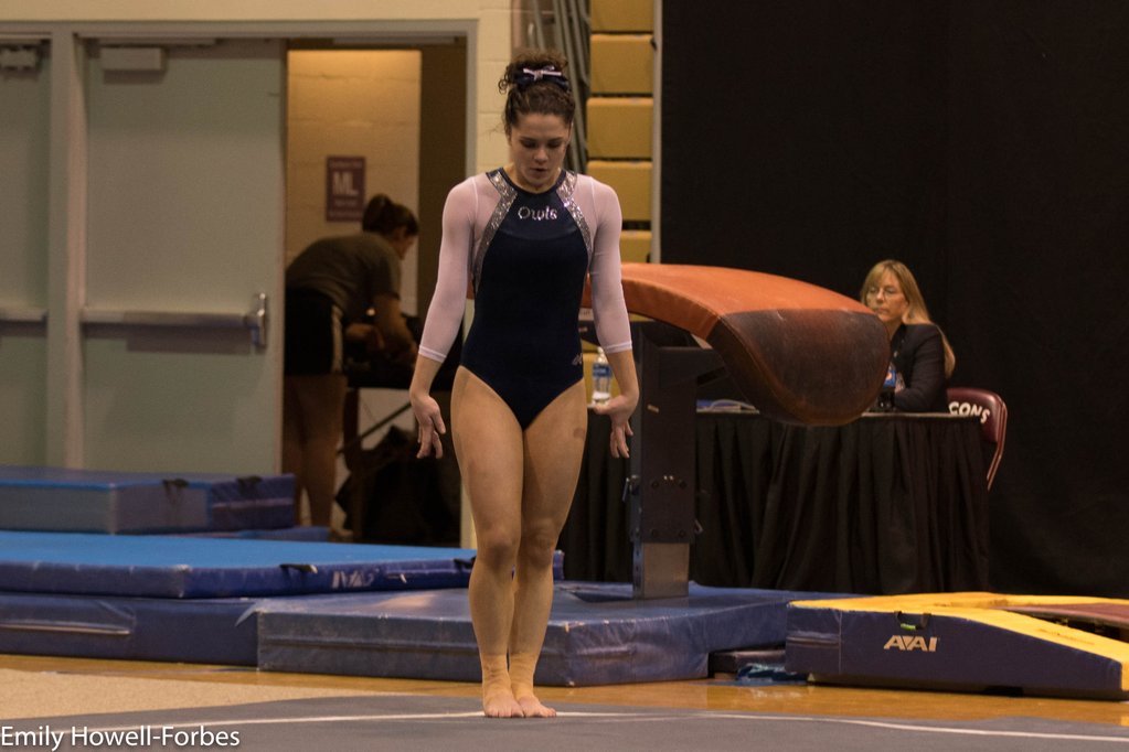
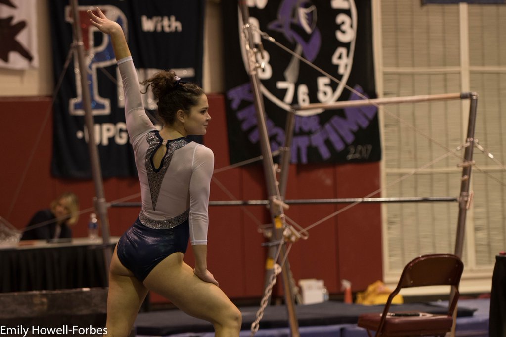
By Elizabeth Grimsley, Caroline Medley and Christina Marmet
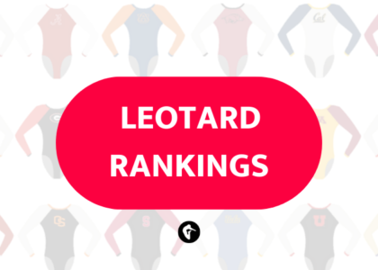
We couldn’t let the season end without taking a look at the great leotards showcased at USAG Collegiate Nationals a couple weeks ago! Which team has our favorite from Seattle? The criteria is the same as always. But to refresh your memory: up to three points for design; two points for fabric, sparkle, etc.; and two points for school spirit; three points for overall appearance. After assigning points to each category, we’ll tally up the scores and average them with the previous week’s. So by the end of the season, we’ll know for sure which team has the best leotards (according to us) and which teams not so much. We want to know what you thought too (or if we forgot one of your favorites from this weekend)! Let us know in the comments below or on Twitter. And make sure to vote in our poll at the bottom of the page to make your opinion heard in the fan vote, new this season.
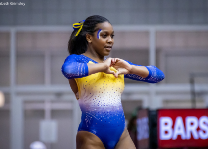
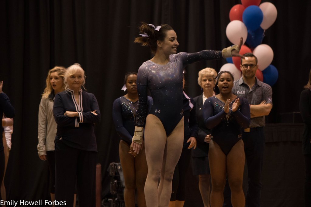
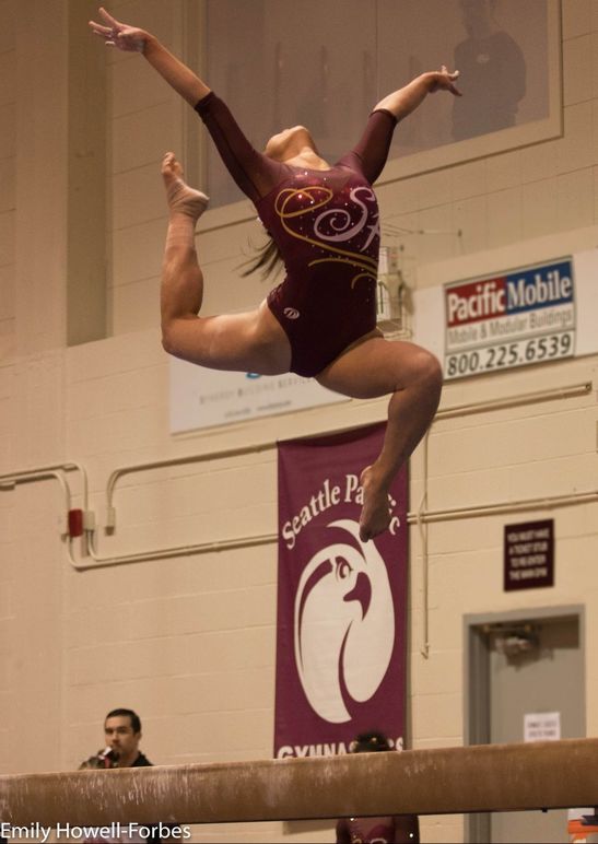
All photos are courtesy of Emily Howell-Forbes/@emilykhf.
|
Caroline
Design: 2.4/3 Fabric/Sparkle: 1.7/2 School Spirit: 1.4/2 Overall Appearance: 2.5/3 Total: 8.0/10This is lovely! The grey ombre is very classy, and the sparkle cascade is a super elegant touch. I don’t know if it’s included on the back, but I would have liked to see some more school spirit in there, a big Y or Yale or something. Other than that, I honestly have no complaints, this is gorgeous! |
Christina
Design: 2.3/3 Fabric/Sparkle: 1.5/2 School Spirit: 1.6/2 Overall Appearance: 2.5/3 Total: 7.9/10I usually don’t like grey, but this is actually lovely. I like the shiny ombre although I wish it continued further down to give this leo a less dark look. I love the sparkles on the sleeves and along the neckline. A clean look overall. |
Elizabeth
Design: 2.6/3 Fabric/Sparkle: 1.7/2 School Spirit: 1.7/2 Overall Appearance: 2.7/3 Total: 8.7/10Love! Best leo of the weekend! I love the shiny ombre and the sparkle added to it to make it even more blinged out.I also like the “Yale” in rhinestones on the hip. I do wish the ombre went a bit further down but then that might look awkward on the chest? Overall, though, it’s a great one! |
|
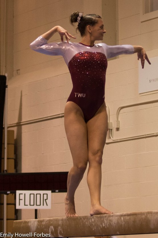
Caroline
Design: 2.2/3 Fabric/Sparkle: 1.5/2 School Spirit: 1.8/2 Overall Appearance: 2.1/3 Total: 7.6/10Lovely sparkle on the front, big giant Texas on the back! What’s not to love? That said, I would’ve preferred the sleeves to be mesh rather than the shiny white, and a full sweetheart I think would’ve complimented the design much better. Overall a solid showing from TWU! |
Christina
Design: 2/3 Fabric/Sparkle: 1.5/2 School Spirit: 2/2 Overall Appearance: 2/3 Total: 7.5/10Bahah I am obsessed with the Texas shape on the back. This is soooooooo Texas too. All the points for school spirit. Other than that, it’s a fairly simple leo, and the front is just very bland. I wish the neckline were different, maybe with a V or a sweetheart. It would make it more lovely to me. |
Elizabeth
Design: 2.3/3 Fabric/Sparkle: 1.4/2 School Spirit: 1.8/2 Overall Appearance: 2.3/3 Total: 7.8/10The giant “Texas” shape on the back is my everything. Yeah, it’s a little big, but everything is bigger in Texas, right? I also like that it kind of looks like a cutout/hole since it’s the same shimmery white color but also isn’t? Plus, I’m always a fan of that red color. |
|
|
|
|
Caroline
Design: 2.2/3 Fabric/Sparkle: 1.4/2 School Spirit: 1.1/2 Overall Appearance: 2/3 Total: 6.7/10So I like this design even less in monochrome. The back is fun, but I feel like it doesn’t really match the front? I don’t recall if I said that when LSU wore their design like this but the back and front honestly look like two different leos to me. Also, the black and white is very blah for a national championship! |
Christina
Design: 2.3/3 Fabric/Sparkle: 1.5/2 School Spirit: 1.3/2 Overall Appearance: 2.4/3 Total: 7.5/10Well, I’m having deja-vu over here. Did they raid LSU’s closet and hoped the leos would bring in the same scores? Ok seriously, I already liked this one on LSU, so my opinion hasn’t changed. I wish the front did have a little more oomph to it, but other than that it’s nice. |
Elizabeth
Design: 2.5/3 Fabric/Sparkle: 1.8/2 School Spirit: 1.6/2 Overall Appearance: 2.4/3 Total: 8.3/10So this is literally an LSU leo, but it’s an LSU leo I really like so I’m all for a “smaller” school having it and really going all out with the bling. If you’re a team that only has one or two leotards, might as well make them really stunning, right? Maybe I would have prefered it being slightly different from LSU so it wasn’t an exact copycat, but overall I like it. |
|
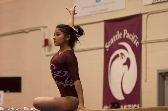
Caroline
Design: 2.4/3 Fabric/Sparkle: 1.5/2 School Spirit: 1.7/2 Overall Appearance: 2.5/3 Total: 8.1/10This is gorgeous! I don’t mind the swirl on the front, because it’s actually part of the underline for the whole script design. I love that they made SPU the actual design rather than just a small tribute somewhere like most teams, and the colors and the mesh really compliment each other well. My only complaint would be that I want more sparkle! |
Christina
Design: 2/3 Fabric/Sparkle: 1.4/2 School Spirit: 1.8/2 Overall Appearance: 2/3 Total: 7.2/10I like this! The way “SPU” is incorporated with the other swirls works really well.I am not a fan of the golden boob swirl though. The sweetheart neckline looks lovely, although I would have liked a tad more sparkles around it. A nice look overall. |
Elizabeth
Design: 1.8/3 Fabric/Sparkle: 1.4/2 School Spirit: 1.7/ Overall Appearance: 1.9/3 Total: 6.8/10I like how “SPU” is incorporated on this leo. The red color is also nice and the mesh sleeves plus subtle sweetheart neckline is a good added touch. I don’t really like the random gold swirly on the boob but it gets that other school color in so good job? |
|
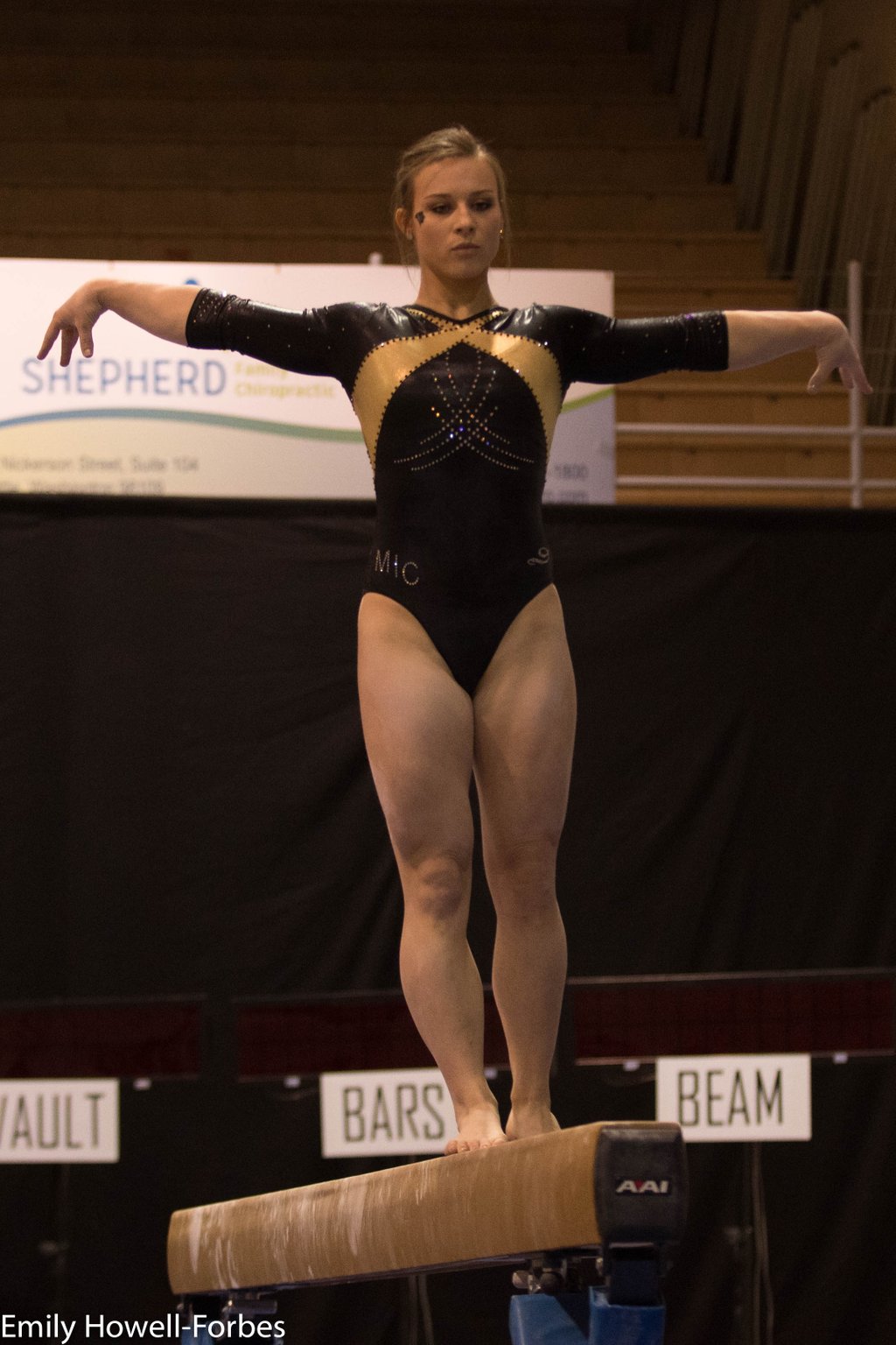
Caroline
Design: 2.2/3 Fabric/Sparkle: 1.4/2 School Spirit: 1.3/2 Overall Appearance: 2.1/3 Total: 7.0/10This is quite elegant! I love the way the sparkles and the gold are inverted from each other, almost mirror images. I’m not super crazy about the neckline, the way it crosses around the neck almost like a collar. I think that’s a school logo on the hip opposite the MIC? It’s totally cut off but there’s something there. Wish I could see it to judge it! Overall, a nice understated look, but for nationals, I almost expect more! |
Christina
Design: 1.5/3 Fabric/Sparkle: 1/2 School Spirit: 1.6/2 Overall Appearance: 1.7/3 Total: 5.8/10This is alright, but I KNOW Lindenwood has much better leos than this. This is a bit underwhelming for nationals. It is a simple and athletic look, but this one also severely lacks in sparkles. A bit disappointed about this one, I have high expectations from LU now. |
Elizabeth
Design: 2.0/3 Fabric/Sparkle: 1.3/2 School Spirit: 1.6/2 Overall Appearance: 2.1/3 Total: 7.0/10I’d actually never seen this Lindenwood leo before, which surprised me. I don’t like it as much as some of the team’s other designs but it’s still nice and actually looks quite good on the gymnasts. The gold design creates an athletic look and there’s not too much sparkle design going on. |
|
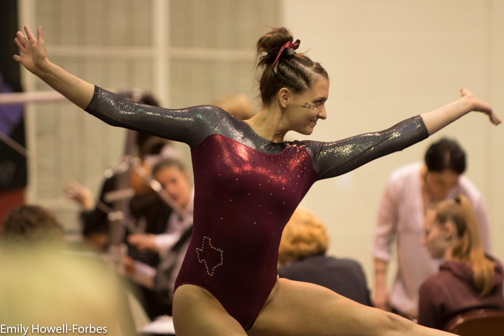
Caroline
Design: 1.8/3 Fabric/Sparkle: 1.2/2 School Spirit: 1.6/2 Overall Appearance: 1.4/3 Total: 6.0/10At first glance I loved this, but then I looked closer. The red is asymmetrical on the front, and in the worst way possible. The right shoulder kinda has a little bump in the armpit there, and I don’t even know what the idea was with the left shoulder. It almost looks like it connects to the back, but then the picture of the back shows no red connecting there. Great points for school spirit but otherwise a bit baffling. |
Christina
Design: 1.3/3 Fabric/Sparkle: 1/2 School Spirit: 2/2 Overall Appearance: 1.3/3 Total: 5.6/10More Texas shape! WIN! Unfortunately, that’s the only thing I like about this one. As you’ve learned this season, I have a very hard time liking anything grey, and here is no exception. I’m not really a fan of the red in the front that looks like it’s going over the left shoulder? It’s an odd neckline, and I’m not sure what’s happening there. But the biggest turnoff on this leo for me is the color combination. |
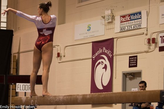
Elizabeth
Design: 2.0/3 Fabric/Sparkle: 1.7/2 School Spirit: 1.9/2 Overall Appearance: 2.4/3 Total: 8.0/10This was my favorite of the two TWU leos. It’s got the nice red color, shiny silver, the state of Texas, the letters TWU and sparkle—basically everything I like. Although I do wish the neckline was different. It’s just weird. |
|
Caroline
Design: 1.7/3 Fabric/Sparkle: 1.3/2 School Spirit: 1.5/2 Overall Appearance: 1.5/3 Total: 6.0/10So we have a couple schools now that have this design, and all I can say is… what? Florida’s isn’t as bad because the two colors aren’t as contrasting, and they made it so the bodice and arms were the same color, but this one does not do that and it’s so jarring! I don’t understand the placement of the yellow at all. The mesh sleeves are nice, but I just wish the rest of the design was purple too, without any of the yellow thrown in. The sparkle is nice though? |
Christina
Design: 1.3/3 Fabric/Sparkle: 1.5/2 School Spirit: 1.5/2 Overall Appearance: 1.7/3 Total: 7.0/10I quite like this one, I think mainly for the color combination. I love this shade of solid purple, the purple mesh and the yellow. I also like how the sparkles are arranged. That said, I agree with Elizabeth in that it’s not a flattering design. I feel like we’ve seen this one on other teams, and I told myself the same thing. So yay on the fabric and sparkles, but nay on the design for me. |
Elizabeth
Design: 1.2/3 Fabric/Sparkle: 1.3/2 School Spirit: 1.6/2 Overall Appearance: 1.6/3 Total: 5.7/10I’ve always thought this design isn’t all too flattering on anyone. It kind of makes the gymnasts look wider than they are? Even the Florida leo that’s the same. But I do like how both school colors were incorporated and the yellow wasn’t too overpowering. Plus, the purple mesh sleeves are really nice. |
|
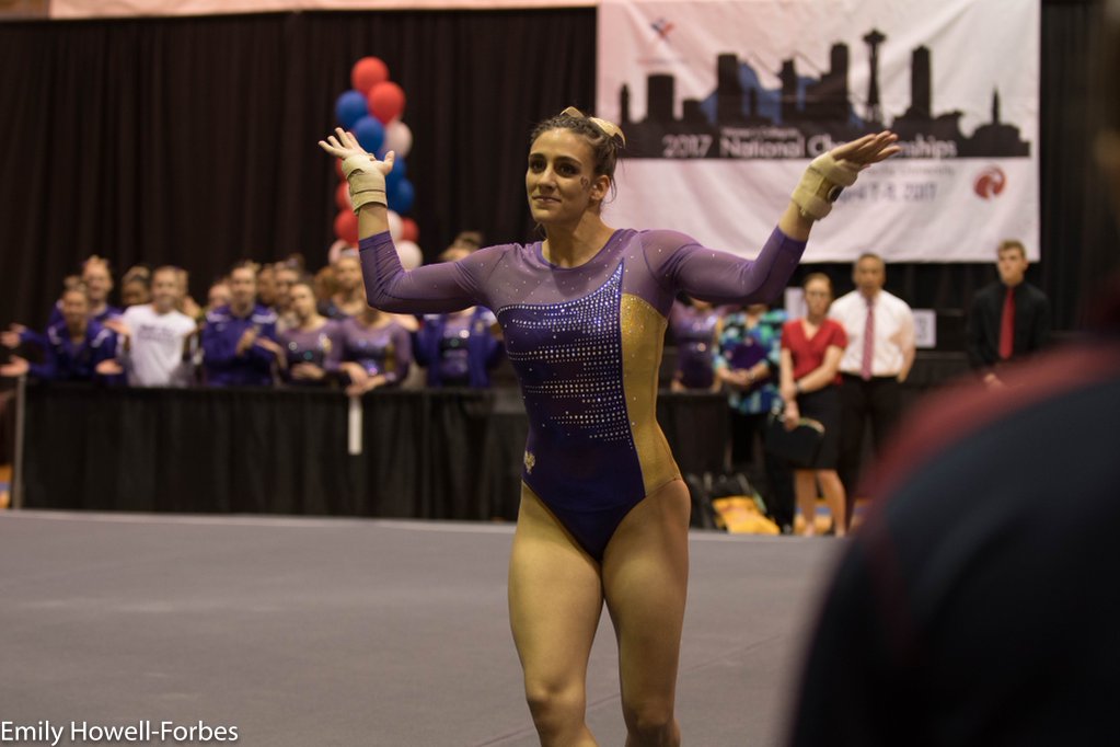
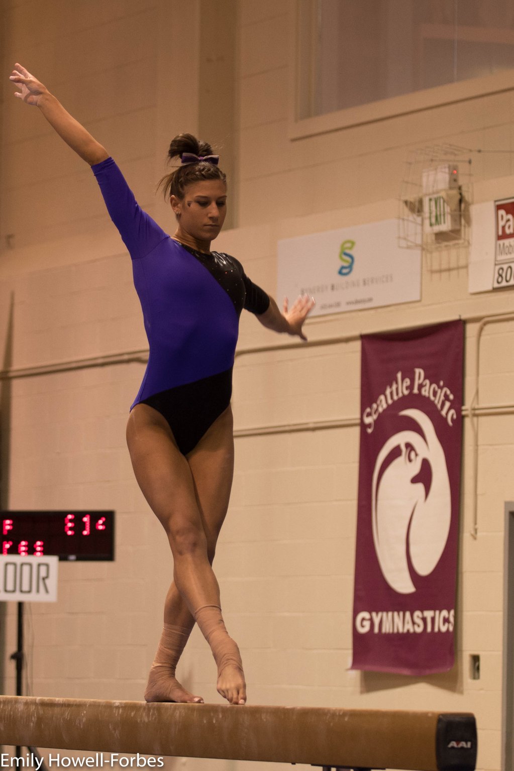
Caroline
Design: 1.7/3 Fabric/Sparkle: 0.8/2 School Spirit: 1.4/2 Overall Appearance: 2/3 Total: 5.9/10I kinda love the design itself, but it feels half-baked. The diagonal is really cool, but there needs to be more to it for it to really work. Sparkle would absolutely help, or some kind of design on the purple section. That said, I think it’s a flattering design, and it’s definitely different! |
Christina
Design: 1/3 Fabric/Sparkle: 0.5/2 School Spirit: 1.2/2 Overall Appearance: 1.3/3 Total: 4.0/10This is bland, and severely lacks in sparkles. The design has potential, but it wasn’t really executed well (again, SPARKLES). I like this shade of purple, but it doesn’t blend too well with the black there. Meh overall. |
Elizabeth
Design: 1.2/3 Fabric/Sparkle: 1.1/2 School Spirit: 1.5/2 Overall Appearance: 1.8/3 Total: 5.6/10Hmm. This reminds me of one of those wrap dresses that I’m not a fan of. The blend between purple and black is basically nonexistent, but I do like the color of purple used. This just needed more sparkle, a better blend and a touch more school spirit. |