
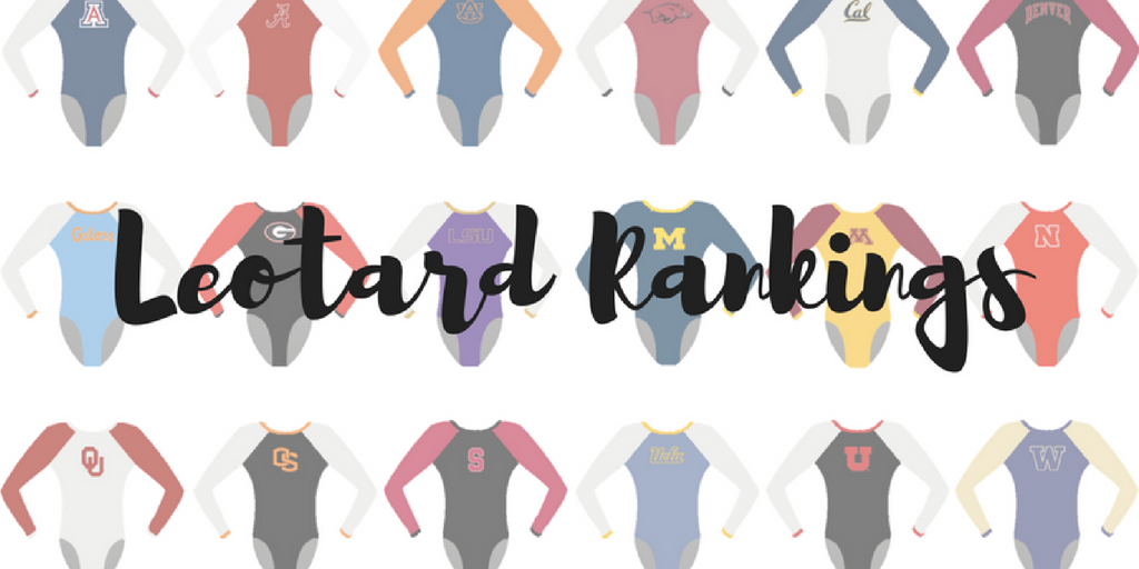
By Elizabeth Grimsley, Christina Marmet and Caroline Medley
Today’s leo! ✨ pic.twitter.com/I1HURhfseP
— Oklahoma Women’s Gym (@OU_WGymnastics) March 18, 2017
|
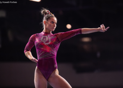
Caroline
Design: 2.6/3 Fabric/Sparkle: 2/2 School Spirit: 1.6/2 Overall Appearance: 2.3/3 Total: 8.5/10I’m in LOVE with this! It looks like real ornate lace that someone would’ve worn on a ballgown back in like the French royal court or that a bride would have on her wedding dress. I’m like foaming at the mouth I want one so badly. Leotard fit for a queen (which Chayse Capps absolutely is). However, I suppose I do have to admit that on broadcast you can’t see it very well, especially from a distance, and it can get a little busy. So I guess I have to take points for that. |
Christina
Design: 2.1/3 Fabric/Sparkle: 1.8/2 School Spirit: 1.5/2 Overall Appearance: 2.4/3 Total: 7.8/10 Well, unlike Elizabeth I haven’t seen this one in person so alas, I’ll judge with what I have. Unfortunately, I’m very torn here. It’s just so. busy. It reminds me of like… an old tapestry covered in sparkles. Or some fine porcelain china pattern. I really can’t get myself to like it when I see it in pictures like this. However, it looked wonderful on TV. I mean, the girls were so sparkly you HAD to look at them, which I am 100-percent sure is what KJ intends to when she designs a leo. I really like all the glitters in the front and the patterns they create, but overall this is just way too busy. That said, it is just such a unique and “statement” look and like nothing we’ve seen before, so kudos for that. Anyways, I’m not a fan of it in pictures, but it looks nice in motion. |
Elizabeth
Design: 2.8/3 Fabric/Sparkle: 1.9/2 School Spirit: 1.7/2 Overall Appearance: 2.8/3 Total: 9.2/10 Guys. You can’t judge this leotard properly without first seeing it in person. It. Is. Stunning! And so incredibly sparkly that I couldn’t even tell what the design WAS until I took a picture of it. I love the faux lace/doily/fine china look. This is definitely the look for a championship team. It’s obviously an Oklahoma leotard but also different from what it normally does. I love love LOVE it! |
|
Caroline
Design: 2.3/3 Fabric/Sparkle: 1.4/2 School Spirit: 1.8/2 Overall Appearance: 2.1/3 Total: 7.6/10 Another non-obnoxious way to incorporate this very tricky flag design. I definitely like it, but I feel like it would have been more effective had it not been faded by the way the stoning was done? I like the warmup version’s flag section better, personally. Solid showing from Towson though! |
Christina
Design: 2.5/3 Fabric/Sparkle: 1.6/2 School Spirit: 2/2 Overall Appearance: 2.6/3 Total: 8.7/10 This is super cool. I love that they incorporated the calvert flag onto this leo, as it’s such a great way to show school spirit. The design overall is quite lovely, although I could have gone without the random white coloring on the sides, and I would have added a band of gold alongside the neckline in the back to match the front. Other than that, it really looks great! |
Elizabeth
Design: 2.7/3 Fabric/Sparkle: 1.8/2 School Spirit: 2/2 Overall Appearance: 2.6/3 Total: 9.1/10I love this! It’s so unusual and bursting with school pride. And I love that the arm design is made exclusively of sparkle and rhinestone and not fabric like most. The white sheen is great and the side coloring makes the gymnasts’ figure look great. |
|
Caroline
Design: 2.3/3 Fabric/Sparkle: 1.8/2 School Spirit: 1.7/2 Overall Appearance: 2.3/3 Total: 8.1/10 The real star here is the sparkle. What Bama knows how to do really well with leos is use sparkle to focus a fan’s eye on the places they want it. The A logo, the Bama on the sleeve, and the gorgeous V neckline are central components of this design that really stand out because of the way in which they are bedazzled. I would love to see Bama try accenting with something other than white, because that’s what they always do, and there are a few too many bands of trim for me up top. Other than that, this is an excellent showing. |
Christina
Design: 2.6/3 Fabric/Sparkle: 1.6/2 School Spirit: 1.9/2 Overall Appearance: 2.6/3 Total: 8.7/10 This is quite a nice look, although I feel like it also still remains in the same sort of style that we are used to seeing Bama in. At first, I thought the front almost looked like a superhero mask like Wolverine or Batman. But once I got past that, I actually really liked it. The back is lovely as well. Anyway, I like this one, although all these crimson leos are starting to blend in together for me. |
Elizabeth
Design: 2.6/3 Fabric/Sparkle: 1.6/2 School Spirit: 1.7/2 Overall Appearance: 2.6/3 Total: 8.5/10 I really like the design on this one. It’s a top Alabama leo for me for sure. The crimson color is also lovely and there’s just enough white on there. I like the Bama on the sleeve adding to the school spirit and the Script A in reverse sparkle. Overall, it was one of the better, if not the best, new leo at SECs in my opinion. |
Look back at our night at the SEC Championship.
PHOTO GALLERY: https://t.co/m6ZM0iDtSW pic.twitter.com/R0PhJ2QMgY
— Kentucky Gymnastics (@UKGymnastics) March 19, 2017
|
Caroline
Design: 2.3/3 Fabric/Sparkle: 1.6/2 School Spirit: 1.4/2 Overall Appearance: 2.1/3 Total: 7.4/10 This is one of those where I love the front and can’t decide on the back. The front design is gorgeous, it has the whole package. Ombre, sparkle, faux necklace, team colors and logo, the whole nine yards. The back cutouts are not my favorite, but they are nowhere close to as bad as some teams have done with their back cutouts this year, so I feel like I can’t really complain? Good, not great. That’s all I’ve got here. |
Christina
Design: 2.5/3 Fabric/Sparkle: 1.6/2 School Spirit: 1.8/2 Overall Appearance: 2.5/3 Total: 7.9/10 I really loved this one when I first saw it on TV! The sweetheart neckline in the front is lovely, and I am obsessed with this shade of ombre. I also LOVE the subtle ombre on the mesh sleeves. Perfect. The back is rather unique, and I like that pattern as well. Another nice one for Kentucky! |
Elizabeth
Design: 2.4/3 Fabric/Sparkle: 1.5/2 School Spirit: 1.7/2 Overall Appearance: 2.5/3 Total: 8.1/10 I loved this one! I like the black/blue ombre combo and the sparkle is just enough. I like the back design, too, as it’s unique. But it’s not my favorite. But bonus points for being unusual. |
Check out our brand new look□□□□□Warm-up and competition leo for the 2017 MAC Championships! #chirpchirp pic.twitter.com/6L0zMeA7hF
— BallState Gymnastics (@BallStateGYM) March 18, 2017
|
Caroline
Design: 2.1/3 Fabric/Sparkle: 1.3/2 School Spirit: 1.7/2 Overall Appearance: 2.1/3 Total: 7.2/10 This is another one where I almost like the warmup version better! I do like using the grey instead of a regular black, and the sparkle Vs are nice. But the cardinal sparkle outline goes a bit far, even up onto the raised fabric of the neckline, which looks out of place, and I have no clue what the red on the side is supposed to be or do? |
Christina
Design: 2.3/3 Fabric/Sparkle: 1.4/2 School Spirit: 1.7/2 Overall Appearance: 2.2/3 Total: 7.6/10I like this one! It’s simple yet elegant and school spirit is there. I am usually not a fan of silver leos, but it really does work well here. |
Elizabeth
Design: 2.4/3 Fabric/Sparkle: 1.4/2 School Spirit: 1.8/2 Overall Appearance: 2.4/3 Total: 8.0/10First-off, I love the silver. I also think the bird on the chest is just the right side.The amount of red on the sides is just enough and the sparkles just sparkly enough. Overall, it’s a great one! And the back’s not boring! |
□ Highlights from Auburn’s season-high 196.55 at the SEC Gymnastics Championship #WarEagle pic.twitter.com/nPXJ3dXzCn
— Auburn Gymnastics (@AuburnGym) March 18, 2017
|
Caroline
Design: 2.2/3 Fabric/Sparkle: 1.6/2 School Spirit: 1.8/2 Overall Appearance: 2.2/3 Total: 7.8/10I like this one! The sparkle use is great, I love the sweetheart neckline, and the white trim was a nice touch. A little off in execution on the armbands though, the solid hunk of white cuts off their lines, which can make it look like their arms are disjointed from their bodies. A softer color or a smaller band would help. I also love the War Eagle on the back! |
Christina
Design: 2.2/3 Fabric/Sparkle: 1.3/2 School Spirit: 1.8/2 Overall Appearance: 2.1/3 Total: 7.4/10I like this one. It’s a bit different from what we have seen so far from Auburn, and I really like the back design. The front is more classic with the sweetheart neckline in sparkles and mesh at the top. The transition between the navy blue and the orange is quite abrupt though. The white bands do help with that. All in all, a nice “new” look while still representing Auburn and its colors quite well. |
Elizabeth
Design: 2.3/3 Fabric/Sparkle: 1.3/2 School Spirit: 1.7/2 Overall Appearance: 2.2/3 Total: 7.5/10I like it! It’s still super “Auburn” but also not the same old thing we always seen from Auburn. I like how the orange looks on the girls and the little bit of mesh on the top of the front. The back hole is nice and shows off the gymnasts’ muscles. I also like the white design on the arms. |
GW’s leos actually have George Washington on them if that isn’t team spirit, what is? #ncaagym pic.twitter.com/EJxV3FbkxL
— Alison (@alis0n____) March 12, 2017
|
Caroline
Design: 1.6/3 Fabric/Sparkle: 1.7/2 School Spirit: 2/2 Overall Appearance: 2.2/3 Total: 7.5/10Oh my GOSH I wish we had known last week that this was a thing! I honestly don’t know that combined with how much I like the rest of the design that my score really differs that much, because I like the front design and the colors and such. That being said, y’all. I know he’s your namesake president. But his face does not need to go on your leotard. |
Christina
Design: 1.8/3 Fabric/Sparkle: 1.6/2 School Spirit: 2/2 Overall Appearance: 2/3 Total: 7.4/10I literally screamed when I found out we totally missed the George Washington head in the back of this leo. Here I was praising GW for its lack of hashtag… And here it is putting a dead president onto its leo. Oh GW, you never fail to amaze me. Truthfully, I really am not a fan of it all, but it’s so bad it’s almost hilariously good? It did give us some good laughs, but that said, I still really like the rest of the leo. |
Elizabeth
Design: 2.1/3 Fabric/Sparkle: 1.4/2 School Spirit: 2/2 Overall Appearance: 2.0/3 Total: 7.5/10So we decided we needed to rejudge this GW leotard from last week because we were unaware of a VERY important detail: the back is almost exclusively George freaking Washington. It’s amazing and terrible all at the same time. If I could give over a 2 for school spirit, I totally would. All leotards from now on should feature dead presidents. |
Beautiful beam routine by Zois!! She #sticks the landing and we are off and running in rotation II pic.twitter.com/j3npkS6WTr
— GW Gymnastics Team (@GWGymnastics) March 18, 2017
|
Caroline
Design: 2.1/3 Fabric/Sparkle: 1.5/2 School Spirit: 1.7/2 Overall Appearance: 2/3 Total: 7.3/10I hate to say this but some of the GW leos are running together for me? I dunno, I feel like a lot of them have this diagonal ombre pattern, just slightly differently, and that’s throwing me. That said, I love the detailing on this one, and I appreciate the use of a darker color on the bottom, because that’s always more flattering, and they’ve tended to put the darker colors on top recently. More sparkle por favor, and thank you for leaving the hashtags and dead presidents in the regular season! |
Christina
Design: 2/3 Fabric/Sparkle: 1.4/2 School Spirit: 1.7/2 Overall Appearance: 2.1/3 Total: 7.2/10No George Washington head covering half the back of the leo? I am disappointed. Anyways, I like it from far away, so I guess that’s good. It shines really well and the blue ombre into white is nice. It’s a nice shade. From closer up, I am not a fan of the zebra/tiger pattern going on around the shoulders or whatever is happening there. It’s yet another diagonal-type design for GW though, but it’s still a nice change from all the other blue/yellow ombre we’ve seen this season. |
Elizabeth
Design: 2.2/3 Fabric/Sparkle: 1.4/2 School Spirit: 1.7/2 Overall Appearance: 2.4/3 Total: 7.7/10I think I like it? It’s kind of a feathery design on the arms, which is cool. And it’s a nice color of blue as well. It’s a similar design as we’ve recently come to expect from GW with the diagonal look. But it’s still unusual enough to keep itself from falling into the UCLA/Auburn trap of every leo looking the same. Also, the yellow really pops and shows off the school spirit. |
For the record, it’s gray! #theleotard #pac12gym pic.twitter.com/ynEDPYtpeo
— UCLA Gymnastics (@uclagymnastics) March 19, 2017
|
Caroline
Design: 2.1/3 Fabric/Sparkle: 1/2 School Spirit: 0.8/2 Overall Appearance: 2/3 Total: 5.9/10I appreciate the clarification on the color they gave, but like, you shouldn’t have to tell us what color it is? Also, why grey? I like the change from plain ol’ navy blue but I wouldn’t call it a step in the right direction. I do like the actual design though. The thick criss-cross on the back gives the girls a little more coverage while still looking elegant, and the Xs over the mesh panel in front bring a little charm to the design. Great design, different color please! (Preferably like more than one? Monochromatic only works for so long!) |
Christina
Design: 1.9/3 Fabric/Sparkle: 1.2/2 School Spirit: 0.6/2 Overall Appearance: 1.7/3 Total: 5.4/10Nope. This grey made the girls just blend in with the background on TV. The front design isn’t new as we’ve seen it on one of their blue leos (from the good old Tasha Schwikert era), but it’s nice to see it brought back here. I also do really love the back with the thick crossing, sparkly straps. But gosh that grey… Just no. You’re basically the same color as the chair behind you. Why. Following the same reasoning as last week, school spirit is non existent other than the fact that only UCLA would wear something like this. |
Elizabeth
Design: 2.8/3 Fabric/Sparkle: 1.9/2 School Spirit: 1.6/2 Overall Appearance: 2.8/3 Total: 9.1/10I loooooooved this! It’s TOTALLY a UCLA leo but it’s not like literally every other UCLA leo. The grey looked great on the gymnasts and in motion, and I love that fat strap design on the back. I also liked the front mesh and cross-hatching design as well as the amount of sparkle as a whole—more than a typical UCLA leo but not over the top. |
Breaking out another new leo for EAGL Championships!! #Carolinablue #sparkles □□✨ pic.twitter.com/kuw12b3UuN
— Carolina Gymnastics (@uncgymnastics) March 18, 2017
|
Caroline
Design: 2/3 Fabric/Sparkle: 1.4/2 School Spirit: 1.5/2 Overall Appearance: 2.2/3 Total: 7.1/10Last week UNC had such a great design that this feels a little bit like a letdown. However, that’s not to say I don’t like it. It’s a classic, minimalist look that incorporates yet another school tradition and excellent use of sparkle. I would have liked a touch of white somewhere though, maybe a UNC on the arm? Other than that, just more is what I’m looking for! |
Christina
Design: 1.6/3 Fabric/Sparkle: 1.3/2 School Spirit: 1.6/2 Overall Appearance: 1.9/3 Total: 6.4/10This is lovely but a bit underwhelming for me. I have raised my expectations regarding UNC’s leos this season! I really do like the Carolina blue and the pattern the sparkles make, especially in the back all along the deep V. A clean look, but I am left wanting more. |
Elizabeth
Design: 1.8/3 Fabric/Sparkle: 1.3/2 School Spirit: 1.5/2 Overall Appearance: 2.0/3 Total: 6.6/10 This is a tad underwhelming, but I do love that blue color. However, it’s so bright and vibrant that adding more to the design would make it too busy. I do like the cascade of sparkles on the front and the neckline design is subtle but nice too. |
“That may be her very best ever!”@LSUgym‘s Ashleigh Gnat with a PERFECT □ on vault ➡️ https://t.co/jyvcET0AI3 pic.twitter.com/CxoneQ5UUE
— SEC Network (@SECNetwork) March 18, 2017
|
Caroline
Design: 2.2/3 Fabric/Sparkle: 1.8/2 School Spirit: 1.3/2 Overall Appearance: 2.7/3 Total: 8.0/10Okay so I may be a little biased because I was in New Orleans this weekend for my best friends’ wedding where the primary color was lavender but this is gorrrrgeous. It looked classic and classy on all the girls, it stood out in the arena, it filmed well, and it was different. All big plusses. I obviously could’ve done with some gold, maybe some more sparkle (in the school letters on the back perhaps?), but my biggest thing was the metaphor I saw here. We know how I like metaphors. When a lot of people saw this leo, the immediate question was “why white?” Why not gold or green or even just black? It might just be the wedding mentality speaking, but I answered the question immediately: the use of white here to me was LSU declaring its intent to win. Since the inaugural SEC championship in 1981, which is the last time it won, LSU has always been the bridesmaid and never the bride. It’s come in almost every other place possible from runner-up on down the line, but it hasn’t won in 36 years. This leo was the team’s declaration saying, “we’re the brides this time y’all! This is ours to take!” And I like that. |
Christina
Design: 1.9/3 Fabric/Sparkle: 1.4/2 School Spirit: 1.3/2 Overall Appearance: 2.2/3 Total: 6.8/10This is really lovely and elegant but oh so underwhelming for the freaking SEC Championship! Give me something that pops, with a darker purple and some golds and a ton of sparkles! That said, I really do like the leo in and of itself. I love this lavender shade; it’s almost calming and soothing. I also liked the criss-cross patterns on the front of the leo that the sparkles made. Overall though, it is a bit bland and too simple for LSU and again, for championship season. I expected more from the Tigers! |
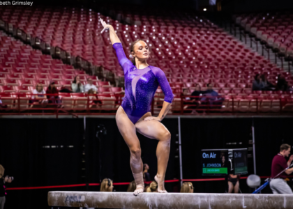
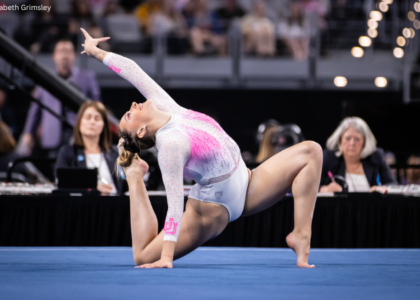
Elizabeth
Design: 1.2/3 Fabric/Sparkle: 1.0/2 School Spirit: 1.2/2 Overall Appearance: 1.6/3 Total: 5.0/10This reminds me of a leotard Kyla Ross wore in her elite days. Or am I making that up? Anyway, it’s so blah to me. The purple mesh color is nice but the white is so plain. This is a leo you’d see in the GK catalogue, not for the SEC Championship of a team that wins said championship. There’s not even that much sparkle to it. Super underwhelming to me and not very “LSU” at all. |
Photo gallery from last night’s SEC Gymnastics Championship, by @tallbrighty and Erin Long #GoGators https://t.co/gpQdoDFriM pic.twitter.com/qxFfFL1BKA
— Gators Gymnastics (@GatorsGym) March 19, 2017
|
Caroline
Design: 2/3 Fabric/Sparkle: 1.5/2 School Spirit: 1.7/2 Overall Appearance: 2/3 Total: 7.2/10 Orange! Finally! Thank you Gators! I love the ombre sleeves, but I don’t really think they go with the rest of the leo? Like yay, we’re getting orange, but there has to be a better way to really incorporate it into a design. Fingers crossed for regionals. I like the little faux necklace and the sweetheart neckline is super nice. Just make the orange more connected next time!! |
Christina
Design: 1.8/3 Fabric/Sparkle: 1.4/2 School Spirit: 1.8/2 Overall Appearance: 2/3 Total: 7.0/10 We are FINALLY getting out of our dark blue rut—thankfully! I am loving the ombre sleeves, and it is a great way to incorporate orange into a leo. They do look a bit off compared to the rest of it, as in they don’t blend in well with the design. The latter is a bit too simple for my own taste and almost underwhelming. I wish the entire upper body had been either mesh or solid white. The back had a lot of potential, and I like what’s there with the big hole and the band across with “Gators” but it seems unfinished compared to the front. Anyways, I still like that look and I am glad to finally see some white and orange again from the Gators. |
Elizabeth
Design: 1.4/3 Fabric/Sparkle: 1.0/2 School Spirit: 1.6/2 Overall Appearance: 1.5/3 Total: 5.5/10I was also underwhelmed by this one. It reminds me a lot of a Boise State leotard rather than a Florida one. I don’t like how the fabric above the neckline is solid while the sleeves are mesh. It makes it look like the sleeves were added as an afterthought. Speaking of afterthought, the orange looks like it doesn’t really go with the rest of the leo. It’s a perfectly good Florida leo and then the gymnasts dipped their hands in orange paint. Eh. |
Highlights from today’s Big Ten Championship #GoBlue https://t.co/mzYqpYO04L
— Michigan Gymnastics (@UMichWGym) March 19, 2017
|
Caroline
Design: 1.9/3 Fabric/Sparkle: 1.3/2 School Spirit: 1.7/2 Overall Appearance: 1.6/3 Total: 6.5/10There’s a moment when the school spirit becomes too much and starts to take away from the overall look of the leo. This is one of those. I feel like I’m being smacked in the face with Michigan pride here, which is sometimes not a terrible thing, but when the design of the leotard itself isn’t as strong, it adds insult to injury. The back hole isn’t universally flattering and it’s placed rather low, and the top M on the front becomes more of a boob stripe and makes some girls look top-heavy. There also seems to be an imbalance in where things are placed – back versus front and torso versus arms, the latter of which may explain the top-heavy illusion. There’s also just not enough sparkle for me! Definitely not my favorite Wolverine leo. |
Christina
Design: 1.7/3 Fabric/Sparkle: 1.3/2 School Spirit: 1.8/2 Overall Appearance: 1.8/3 Total: 6.6/10 This is alright, although it is super redundant with all the M on the front. I actually like the front with the M in the big golden bands, and like I said they probably could have gone without the extra “M” again in sparkles. The back is… okay I guess. The two big gold bands wrapping around and a bit lopsided do kind of bother me because they are just big. Anyways, an okay leo and definitely not one of my favorites from Michigan. |
Elizabeth
Design: 1.6/3 Fabric/Sparkle: 1.3/2 School Spirit: 1.8/2 Overall Appearance: 1.8/3 Total: 6.5/10Hmm. I like the idea behind it, but I don’t think the yellow rhinestone M AND the M in the design on the front were necessary. Pick one or the other. I did like that back hole though but the lopsided yellow band was a bit off putting. Overall, I liked it fine but it wasn’t anything spectacular. |
Tonight’s new leo□□❤️□ #GoDawgs #AsOne #SEC pic.twitter.com/MxWlQ3OQ8w
— Georgia Gymdogs (@UGAGymnastics) March 18, 2017
|
Caroline
Design: 1.8/3 Fabric/Sparkle: 1.3/2 School Spirit: 1.4/2 Overall Appearance: 1.7/3 Total: 6.2/10I don’t hate it? There’s definitely something off about it that I can’t place. The diagonals, the ombre that isn’t really ombre, the way the sleeve doesn’t quiiiite line up with the colors on the bodice… it’s just little things that add up. Add the poor fit in the shoulders and the lack of school identifiers (which is shocking for Georgia) and this one didn’t stand much of a chance. However, that said, I love the galaxy look idea going here. Just, not great execution. |
Christina
Design: 1.2/3 Fabric/Sparkle: 1.1/2 School Spirit: 1.3/2 Overall Appearance: 1.4/3 Total: 5.0/10Ugh, no. At first I only saw it from far away since the Gymdogs started out on floor, but once we got a few closeups on vault, I was just like “nope”. The part that bothers me most is at the shoulders where it looks like the leos just don’t fit the girls and it’s all bunched up! It made it look like the leos were too big and unfitted for some like Morgan Reynolds and Gigi Marino. Moreover, I am not a fan of the colors chosen, especially the greyish/black in the upper body. Finally, I bugged that the diagonal design just “cuts” the chest area, and it doesn’t create a flattering look. One of my least favorite leos from this weekend. |
Elizabeth
Design: 1.8/3 Fabric/Sparkle: 1.5/2 School Spirit: 1.5/2 Overall Appearance: 2.0/3 Total: 6.8/10So I liked where this was trying to go. It’s ombre, but it’s not like every other ombre leo we see. However, the diagonal design looks weird, and as a whole, it doesn’t look much like a Georgia leo. It’s fine but I’m not obsessed with it like I thought I would be when I saw the sneak peek on Snapchat. |
Elizabeth, Christina, and Caroline, I’m a huge fan of your blog, “Leotard Rankings”! I started sharing your rankings with my teacher friends at lunch, and now it is a weekly lunchtime ritual. (We will miss you guys when the season is over.) Can you explain why UCLA wears drab leos? Most of their competition-wear looks like they are taking their inspiration from the “mother of the bride” collection at David’s Bridal. I just don’t get it. :/
Thank you so much! We appreciate this more than you know and are so happy you and your friends enjoy the leotard feature each week!
As for UCLA, we’re just as confused as you are! Who even knows what goes on in the mind of Miss Val haha