
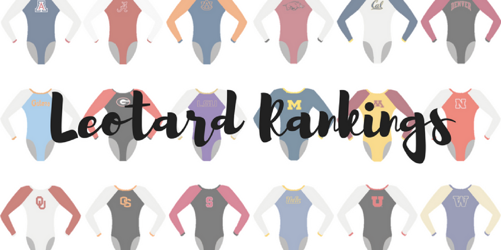
By Elizabeth Grimsley, Christina Marmet and Caroline Medley
Today’s Leo is stunning! 〽️❤ pic.twitter.com/meRpeWWNfV
— Rachel Haines (@Rae_Haines) February 26, 2017
|
Caroline
Design: 2.7/3 Fabric/Sparkle: 1.9/2 School Spirit: 1.6/2 Overall Appearance: 2.7/3 Total: 8.9/10At the Florida meet, I thought for sure they’d be the winners, but then Christina sent us a picture of this, and I fell in love. I know I normally don’t like the swirlies, but these are very clearly not random. It’s almost like a burst of power or magic from one corner and overtaking the gymnast’s body. I’m probably reading way too much into that but I’m a metaphor person, so sue me. The use of sparkle accentuating the curves that the squigglies draw is again very sophisticated, much like Florida’s, and the ombre sleeve is a very nice touch. The gorgeous contrast between the red and yellow just totally seals the deal for me. My only criticism is that I’d love an M or a Gophers somewhere on it—the sleeve maybe? |
Christina
Design: 2.7/3 Fabric/Sparkle: 1.8/2 School Spirit: 1.8/2 Overall Appearance: 2.8/3 Total: 9.1/10This is gorgeous! I love everything about this leo… The shade of red and the golden swirls, the ombre sleeves, AND the ombre in the back is just so subtle and beautiful. Perfect amount of sparkles too. I can’t find anything I dislike about this one. |
Elizabeth
Design: 2.8/3 Fabric/Sparkle: 1.8/2 School Spirit: 1.8/2 Overall Appearance: 2.8/3 Total: 9.2/10LOVE. This is how you do yellow. There’s just enough of it on this leo with the ombre arms and front design. And I love it paired with the crimson. And adding in the touch of white to the ombre adds the extra dimension that puts it over the top. I also like how the design on the body of the leo on the front and back are off center. Ahh love this one so much!! |
Today’s leo! ✨ pic.twitter.com/l9fUz6e6Qq
— Oklahoma Women’s Gym (@OU_WGymnastics) February 26, 2017
|
Caroline
Design: 2.6/3 Fabric/Sparkle: 1.7/2 School Spirit: 1.6/2 Overall Appearance: 2.5/3 Total: 8.4/10I remember first seeing this leo and going, “Boob swirls? Really?” But it’s grown on me since then! The design on the front is unique, very eye-catching, and emphasizes the figure of the gymnasts without being overtly focused on the chest. And I love the back. The racerback illusion created by the stoning and open circle back (p.s. That’s how you do an open back while keeping in mind the girls’ musculature) is very athletic but still maintains the level of elegance we expect from OU. |
Christina
Design: 2.8/3 Fabric/Sparkle: 2/2 School Spirit: 1.8/2 Overall Appearance: 2.8/3 Total: 9.4/10Gorgeous leo. I remember seeing it in person at Super Six last year, and I was just mind-blown. Also, you could see the girls from the other side of the arena, so that’s always a positive. I really like it, and the design looks like one you’d see on these super fancy dresses at the Oscars (I’m actually fairly sure that’s where K.J. gets some inspiration for leos). I’m glad they wore it again even though I feel like it’s almost a “sacred” leo. Looks fantastic! |
Elizabeth
Design: 2.7/3 Fabric/Sparkle: 2/2 School Spirit: 1.8/2 Overall Appearance: 2.7/3 Total: 9.2/10I love this leo. But it’s not my fave of OU’s because of the design on the front that the rhinestones make. However, after seeing it in person and just how sparkly and blinding those rhinestones are? STUNNING. They didn’t stop sparkling one second of the meet. And the back is cool too. I’m a huge fan of cool backs, and obviously that color is a fave of mine too. |
#Ursinus‘s Alexandra Puryear and Skylar Haas Sweep NCGA East Gymnast of the Week Honors: https://t.co/G8pHKZG9bh #NCGAGym #whyd3 pic.twitter.com/2Kk1ZlSQB0
— NCGA Gymnastics (@d3ncga) February 27, 2017
|
Caroline
Design: 2.4/3 Fabric/Sparkle: 1.6/2 School Spirit: 1.4/2 Overall Appearance: 2.4/3 Total: 7.8/10Wow! Ursinus from left field with a gorgeous design! It’s a lot like some of the other ombres we’ve seen this season, but to see a smaller team so on trend is really exciting. I love the V-neck illusion created with the stoning, and I like that it’s mirrored in the back, though I would’ve liked to have seen the sparkle there too. I also would’ve liked to have seen more school spirit than just the colors. But this is excellent! |
Christina
Design: 2.5/3 Fabric/Sparkle: 1.4/2 School Spirit: 1.5/2 Overall Appearance: 2.4/3 Total: 7.8/10Pretty! This shade of ombre is lovely, and the sparkles around the sweetheart/V neckline looks amazing. The back severely lacks sparkles for my taste, and I wish they had gone the same route as the front and outlined the V there as well. It’s almost like they didn’t have time to finish the back. Other than that, a very elegant leo. |
Elizabeth
Design: 2.7/3 Fabric/Sparkle: 1.6/2 School Spirit: 1.6/2 Overall Appearance: 2.6/3 Total: 8.5/10I really like this one! Bravo, Ursinus. Normally DIII teams don’t have AS great leos because there’s not as much money allocated for that type of thing. But this one’s stunning. I really like how they just went simple with the ombre and little bit of sparkle on the V neckline. I also like the color combo and think it looks good on all the girls. |
WATCH: Perfection AGAIN for @alexmcmurtry! □□□□□□□#GoGators pic.twitter.com/tw1fUmMWqw
— GatorVision (@GatorVisionTV) February 25, 2017
|
Caroline
Design: 2.7/3 Fabric/Sparkle: 1.7/2 School Spirit: 1/2 Overall Appearance: 2.8/3 Total: 8.2/10Seeing these leos in person was an absolute treat, and I’m so glad they photograph as well as they look! The corset illusion is such a cool idea, I would love to see that become a trend. I love that they found a different and unique way to incorporate the ombre, and the stoning really highlights the color transition, which is a much more sophisticated way to use sparkle than we typically see. I do wish Florida would use some orange, though, even just as an accent color. |
Christina
Design: 2.6/3 Fabric/Sparkle: 1.5/2 School Spirit: 1.3/2 Overall Appearance: 2.6/3 Total: 8.0/10This is a really pretty leo. The ombre is done so nicely within the design on the front and the back, and it’s more original than a “simple” ombre leo. This corset-like design on the front works well here, and I just love the deep V in the back.The sparkles have been laid out perfectly and it works well with the design, and the “X” on the front is cool and unique. I also like that they added some sparkles on the black sleeves as well; it makes them pop up more than they would have The only thing I’m a bit disappointed in is that it’s yet another leo with this dark blue/black combo that apparently Rowland just loves. I really would like to start seeing some lighter colors from the Gators these days! Other than that, a lovely leo. |
Elizabeth
Design: 2.4/3 Fabric/Sparkle: 1.4/2 School Spirit: 1.5/2 Overall Appearance: 2.4/3 Total: 7.7/10I really like this one. The blue ombre is beautiful, and I’m a huge fan of this semi-V neckline design. I do wish the ombre near the bottom was different though. It looks like they’re wearing black briefs on top of their leos from afar and that’s not exactly a look they probably want to go for. I also think there’s a tad too much black. But overall I really love this one. |
Chayse Capps’ last floor routine in Lloyd Noble earns a 9.925!
Watch @OU_WGymnastics live on https://t.co/0zBSitWc8P pic.twitter.com/pUFkTHn8vI— Sooner Sports TV (@SoonerSportsTV) February 25, 2017
|
Caroline
Design: 2/3 Fabric/Sparkle: 1.5/2 School Spirit: 1.7/2 Overall Appearance: 2.2/3 Total: 7.4/10I personally am not a scallop fan, but I think this design uses the scallop shape very tastefully and that it looks good on the gymnasts. I love the big Oklahoma in the back, and the white arms are a nice contrast to the dark red bodice. The scalloped V-neck in particular is interesting. It’s an unusual take on a very common silhouette, so I like the originality there. |
Christina
Design: 2.1/3 Fabric/Sparkle: 1.7/2 School Spirit: 1.8/2 Overall Appearance: 2.4/3 Total: 8.0/10It is nice to see a bit of white on a OU leo, something we hadn’t seen in a while. I’m also pretty pumped the Sooners didn’t go for their “home” Beyonce leo tonight and gave us something to judge this week. I like this leo although it doesn’t rank among my favorite OU leos. The scalloped neckline is different from what we usually see from this team or any other teams for the matter. I like that the scalloped-look continues onto the back although in a straight line this time. Simple, yet it worked well. The crimson cuffs are a nice touch as well. The Sooners did go all out on the school-spirit here, with both “Oklahoma” and “OU” on the back, but I kinda wish it had been one or the other. The one thing that made me go “uh?” on this leo is the glittery-scallopy design on the white sleeves. I get that it goes with the theme of the leo, but I didn’t really like that. |
Elizabeth
Design: 2.3/3 Fabric/Sparkle: 1.6/2 School Spirit: 1.7/2 Overall Appearance: 2.3/3 Total: 7.9/10I like it! It’s not my fave OU leo, but I’m glad the team strayed from the “home leo” for senior night. The scalloped design looks good against the white mesh sleeves and the simple Oklahoma on the back with the OU is clean and provides just enough sparkle. Overall it’s a good, standard OU leo. |
|
Caroline
Design: 2/3 Fabric/Sparkle: 1.4/2 School Spirit: 1.6/2 Overall Appearance: 2.2/3 Total: 7.2/10I feel very blah about this one. School spirit is fine, no major design flaws, decent use of sparkle, but nothing really stands out to me about this. It doesn’t have a wow factor. They’re up against Georgia this coming week, who may be hit or miss on leo design, but their hits are spectacular and their misses aren’t half-baked. I’d love to see the Tide take a risk. |
Christina
Design: 2.4/3 Fabric/Sparkle: 1.6/2 School Spirit: 1.8/2 Overall Appearance: 2.5/3 Total: 8.3/10I really like this Bama leo. It’s quite simple and elegant at the same time. The corset look in the front is lovely with the crimson and white combo, the “A” and a light rain of sparkles. I also like the white cuffs as it adds a nice touch and recalls the white of the front. The design in the back is a bit too straight for my liking, but again the white is nice, and I do like the “Bama” in sparkles. |
Elizabeth
Design: 2.2/3 Fabric/Sparkle: 1.4/2 School Spirit: 1.8/2 Overall Appearance: 2.4/3 Total: 7.8/10I like this one more than most Alabama leos! I like the semi-V neckline, especially in the white and the little As all over the sleeves. I also like the sleeve color—how it’s sort of shimmery.The white cuffs also add a good touch to detail and one more layer without going over the top. |
Check out these new leos!!! □ We are proud to honor our commitment to the US Air Force with this AF Shield! #Military #service #honor pic.twitter.com/P0OsWZ4R1p
— Air Force Gymnastics (@AFAgymnastics) February 25, 2017
|
Caroline
Design: 2.1/3 Fabric/Sparkle: 1.5/2 School Spirit: 2/2 Overall Appearance: 2.2/3 Total: 7.8/10Air Force words, Air Force colors, Air Force logo? So this is where all the school spirit went this week! I love it! While simple, the design is clean and focused, and has none of our pet peeves! Always a plus. I like the few accent lines that they used to structure the design around the build of a gymnast, very subtle and effective. |
Christina
Design: 1.7/3 Fabric/Sparkle: 1.2/2 School Spirit: 2/2 Overall Appearance: 2.0/3 Total: 6.9/10This is a cool leo, especially with the Air Force shield on the front. It makes the whole thing look very superhero-like. You can’t get any more school spirit than this! The rest of the design is fairly simple, but I like that it incorporates the school colors. A nice, clean look. |
Elizabeth
Design: 2.1/3 Fabric/Sparkle: 1.5/2 School Spirit: 2/2 Overall Appearance: 2.3/3 Total: 7.9/10I like it! When Air Force held the poll a couple weeks ago about which leo to wear, I honestly liked both, so I’m glad it chose to wear this one eventually as well. I like the big shield on the front—such school spirit! And the “Air Force” on the back as well as the small chest detailing and shiny white arms are nice touches that bring everything together as well. |
HELLO @A_Bugs_Lyfe!!! She closes us out with a 9.95 on vault. pic.twitter.com/cCcLULoucI
— LSU Gymnastics (@LSUgym) February 25, 2017
|
Caroline
Design: 2/3 Fabric/Sparkle: 1.3/2 School Spirit: 1.3/2 Overall Appearance: 1.7/3 Total: 6.3/10My gut reaction to this leo was, “Why would you have cutouts there?” That’s such an awkward place to decide to go mesh. Major points deducted from both design and fabric for that choice. I also think the big sparkle line at the hips is kinda odd, but the rest of it is pretty much fine. Not getting a whole lot of school spirit this week, boo. |
Christina
Design: 2.5/3 Fabric/Sparkle: 1.7/2 School Spirit: 1.6/2 Overall Appearance: 2.4/3 Total: 8.2/10Aaaah the infamous love-handle leo. Honestly, I do really love this leo, but these random mesh cutouts on the side are just so weird and I can’t stop staring. I just don’t understand why this decision was made; it brings nothing to the design and just doesn’t look to me. That said, I really like the rest of the leo and this shade of purple is just lovely. |
Elizabeth
Design: 1.8/3 Fabric/Sparkle: 1.8/2 School Spirit: 1.7/2 Overall Appearance: 2.3/3 Total: 7.6/10This leo would be SO GREAT without the stupid love handle mesh cutouts! WHY put those there? I don’t even understand. It’s so random. The purple is gorgeous and I love how shiny it is. I also love the design on the body and the rhinestone placement as well. This is a great leo, but I can’t forget about those love handle cutouts. |
— Stanford Gymnastics (@StanfordWGym) February 25, 2017
|
Caroline
Design: 2.2/3 Fabric/Sparkle: 1.4/2 School Spirit: 1.2/2 Overall Appearance: 2.3/3 Total: 7.1/10So yes, the design is the same as Kentucky’s, and while I’m not as big of a fan of this color combo, I do like the addition of the white trim. I think it lightens up the design a lot. That being said, it is fairly basic, and there’s no school spirit past the colors. |
Christina
Design: 1.5/3 Fabric/Sparkle: 1.2/2 School Spirit: 1.3/2 Overall Appearance: 2.2/3 Total: 6.2/10All it took for Stanford to kinda get it together was a new leo! This is exactly the same design as Kentucky’s this week, and again a bunch of schools have worn it in the past. I do like the color combo on this one much better than Kentucky’s (thankfully). I’ll repeat myself from my UK review, but the design is just alright for me. I do like the sparkles all around the small V neckline on the front, and I wish some sparkles lined up the back a bit more. Other than that, yay Stanford for showing us its one new leo of the season! |
Elizabeth
Design: 2.6/3 Fabric/Sparkle: 1.5/2 School Spirit: 1.6/2 Overall Appearance: 2.5/3 Total: 8.2/10Of course I like it! See my comment on Kentucky’s about originality but for this one as it’s own leo, I like the grey color on the arms and how shiny and sparkly it is. I also like the red color and how the white detailing stands out on the front and back. And bravo Stanford for a new leo! And not even waiting for postseason! |
|
Caroline
Design: 2.1/3 Fabric/Sparkle: 1.4/2 School Spirit: 1.2/2 Overall Appearance: 2/3 Total: 6.7/10This is another instance of the disconnected front and back. I really like the front, and I actually kinda dig the suspender design? I dunno, I think menswear as a leotard is kind of a great irony and would make a cool fashion statement. But anyhow, I don’t think they go together. I like the use of the mesh on the front, and the sparkle cascade on the neckline, but the super open back with the suspender illusion doesn’t really match with the design on the front. Also, yet another navy and black leotard with the only distinguishing marking being a small logo on the hip. Other teams are effectively using their secondary colors—UCLA, get on it! |
Christina
Design: 1.9/3 Fabric/Sparkle: 1.4/2 School Spirit: 1.4/2 Overall Appearance: 1.8/3 Total: 6.2/10This leo is interesting, but it doesn’t do it for me. The front is very origami-like and it’s just a wardrobe malfunction waiting to happen especially for gymnasts with bigger chests. The back just looks like suspenders, and I’m kind of over open backs. I mean, it is gorgeous on some leos, but it doesn’t work here. The front is nice though and I’ve grown used to it and I kinda like it. It’s very different. But it’s just cut way too low for my taste and I feel for the girls with tatas who are probably paranoid of flashing the crowd as they run. When we can see their boob tape on TV, you know it’s cut too low. The back is just… no. Literally sparkly suspenders on black mesh. Overall though, it does look good mostly thanks to the front design that’s original and glittered the right way. I just wish it was higher. |
Elizabeth
Design: 2.1/3 Fabric/Sparkle: 1.6/2 School Spirit: 1.6/2 Overall Appearance: 1.8/3 Total: 7.1/10I like it as a whole: the front design, the back suspenders and the color. But on the gymnasts, especially the chestier ones, it’s too low. You could see the tape that was being used in place of bras on some and I was deathly afraid we were going to see a wardrobe malfunction. But some of the girls were wearing those clear-strap bras so why weren’t all of them?! Anyway, as a leo, I liked it! But they have GOT to keep the gymnasts in mind when designing these things in the future. |
Let’s hear it for @alexhyland08. She’s averaging 9.9 on beam and that’s what she scored tonight! pic.twitter.com/R8TuJb90C1
— Kentucky Gymnastics (@UKGymnastics) February 25, 2017
|
Caroline
Design: 2.2/3 Fabric/Sparkle: 1.3/2 School Spirit: 1/2 Overall Appearance: 2.4/3 Total: 6.9/10It may just be personal taste (since my favorite color is blue) but I like this design in these colors a lot better than any of the other colors we’ve seen so far! It is still very simple, and does the bare minimum for school spirit, but I like the contrast between the blue and steel grey. |
Christina
Design: 1.5/3 Fabric/Sparkle: 0.7/2 School Spirit: 0.9/2 Overall Appearance: 1.2/3 Total: 4.3/10Urgh, nope. First of all, we have seen this design on a bunch of teams already (Stanford actually wore that same design on the same night as well), so no points for originality. The design in itself is alright, but gosh do I just really dislike this color combo. This darker grey doesn’t do it for me, and I don’t find it pretty. I like the sparkles all along the V-cut neckline, but that’s about all I like in this leo. This is just not a pleasing look and it didn’t make the home team stand out too much or showcase the gymnasts as much as I’d like. A no-no for me on this one. Come on Kentucky, we know you can do better! |
Elizabeth
Design: 2.6/3 Fabric/Sparkle: 1.7/2 School Spirit: 1.7/2 Overall Appearance: 2.6/3 Total: 8.6/10I liked this on Iowa State and I like it on Kentucky (and Stanford). The shiny dark grey is awesome and paired with that beautiful blue color looked great on the gymnasts. I like the small amount of detail on the top and back. It’s not too over the top and doesn’t need to be because the fabric is shiny enough for the leotard anyway. Yeah, it lacks a tad in originality because of the other teams with it, but that’s not so much the fault of the team as it is GK for not telling other teams were getting leos exactly like it. And I kind of like seeing variations of the same design and how different they can look. |
Gardiner 9.900 on vault! #GoBeavs pic.twitter.com/cDg2g1AGJs
— Oregon State Gym (@BeaverGym) March 20, 2016
|
Caroline
Design: 2.1/3 Fabric/Sparkle: 1.4/2 School Spirit: 1.3/2 Overall Appearance: 2.3/3 Total: 7.1/10I wish more teams could do white leos right! I really like this one. The random swirlies aren’t my favorite, as we all know, but I like the contrasting-colored criss-cross back and the fact that they still incorporate all their school colors despite using the white background. See, Florida? Orange can be used tastefully! I like the concept of the part-mesh sleeve, but I don’t think the execution is quite right here. |
Christina
Design: 1.7/3 Fabric/Sparkle: 1.4/2 School Spirit: 1.7/2 Overall Appearance: 2.1/3 Total: 6.8/10Hmmmm, I’m torn in this one. I do like that Oregon State is ballsy enough to go for a white leo, as it’s not something we see often and I’m quite fond of white leos when well done. The thing that bothers me with this one is the black mesh going across the neckline and onto the right shoulder. I feel like it just “cuts” the design and doesn’t create a pleasant look. And I’m also having troubles with the two sleeves in different colors, and that the black mesh one isn’t linked to that random mesh wave I talked about. I do like the subtle swirly design on the front that incorporates both school colors. The back is very busy, and I wish they had picked either the many criss-crossing straps, or the swirly-swirl design. I don’t know, I kinda like it, but I also do think there is a bit too many different things going on with this one. |
Elizabeth
Design: 2.1/3 Fabric/Sparkle: 0.6/2 School Spirit: 1.6/2 Overall Appearance: 1.4/3 Total: 5.7/10I’m not a fan of this one. I do like the design and how the mesh weaves around the one arm and shoulder, but the white is not flattering on any of the girls. It makes them look bigger than they are (they’re not big AT ALL). Maybe if this was black with orange mesh and some white detailing? I do love the back straps though. |
Tonight’s leo, brought to you by @jazmynlisette. #AggiesAllTheWay #Breakthrough pic.twitter.com/USerctlSTa
— USU Gymnastics (@USUGymnastics) February 25, 2017
|
Caroline
Design: 1.8/3 Fabric/Sparkle: 1.2/2 School Spirit: 1.3/2 Overall Appearance: 1.7/3 Total: 6.0/10Usually with most leotard designs, I can understand what the desired effect was… this one, to me, is a mystery. The random white section on one side is really what throws me, this could’ve been a really nice leo without that and with a little more bling added. Also, the fact that the black mesh ribbon cuts through the design right at the armpits looks a little bit funky to me. |
Christina
Design: 1.6/3 Fabric/Sparkle: 1.0/2 School Spirit: 1.4/2 Overall Appearance: 1.5/3 Total: 5.5/10This is… okay I guess? I do kinda like the overall design and lines this leo has, but the white blob in the middle of it bothers me. I don’t really have any suggestions on what could have been done instead to be honest. It’s a simple leo, but I feel a bit indifferent on this one. Just average, I guess. |
Elizabeth
Design: 1.4/3 Fabric/Sparkle: 1.6/2 School Spirit: 1.4/2 Overall Appearance: 1.6/3 Total: 6.0/10Eh. It’s too compulsory level club gymnast for me. The vertical blocks of color look weird as a whole. I do like the colors together, just not in the design they’re presented. Sidenote: We love that so many teams are posting front/back pics of their leos for us to easily use and judge! |
A few highlights from tonight’s meet against OU! We’re back in Stegeman on March 5th! #AsOne #GoDawgs pic.twitter.com/2jL1Zo7qRA
— Georgia Gymdogs (@UGAGymnastics) February 25, 2017
|
Caroline
Design: 1.7/3 Fabric/Sparkle: 1.2/2 School Spirit: 1.6/2 Overall Appearance: 1.5/3 Total: 6.0/10…Who decided that mesh hole was a good idea?? Apparently the theme this week is oddly-placed mesh! I understand the desired effect, and I think it could be done, but this is just poor, poor execution here. Other than that, school spirit was fine, I could’ve used more sparkle, and the random red ribbon across the back is a little weird. Not your best, Georgia. |
Christina
Design: 1.3/3 Fabric/Sparkle: 0.9/2 School Spirit: 1.5/2 Overall Appearance: 1.2/3 Total: 4.9/10I have never been a fan of this leo. I don’t know if it’s the tan mesh or the random mesh hole in the middle of the chest that bother me most. Probably both equally? It’s definitely a unique design and I could get myself to like it, but that damn hole bothers me so much. And this leo just severy lacks in sparkles for my taste. Anyways, overall, bleh. |
Elizabeth
Design: 1.7/3 Fabric/Sparkle: 1.1/2 School Spirit: 1.6/2 Overall Appearance: 1.8/3 Total: 6.2/10Meh, this one’s just alright for me. I like that it’s so different from most other Georgia leos , but there’s a bit too much nude mesh for me. It’s like that Nebraska one from earlier in the season. Maybe if there was more sparkle or a different chest design or something, I’d like it a bit more. |
Our Senior Night leos on our seniors!#Huskers #GBR #FuelTheFire pic.twitter.com/9OZEozgj1N
— Nebraska Women’s Gym (@HuskersWGym) February 25, 2017
|
Caroline
Design: 1.6/3 Fabric/Sparkle: 1.1/2 School Spirit: 1.5/2 Overall Appearance: 1.4/3 Total: 5.6/10This looks… Cheap. The swirls are way too big and way too aimless, the fabric they’re made of looks low-quality, and the V in the back is a complete departure from the front. I like the two different sleeve color idea from the front, but from the back it looks really odd, particularly since the mesh sleeve looks like a different mesh from the mesh across the shoulders. I hardly even notice the ombre with everything else going on. |
Christina
Design: 1.4/3 Fabric/Sparkle: 0.9/2 School Spirit: 1.4/2 Overall Appearance: 1.2/3 Total: 4.9/10This is a busy, busy leo. There is too much going on for my taste: the ombre, the huge swirls in two different colors, the mismatched sleeves, and a deep-V look in the back. No, no. I wish the Huskers had just picked one. This leo would have been just fine with the simple ombre look and a few more sparkles. I really dislike the swirls. They are too big and they look almost unprofessional, like they got cut and sewn last minute. I don’t know… There is just not a clean and precise look from them. I’m also not a big fan of the different sleeves, especially since these big wavy swirls continue onto them. The back is lovely, though I wish it sparkled a bit more. |
Elizabeth
Design: 1.6/3 Fabric/Sparkle: 1.3/2 School Spirit: 1.7/2 Overall Appearance: 1.7/3 Total: 6.3/10Oh Nebraska. This was going to be a nice one until you threw random white and black squiggles on top of a perfectly good ombre leo. Without the squiggles, I love it. The ombre is nice and the back design is cool with the rhinestone N. But throw the randomness on top and just no. |
Ok maybe I’m reading into it too much, but the back of the Minnesota leo almost gives the appearance of an M (much like the Michigan leo that uses the swirl to the back to make an M, but without the sides of the M)
you guys need to check out URI’s club team leos! They’re not an NCAA team anymore, although they compete against Brown and a few other schools I think, but their new leos this season are gorgeoussss. http://urigymnastics.weebly.com/